Explore the nuances of web development with this comprehensive tutorial on CSS grid layout, including an in-depth exercise and useful tips on when to use Flexbox and Grid for optimal content arrangement.
This exercise is excerpted from Noble Desktop’s HTML & CSS training materials and is compatible with Flexbox, Grid, and Bootstrap updates through 2023. To learn current skills in HTML & CSS with hands-on training, check out our Front-End Web Development Certificate, Full-Stack Web Development Certificate, and coding classes in-person and live online.
Topics covered in this Web Development tutorial:
Getting Start With Grid (Columns, Rows, & Gaps), The Explicit vs. Implicit Grid, Firefox DevTools for Grid
Exercise Preview
Exercise Overview
In this exercise you’ll get started with CSS grid, which is a way to lay out content in columns and rows. It’s very different than other CSS layout techniques and completely changes how we approach laying out a webpage.

When to Use Flexbox & Grid
Flexbox and grid are different approaches to laying out content, and can be used together. While grid is newer, it does not replace flexbox. There are scenarios in which you could use both, so both are useful to know.
On the CSS Tricks article What’s the Difference Between Flexbox and Grid? Beverly @aszenitha commented “Use grid when you already have the layout structure in mind, and flex when you just want everything to fit. Layout first vs content first.” You can read that article at tinyurl.com/flex-grid-dif
Getting Started
- In your code editor, close any files you may have open.
- For this exercise we’ll be working with the Grid Intro folder located in Desktop > Class Files > yourname-Flexbox Grid Class. You may want to open that folder in your code editor if it allows you to (like Visual Studio Code does).
-
Open index.html from the Grid Intro folder.
- Notice there’s a .container div that wraps a bunch of divs with numbers.
-
Preview index.html in Firefox. We’ll be using Firefox because (at the time of this writing) Firefox has better DevTools for inspecting CSS grid.
- Notice the .container div has an orange border (so you can more easily see its size) and we’ve given different background colors to the numbered divs inside.
- Notice the numbered divs currently take up the entire width of their parent container div.
Leave index.html open in Firefox as you work, so you can reload the page to see the code changes you’ll make.
Display Grid
- Switch back to your code editor.
- Open main.css from the css folder (in the Grid Intro folder).
-
In the .container rule add the following bold code:
.container { display: grid; border: 8px solid orange; } -
Save the file, and reload the page in Firefox.
- Notice that nothing changed. That’s because we have not told grid how many columns we want.
- Switch back to your code editor.
-
In the .container rule add the following bold code:
.container {
   display: grid;
   grid-template-columns: 200px 200px;
   border: 8px solid orange;
}
NOTE: Can also use other measurements such as rem, em, %, etc. Later we’ll cover the fr unit which is often a better option than percentages.
-
Save the file, and reload the page in Firefox.
- You should now see the numbered divs have formed 2 columns.
- Notice the container div’s orange border still fills the entire width of the window, but the divs inside do not fill their container (leaving white space on the right).
- Switch back to your code editor.
-
In the .container rule add the following bold code:
.container {
   display: grid;
   grid-template-columns: 200px 200px;
   gap: 10px;
   border: 8px solid orange;
}
NOTE: Early versions of grid used the grid-gap property, which was later replaced by the gap property. The gap property is shorthand for row-gap and column-gap.
- If one value is given, it will be used for both row and column gaps.
- If two values are given, the first is for row-gap and the second is for column-gap. So
gap: 10px 30px;would give 10px row-gap and 30px column-gap.
-
Save the file, and reload the page in Firefox.
- The numbered divs should now have 10px of white space between them.
- Switch back to your code editor.
-
In the .container rule add the following bold code:
.container { display: grid; grid-template-columns: 200px auto 200px; gap: 10px; border: 8px solid orange; } -
Save the file, and reload the page in Firefox.
- You should now have 3 columns.
- The left and right columns should be a fixed 200px wide, with the middle column filling the remaining space between.
- Switch back to your code editor.
-
In the .container rule add the following bold code:
.container { display: grid; grid-template-columns: 200px auto 200px; grid-template-rows: 90px 90px; gap: 10px; border: 8px solid orange; } -
Save the file, and reload the page in Firefox.
- We defined 2 rows, so the first 2 rows are both 90px tall. The other rows have not been changed.
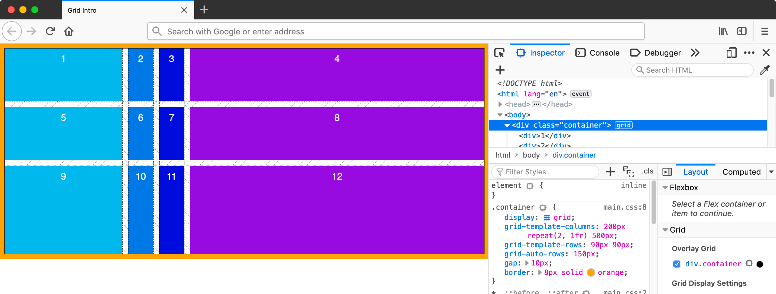
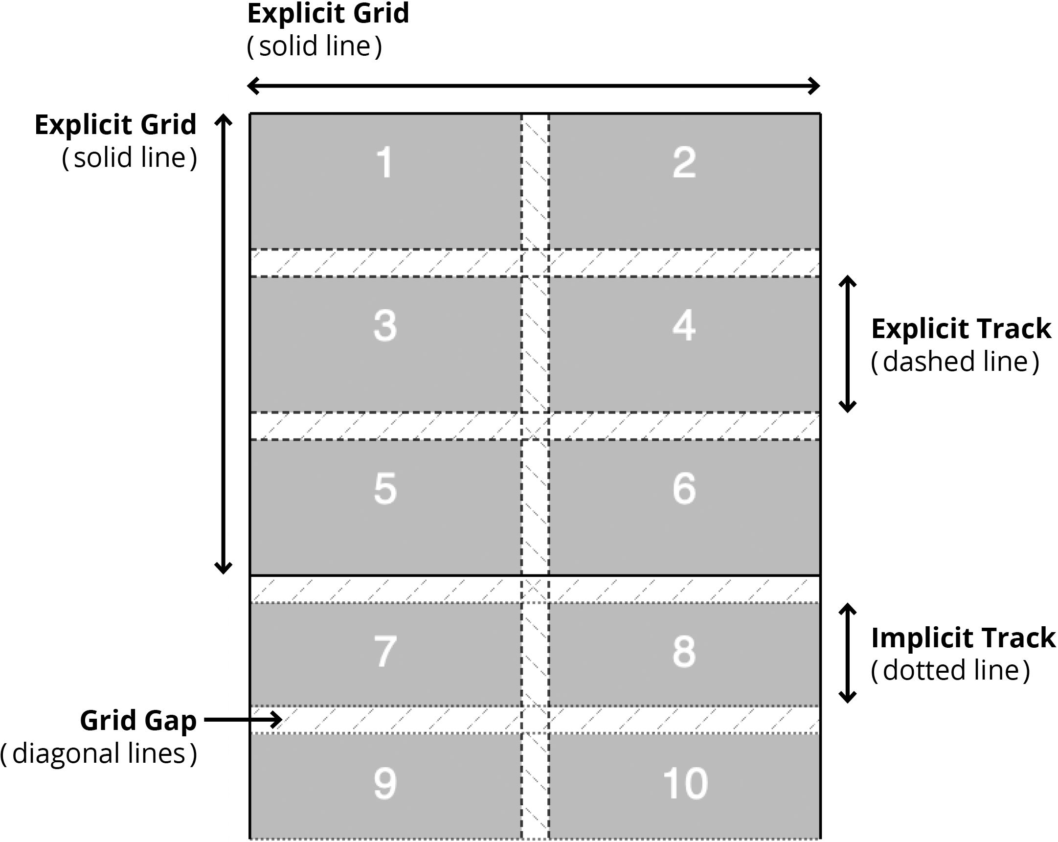
- The columns and rows we define are called the explicit grid.
- The columns and rows that are automatically created are called the implicit grid.
- Currently all our columns are explicit. The first 2 rows are explicit, and the rest are implicit.
- Ctrl–click (Mac) or Right–click (Windows) anywhere in the grid and choose Inspect Element.
- In the DevTools, to the right of
<div class="container">click the grid button to show a grid overlay. - Click the grid button again to turn off the grid overlay.
-
In the Grid area of the DevTools, it lists all the grid containers in the page.
- You should see div.container with a checkbox.
- Check the box for div.container to turn on the overlay (this is the same as clicking the grid button.)
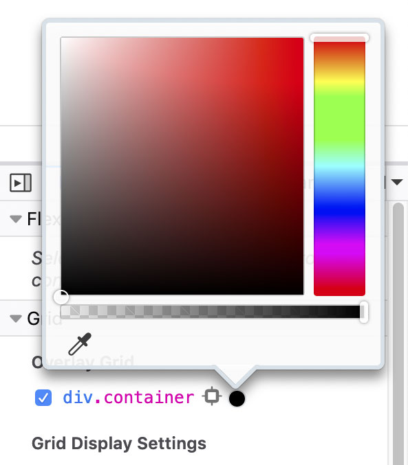
- To the right of div.container is a colored dot. As shown below, click that dot to choose the color of the overlay and choose black (or whatever color makes them easiest for you to see).
The Explicit vs. Implicit Grid
- Switch back to your code editor.
-
Let’s set the size for implicit rows. In the .container rule add the following bold code:
.container { display: grid; grid-template-columns: 200px auto 200px; grid-template-rows: 90px 90px; grid-auto-rows: 150px; gap: 10px; border: 8px solid orange; } -
Save the file, and reload the page in Firefox.
- Notice the first 2 rows remain the same (because they are explicit), but the other row implicit rows are now taller (150px each).
- Switch back to your code editor.
-
In the .container rule, change the size of the columns as follows:
.container {
   display: grid;
   grid-template-columns: 200px 1fr;
Code Omitted To Save Space
}NOTE: The fr unit is a fr actional unit. According to the spec tinyurl.com/fr-unit an fr unit “represents a fraction of the leftover space in the grid container”. So another way to think of fr is that it stands for “free space”. First the browser calculates the size of grid items with specific widths (such as pixels), then takes the leftover free space and distributes it between the grid tracks with fr units.
-
Save the file, and reload the page in Firefox.
- You should now have 2 columns.
- The left column should be 200px wide.
- The right column should fill the remaining space.
- Switch back to your code editor.
-
In the .container rule, change the size of the columns as follows:
.container {
   display: grid;
   grid-template-columns: 200px 1fr 1fr;
Code Omitted To Save Space
} -
Save the file, and reload the page in Firefox.
- You should now have 3 columns.
- The left column should be 200px wide.
- The other 2 columns should equally fill the remaining space.
- Switch back to your code editor.
-
In the .container rule, change the size of the columns as follows:
.container {
   display: grid;
   grid-template-columns: 200px 2fr 1fr;
Code Omitted To Save Space
}NOTE: 2fr gets twice the amount of free space as 1fr.
-
Save the file, and reload the page in Firefox.
- You should still have 3 columns.
- The left column should be 200px wide.
- The middle column should be larger than the right column. The free space is divided into 3 units, with the middle column getting 2 units and the right column getting 1 unit.
- Switch back to your code editor.
-
In the .container rule, change the size of the columns as follows:
.container {
   display: grid;
   grid-template-columns: auto 1fr;
Code Omitted To Save Space
}NOTE: In this case, auto collapses to width of content.
-
Save the file, and reload the page in Firefox.
- You should now have 2 columns.
- The left column should be the width of content.
- The right column should fill the remaining space.
- Switch back to your code editor.
-
In the .container rule, change the size of the columns as follows:
.container {
   display: grid;
   grid-template-columns: 1fr 1fr 1fr;
Code Omitted To Save Space
} -
Save the file, and reload the page in Firefox.
- You should now have 3 equally sized columns.
- Switch back to your code editor.
-
In the .container rule, change the size of the columns as follows:
.container {
   display: grid;
   grid-template-columns: repeat(3, 1fr);
Code Omitted To Save Space
} -
Save the file, and reload the page in Firefox.
- Nothing should have changed, this was just an alternate way of coding.
- Switch back to your code editor.
-
In the .container rule, change the size of the columns as follows:
.container {
   display: grid;
   grid-template-columns: repeat(3, 1fr 50px);
Code Omitted To Save Space
} -
Save the file, and reload the page in Firefox.
- You should now have 6 columns.
- The 1fr 50px repeats 3 times, so the columns should alternate between the flexible 1fr size and the fixed 50px size.
- Switch back to your code editor.
-
In the .container rule, change the size of the columns as follows:
.container {
   display: grid;
   grid-template-columns: 100px repeat(2, 1fr) 500px;
Code Omitted To Save Space
} -
Save the file, and reload the page in Firefox.
- You should now have 4 columns.
- The left column is 100px wide.
- The right column is 500px wide.
- The 2 columns between are flexible and equally share the available space.
Grid Auto Flow
Similar to flexbox, grid has a direction. By default, grid-auto-flow is set to row. As you’ve seen in this exercise, grid items wrap onto multiple lines creating rows.
You can use grid-auto-flow: column; to make grid add new columns instead of new rows. You can then use grid-auto-columns to set a size for the implicit columns (like we did with grid-auto-rows to set a size for the implicit rows).
