Deepen your understanding of web development by learning to position and size grid items using grid template areas with our comprehensive tutorial and practice exercises.
This exercise is excerpted from Noble Desktop’s HTML & CSS training materials and is compatible with Flexbox, Grid, and Bootstrap updates through 2023. To learn current skills in HTML & CSS with hands-on training, check out our Front-End Web Development Certificate, Full-Stack Web Development Certificate, and coding classes in-person and live online.
Topics Covered in This Web Development Tutorial:
Setting up Grid Template Areas, Creating Empty Grid Areas, Using Automatically Created Named Lines, Multiple Elements Occupying the Same Grid Area, Viewing Grid Template Area Names in Firefox’s DevTools
Exercise Preview
Exercise Overview
In this exercise you’ll learn how position and size grid items using grid template areas, which can be an intuitive way to lay out a grid.

Getting Started
- In your code editor, close any files you may have open.
- For this exercise we’ll be working with the Grid Template Areas folder located in Desktop > Class Files > yourname-Flexbox Grid Class. You may want to open that folder in your code editor if it allows you to (like Visual Studio Code does).
-
Open index.html from the Grid Template Areas folder.
- As you’ve seen in previous exercises, there’s a .container div that wraps 4 sections.
-
Preview index.html in Firefox.
- We didn’t add the orange .container border that we had in previous exercises, because we won’t be needing it and wanted a cleaner layout.
- This stacking layout looks good on mobile devices, but we want to create a multi-column grid layout on larger screens.
Leave index.html open in Firefox as you work, so you can reload the page to see the code changes you’ll make.
Setting up Grid Template Areas
- Switch back to your code editor.
- Open main.css from the css folder (in the Grid Template Areas folder).
-
We only want our grid to appear on larger screens, so below all the other rules, create the following media query:
@media (min-width: 600px) { } -
In the min-width: 600px media query add the following bold code:
@media (min-width: 600px) {
   .container {
      display: grid;
      grid-template-areas:
         "nav header"
         "nav main"
         "nav footer";
   }
}
This defines named areas into which we can place grid items. The cool thing is you can visualize the grid simply by looking at these labels!
- We want a nav column on the left that’s 3 rows tall.
- We want a right column that contains a header, main, and footer (each on a different row).
-
Now we need to place the grid items into the named areas we defined. Add the following bold code:
header { grid-area: header; background: #0db8e8; } nav { grid-area: nav; background: #0978e2; } main { grid-area: main; background: #0000d5; } footer { grid-area: footer; background: #9700da; } -
Save the file, and reload the page in Firefox.
- Make the window wider than 600px.
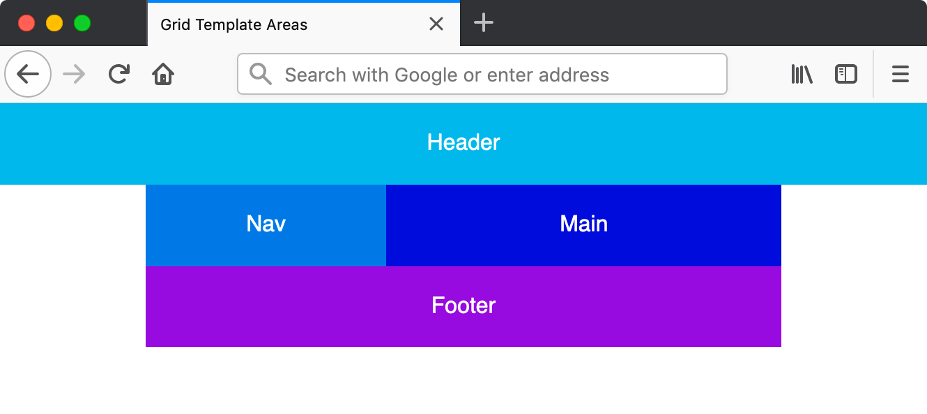
- You should see a 2 column layout, with nav in the left column and the header, main, and footer in the right column.
- Switch back to your code editor.
-
In the .container rule, change the areas as shown below in bold:
.container {
   display: grid;
   grid-template-areas:
      "header header"
      "nav main"
      "footer footer";
}
NOTE: The areas you create must be rectangles.
-
Save the file, and reload the page in Firefox.
- Wow, that was so much easier to totally change the layout!
- Now the header should span both columns on the top and the footer should span across both columns on the bottom.
Creating Empty Grid Areas
Sometimes you don’t want anything in a section of the grid layout. We can use a period (.) to create an empty space.
- Switch back to your code editor.
-
In the .container rule, change the areas as shown below in bold:
.container {
   display: grid;
   grid-template-areas:
      "header header header"
      ". nav main."
      ". footer footer.";
}
NOTE: If you want to line things up better, you can add extra spaces. You can also use multiple periods instead of one (as long as the periods for a single grid area don’t contain spaces). So you could use. or …..
-
Save the file, and reload the page in Firefox.
- If the layout is broken, double-check your code to make sure that you have the same number of columns in all 3 rows (we have 5 columns).
- The header should extend across the entire width of the page, but the other 2 rows should have an empty column on both the left and right sides.
Viewing Grid Template Area Names in Firefox’s DevTools
- CTRL–click (Mac) or Right–click (Windows) anywhere in the grid and choose Inspect Element.
- In the DevTools, to the right of
<div class="container">click the grid button to show the grid overlay. - In the Grid area of the Firefox DevTools, under Grid Display Settings check on Display area names.
- Make sure the window is wide enough to see the grid layout, and you’ll see the grid template area names we wrote in our CSS!
- Close the DevTools.
Sizing the Columns
As we’ve done before, we use grid-template-columns to set the width of columns.
- Switch back to your code editor.
-
In the .container rule, add the following bold code:
.container {
   display: grid;
   grid-template-columns: 75px 200px 1fr 75px;
   grid-template-areas:
Code Omitted To Save Space
}NOTE: We created 5 columns with grid-template-areas so we’re defining 5 column widths with grid-template-columns.
-
Save the file, and reload the page in Firefox.
- The outer empty white columns should be smaller, at 75px wide.
- The nav column should be a fixed 200px wide.
- The rest should be flexible to fill the remaining space.
Using Automatically Created Named Lines
In an earlier exercise we saw how to refer to grid lines by numbers, or by names we define. A cool thing about defining names with grid-template-areas, is that the grid lines are automatically named for you! You simply add -start and -end to your template area names.
Let’s add an overlay on top of the nav, main, and footer areas (but not over the header). We can do this using the named lines.
- Switch back to your code editor.
-
We’ll want the overlay to work on all screens, but currently the grid layout is only for larger screens. Let’s add a simple grid layout for mobile devices. Below the body rule (outside of any media query), the following new rule:
.container { display: grid; grid-template-areas: "header" "nav" "main" "footer"; } -
In the min-width: 600px media query’s .container rule, remove the now redundant
display: grid;so you end up with:@media (min-width: 600px) {.container { grid-template-columns: 75px 200px 1fr 75px; grid-template-areas: "header header header" ". nav main." ". footer footer."; } } -
Save the file, and reload the page in Firefox.
- The layout should be stacked in a single column on smaller screens, and the same multi-column layout on wider screens.
- Switch back to your code editor.
- Switch to index.html.
-
Below the footer add an overlay div as shown below in bold:
<footer>Footer</footer> <div class="overlay">Overlay</div> </div> - Save the file.
- Switch to main.css.
-
Below the footer rule (outside of the media query), add the following new rule:
.overlay {
   background: rgba(0,0,0,.6);
   grid-column: nav-start / main-end;
   grid-row: nav-start / footer-end;
}
NOTE: Notice how we’re using the nav, main, and footer names we defined in the grid-template-areas, adding -start or -end as needed.
-
Save the file, and reload the page in Firefox.
- You should see a darkened overlay on top of the nav, main, and footer areas.
- Isn’t is cool that multiple elements can occupy a grid area?
TIP: The overlay is on top because it comes after the other elements in the HTML. To change the stacking order you could use
z-index: -1;to send it behind the other elements. If you did that in this page you wouldn’t see the overlay because the other elements have background colors. If they didn’t have backgrounds you’d see through to it.
