Explore this comprehensive Web Development tutorial that covers various topics like sizing with Minmax, Auto-Fit vs. Auto-Fill, Max-Content & Min-Content, and includes practical exercises to help you understand and implement these concepts effectively.
This exercise is excerpted from Noble Desktop’s HTML & CSS training materials and is compatible with Flexbox, Grid, and Bootstrap updates through 2023. To learn current skills in HTML & CSS with hands-on training, check out our Front-End Web Development Certificate, Full-Stack Web Development Certificate, and coding classes in-person and live online.
Topics covered in this Web Development tutorial:
Sizing with Minmax, Auto-Fit vs. Auto-Fill, Max-Content & Min-Content
Exercise Preview
Exercise Overview
In this exercise you’ll learn about sizing grid items with minmax, auto-fit, auto-fill, max-content, and min-content.

Getting Started
- In your code editor, close any files you may have open.
- For this exercise we’ll be working with the Grid Minmax folder located in Desktop > Class Files > yourname-Flexbox Grid Class. You may want to open that folder in your code editor if it allows you to (like Visual Studio Code does).
-
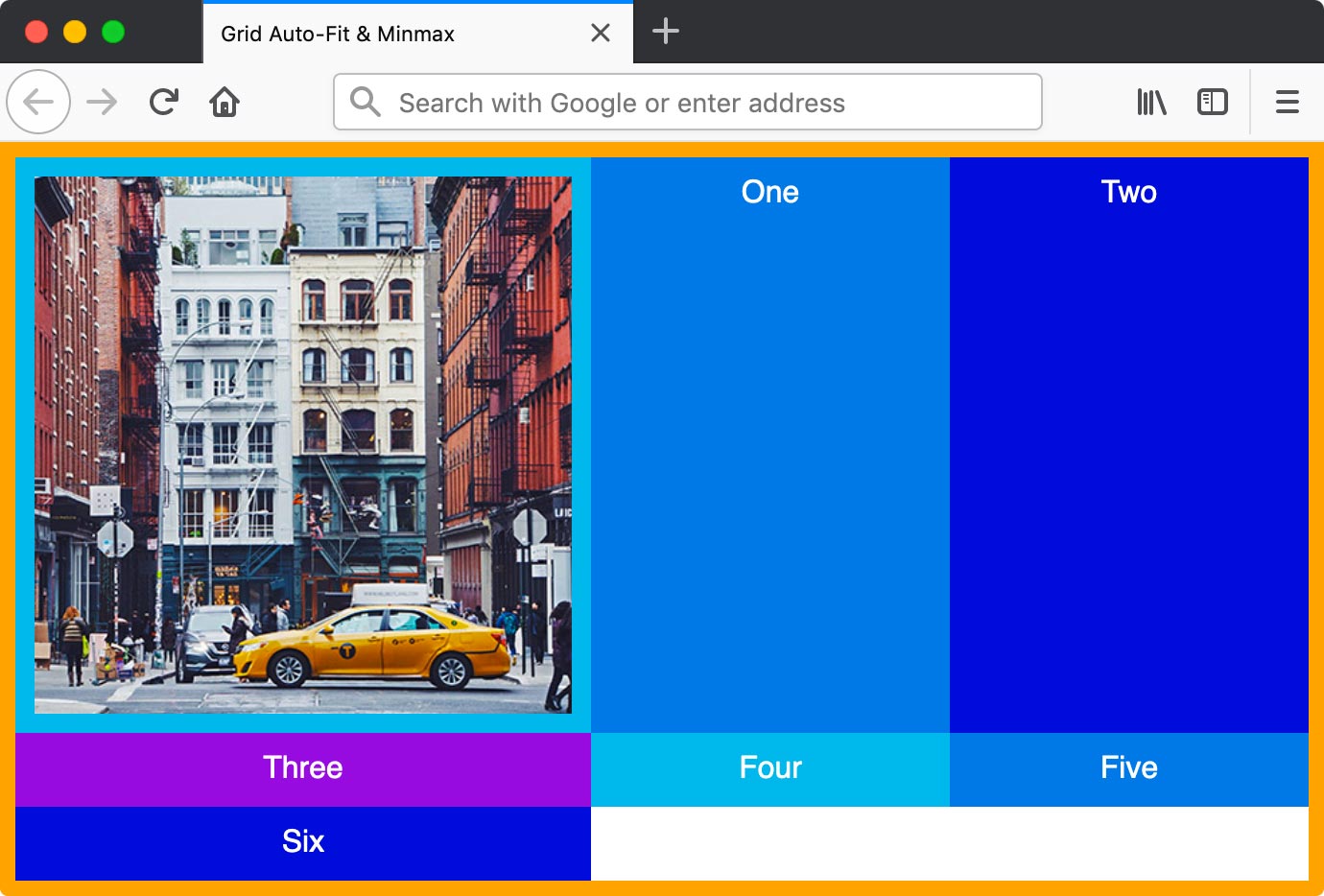
Open index.html from the Grid Minmax folder.
- As you’ve seen in previous exercises, there’s a .container div that wraps a bunch of divs with numbers (and an image in the first div).
- There are some commented out divs so we can quickly add more content later.
-
Preview index.html in Firefox.
- As you’ve seen in previous exercises, the .container div has an orange border with multi-colored divs inside.
Leave index.html open in Firefox as you work, so you can reload the page to see the code changes you’ll make.
Intro to Minmax
- Switch back to your code editor.
- Open main.css from the css folder (in the Grid Minmax folder).
-
In the .container rule add the following bold code:
.container { display: grid; grid-template-columns: repeat(5, 1fr); border: 8px solid orange; } -
Save the file, and reload the page in Firefox.
- You should have 5 columns with flexible widths that fill the container.
- Resize the window narrower to see how small the columns can get.
- Switch back to your code editor.
-
In the .container rule, edit the column size as shown below in bold:
.container { display: grid; grid-template-columns: repeat(5, 100px); border: 8px solid orange; } -
Save the file, and reload the page in Firefox.
- The 5 columns now have fixed widths so they no longer fill the container.
- Switch back to your code editor.
-
In the .container rule, edit the column size as shown below in bold:
.container { display: grid; grid-template-columns: repeat(5, minmax(100px, 1fr)); border: 8px solid orange; } -
Save the file, and reload the page in Firefox.
- Resize the window and notice that at wider screen sizes the columns are the flexible 1fr size (their max size), but have a minimum size of 100px that prevents them from getting too small.
- Ctrl–click (Mac) or Right–click (Windows) anywhere in the grid and choose Inspect Element.
- In the DevTools, to the right of
<div class="container">click the grid button to show a grid overlay. - In the Grid area of the Firefox DevTools, under Grid Display Settings check on Display line numbers.
- Leave the DevTools open with the grid overlay on.
- Switch back to your code editor.
- Switch to index.html.
- Uncomment
<div>Five</div> -
Save the file, and reload the page in Firefox.
- Our grid has a repeat of 5, so we have 5 columns. We just added a sixth column (don’t forget to count the image column), which wraps onto a new row.
Auto-Fit vs. Auto-Fill
- Switch back to your code editor.
- Switch to main.css.
-
In the .container rule, edit the column size as shown below in bold:
.container { display: grid; grid-template-columns: repeat(auto-fit, minmax(100px, 1fr)); border: 8px solid orange; } -
Save the file, and reload the page in Firefox.
- Resize the window from small to wide to see how this works.
- The columns have a minimum size of 100px. Any columns that don’t fit wrap onto rows, and the others scale up as needed to fill the width (their max width is 1fr).
- Once all columns are in a single row, as you keep resizing the window wider, notice the right-most column number keeps increasing but you don’t see any extra columns. Even though additional 100px wide columns would fit, the auto-fit option collapses those columns to allow our actual columns to fill the entire width of the container.
- Switch back to index.html in your code editor.
- Uncomment
<div>Six</div> -
Save the file, and reload the page in Firefox.
- Resize the window and see how things behave.
- It’s cool how with this technique we don’t need to know how many columns we’ll have (the layout adjusts to fit them).
- Switch back to main.css in your code editor.
-
In the .container rule, edit the column size as shown below in bold:
.container { display: grid; grid-template-columns: repeat(auto-fill, minmax(100px, 1fr)); border: 8px solid orange; } -
Save the file, and reload the page in Firefox.
- Resize the window from small to wide to see how this works.
- On small screens this acts like auto-fit, but on wider screens once all columns are in a single row you’ll see it acts differently. As you keep resizing the window wider this technique adds empty columns.
- auto-fill: Fills the available space with columns (which may be empty) by adding or removing columns as needed.
- auto-fit: Fits the current number of columns to the width of the grid.
More About Minmax
- Switch back to your code editor.
-
In the .container rule, edit the column size as shown below in bold:
.container { display: grid; grid-template-columns: minmax(200px, 300px) 1fr 1fr; border: 8px solid orange; } -
Save the file, and reload the page in Firefox.
- Resize the window and notice the first column will be the max 300px wide, unless it can’t fit (then it will scale down until it hits the minimum 200px width).
- Switch back to your code editor.
-
In the .container rule, edit the column size as shown below in bold:
.container { display: grid; grid-template-columns: minmax(200px, max-content) 1fr 1fr; border: 8px solid orange; } -
Save the file, and reload the page in Firefox.
- Resize the window too see the maximum width for the first column is now based on the widest thing in that column (the photo).
- Switch back to your code editor.
-
In the .container rule, edit the column size as shown below in bold:
.container {
   display: grid;
   grid-template-columns: minmax(min-content, 300px) 1fr 1fr;
   border: 8px solid orange;
}
NOTE: While minmax(min-content, max-content) works, it’s the same as minmax(auto, auto) or even more simply, just auto which is a lot less code!
-
Save the file, and reload the page in Firefox.
- Resize the window to see the minimum size of the first column is the width of its narrowest content (in a way that doesn’t cause overflow). In this case that’s Three.
Fit-Content vs. Minmax
Similar to minmax, another sizing option is called fit-content. Below is a comparison and explanation of the slight differences between them. To help you compare them, imagine a scenario where the content does not fill the entire column width.
fit-content(800px)
- If a column’s content is less than 800px wide, the column will be the width of the content (even if there’s enough space to make the column 800px wide).
- If a column’s content is wider than 800px, the column will be limited to 800px wide.
- In other words: fit-content wants to shrink down to fit the content, but has a max width.
minmax(auto, 800px)
- If there is enough space to make the column 800px wide, the column will be 800px (even if the column’s content is less than 800px wide).
- If there’s not enough space to make the column 800px, it will be narrower (down to a minimum width of the content).
- In other words: minmax wants to hit the max (regardless of the content inside) but will be smaller if it can’t be the max width.
Summary: Fit-content if more content centric and therefore wants to shrink down to the content when possible, whereas minmax wants to scale up to fill the space.
