Dive into the world of web development with this comprehensive tutorial on controlling size with flex-grow, flex-shrink, & flex-basis, aligning all vs. specific flex items, nesting flexbox, and flex shorthand, complete with practical exercises for hands-on learning.
This exercise is excerpted from Noble Desktop’s HTML & CSS training materials and is compatible with Flexbox, Grid, and Bootstrap updates through 2023. To learn current skills in HTML & CSS with hands-on training, check out our Front-End Web Development Certificate, Full-Stack Web Development Certificate, and coding classes in-person and live online.
Topics Covered in This Web Development Tutorial:
Controlling Size with Flex-Grow, Flex-Shrink, & Flex-Basis, Aligning All Vs. Specific Flex Items, Nesting Flexbox, Flex Shorthand
Exercise Preview
Exercise Overview
In this exercise you’ll learn how to size an align flex items (which are children of a flex container).

Getting Started
- In your code editor, close any files you may have open.
- For this exercise we’ll be working with the Flexbox Size Alignment folder located in Desktop > Class Files > yourname-Flexbox Grid Class. You may want to open that folder in your code editor if it allows you to (like Visual Studio Code does).
- Open index.html from the Flexbox Size Alignment folder.
-
Preview index.html in a browser.
- This page is the same as the one you finished in the previous exercise.
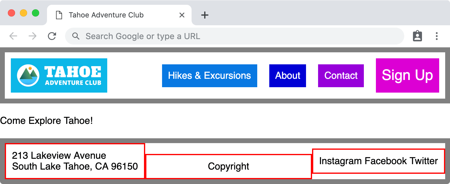
- Notice the colored items in the nav do not fill the entire width of the navbar. Let’s make them fill the entire area.
- Notice the red outlined divs in the footer are stacked on top of each other (because they are block elements). We want to put them into a row and adjust their size and alignment.
Leave index.html open in the browser as you work, so you can reload the page to see the code changes you’ll make.
Controlling Size with Flex-Grow
Let’s see how to change the size of flex items (elements inside a flex container) with the flex-grow property. The default value for flex-grow is 0 which means do not grow. We can set it to a positive number to control how flex items grow.
- Switch back to your code editor.
- Open main.css from the css folder (in the Flexbox Size Alignment folder).
-
In the .navbar li rule, add the following bold code:
.navbar li { flex-grow: 1; color: white; padding: 10px; } -
Save the file, and reload the page in your browser.
- Notice the colored items in the navbar now fill up the entire width.
- The way flexbox works, is the browser takes any leftover space and divides it up between elements based on their flew-grow amounts. Because all the flex items share the same flex-grow (1), the leftover space is divided up and equally added to all the elements.
- Switch back to your code editor.
- Switch to index.html.
-
Add a new list item to the navbar, as shown below in bold:
<li class="hikes">Hikes & Excursions</li> <li class="about">About</li> <li class="contact">Contact</li> -
Save the file, and reload the page in your browser.
- We already had a style for this in our CSS, which is why the About has a color.
- Notice that flexbox handles the new item well. There’s less extra space now that we have another item. Each nav items gets a bit less space, but the spacing is evenly distributed.
- What if we wanted the About element to be slightly bigger than the others? Let’s see another feature of flex-grow.
- Switch back to your code editor.
- Switch to main.css.
-
In the .navbar.about rule add the following bold code:
.navbar.about { flex-grow: 2; background: #0000d5; } -
Save the file, and reload the page in your browser.
- Notice how the About element is now slightly bigger than it was, and proportionally is slightly bigger than the other navbar elements.
How Flex-Grow is Calculated
Flex-grow controls the distribution of free space. In order to know how wide to make the flex items, the browser sizes the elements and then looks at any leftover space. It divides the amount of free space by the total of all the flex-grow values and then adds that amount to elements based on their flex-grow value.
As an example, let’s say there is 500px of leftover space and a total flex-grow of 5 (across all the flex items). 500px/5 means each flex-grow equals 100px. So an element with a flex-grow of 1 gets 100px bigger, an element with a flex-grow of 2 gets 200px, and so on.
Visit css-tricks.com/flex-grow-is-weird to see a great illustration of this.
- Switch back to your code editor.
- Remove the flex-grow: 2; from the .navbar.about rule.
-
Let’s move onto the footer. In the footer rule, make it a flex container with the following bold code:
footer { display: flex; border: 8px solid gray; margin-top: 20px; } -
Save the file, and reload the page in your browser.
- Notice the red outlined divs in the footer are now are in a row.
- Notice the width of the red outlined divs has collapsed to the width of the content, and there’s empty space to the right.
- Switch back to your code editor.
-
In the footer div rule, set them to grow with the following bold code:
footer div { flex-grow: 1; border: 2px solid red; padding: 10px; } -
Save the file, and reload the page in your browser.
- Notice the red outlined divs now fill the entire width of the footer.
- The extra space has been evenly distributed between these 3 flex items, but what if we didn’t want the social div to grow? Let’s prevent that from changing size.
- Switch back to your code editor.
-
Below the footer div rule, add the following new rule:
footer.social { flex-grow: 0; } -
Save the file, and reload the page in your browser.
- Notice the width of the footer’s social networks div has collapsed to the width of the text inside.
- We really only want the copyright div to grow, so we should not have set a grow on all the divs in the footer. Let’s go back and adjust.
- Delete the
flex-grow: 1;from the footer div rule. -
Change the name of the footer.social rule to footer.copyright as shown below:
footer .copyright { flex-grow: 0; } -
In the footer.copyright rule, change flex-grow to 1 as shown below:
footer.copyright { flex-grow: 1; } -
While we’re here, let’s also center the text in the copyright div by adding the following bold code:
footer.copyright { flex-grow: 1; text-align: center; } -
Save the file, and reload the page in your browser.
- Notice the footer’s address and social divs are the width of their content, while the copyright div fills all the space between (with its text centered in the area).
Aligning All Vs. Specific Flex Items
As we saw in the previous exercise, we can align items on the main axis or cross axis. We can align all items in a flex container, or individually align each flex item.
- Switch back to your code editor.
-
Let’s vertically center the footer divs. The current (and default) flex-direction is row, so the main axis is horizontal. That means we’ll use the cross axis for vertical alignment. In the footer rule add the following bold code:
footer { display: flex; align-items: center; border: 8px solid gray; margin-top: 20px; } -
Save the file, and reload the page in your browser.
- Notice the footer’s red outlined divs are all vertically centered (and their height has collapsed to the content inside).
- Let’s align the copyright to the bottom of the footer.
- Switch back to your code editor.
-
In the footer rule add the following bold code:
footer.copyright { flex-grow: 1; align-self: flex-end; text-align: center; } -
Save the file, and reload the page in your browser.
- Notice the copyright should now be aligned to the bottom of the footer.
NOTE: It’s important to keep in mind that some flexbox properties are applied to the flex container (the parent), while others are applied to flex items (the children). CSS Trick’s Complete Guide to Flexbox tinyurl.com/flexref is the definitive flexbox reference with great illustrations and explanations of each property and whether they apply to the flex container or flex item.
Nesting Flexbox
- Switch back to your code editor.
- We no longer want the navbar items to grow, so in the .navbar li rule, delete the flex-grow: 1;
-
Let’s vertically center the items in the navbar. In the .navbar rule add the code shown below in bold:
.navbar {
   display: flex;
   align-items: center;
   border: 8px solid gray;
Code Omitted To Save Space
} -
Save the file, and reload the page in your browser.
- In the navbar, the logo should be on the left with the nav text on the right.
- Let’s make the Sign Up stretch the entire height of the navbar so it stands out.
- Switch back to your code editor.
-
In the .navbar.signup rule add the following bold code:
.navbar.signup { align-self: stretch; background: #dc00d4; font-size: 1.5em; } -
Save the file, and reload the page in your browser.
- Notice that Sign Up stretches to fill the entire height of the navbar, but the text is no longer centered.
- How do we get Sign Up to stretch and have its text vertically centered? Flex containers (the parent element) contain flex items (the child element). Flex items can themselves also be turned into flex containers. This is called nesting. By setting Sign Up (currently a flex item) to also be flex container, we can control the alignment of elements inside it.
- Switch back to your code editor.
-
The .signup div is currently a flex item, but it’s not yet a flex container. Add the following bold code to make it a flex container and align its children along the cross axis:
.navbar.signup { align-self: stretch; display: flex; align-items: center; background: #dc00d4; font-size: 1.5em; } -
Save the file, and reload the page in your browser.
- Notice that Sign Up text is now vertically centered within the color that stretches to fill the entire height of the navbar.
- Switch back to your code editor.
-
Space apart all the nav items by adding the following bold code to .navbar li:
.navbar li { margin: 10px; color: white; padding: 10px; } -
Save the file, and reload the page in your browser.
- Notice everything in the navbar has whitespace around it.
- Resize the window narrower, to notice that the logo shrinks down because its container is shrinking. Let’s stop that.
- The Sign Up text breaks onto two lines when the window is too narrow, which we’d also like to prevent.
Controlling Size with Flex-Shrink
To control whether flex items get smaller we use flex-shrink. Its default value is 1, which means items get smaller. This works like flex-grow, but removing space instead of adding it. Flexbox looks at the space that needs to be removed, and distributes that based on the flex-shrink value. By default all items have flex-shrink of 1, so equal amounts of space are removed from each item.
- Switch back to your code editor.
-
To prevent the Sign Up button from shrinking, add the following bold code to the .navbar.signup rule:
.navbar.signup { align-self: stretch; flex-shrink: 0; display: flex; align-items: center; background: #dc00d4; font-size: 1.5em; } -
Do the same thing in the .navbar.logo rule:
.navbar.logo { flex-shrink: 0; margin-right: auto; background: #0db8e8; } -
Save the file, and reload the page in your browser.
- Resize the window from wide to narrow, noticing that the logo and Sign Up no longer shrink.
Sizing with Flex-Basis
To set the width or height of a flex item (depending on the flex-direction), we use flex-basis. Let’s see how it works by making the logo div less wide.
- Switch back to your code editor.
-
.navbar.logo {
   flex-shrink: 0;
   flex-basis: 160px;
   margin-right: auto;
   background: #0db8e8;
}
NOTE: In the provided CSS we set
max-width: 100%;on all images, so by shrinking the .logo div, the image inside will automatically shrink. If the content could not shrink, the column would not reduce in size. It would be as wide as the content unless you set overflow to hidden (which would cut off the excess content). -
Save the file, and reload the page in your browser.
- Notice the width of the logo div (and therefore the image inside) has reduced.
NOTE: Flex-basis sets the initial size an element should be, before it grows or shrinks. Setting a flex-basis doesn’t guarantee the element will be that size, unless you disable flex-grow and flex-shink.
Flex Basis Vs. Width
“In case both flex-basis (other than auto) and width (or height in case of flex-direction: column) are set for an element, flex-basis has priority.”—Mozilla’s MDN tinyurl.com/fba-vs.-w
Why not just use width? Keep in mind that Flexbox lets you change directions, and flex-basis works on the main axis. That means it works like width for flex-direction: row or height for flex-direction: column. Also, when using the flex shorthand property you can combine all 3 properties (flex-grow, flex-shrink and flex-basis) into one line of code.
Flex Shorthand
Instead of writing out flex-grow, flex-shrink, and flex-basis, we can combine all 3 properties into one shorthand property: flex.
- The syntax is
flex: flex-grow flex-shrink flex-basis; - The default value is
flex: 0 1 auto;
Switch back to your code editor.
-
In the .navbar.logo rule merge the flex-shrink and flex-basis properties into one flex property as shown below:
.navbar.logo { flex: 0 160px; margin-right: auto; background: #0db8e8; } -
Save the file, and reload the page in your browser.
- The page should look the same, but you now had more concise code.
