Explore this comprehensive tutorial on Mobile and Responsive Web Design, diving into topics such as editing visual indicators for media queries, fun with RGBA, the anatomy of a CSS gradient, linear-gradients & repeating-linear-gradients, and linking to Google’s free web fonts.
This exercise is excerpted from Noble Desktop’s past web design training materials. We now teach Figma as the primary tool for web and UX & UI design. To learn current skills in web design, check out our Figma Bootcamp and graphic design classes in NYC and live online.
Topics Covered in This Mobile & Responsive Web Design Tutorial:
Editing the Visual Indicator for Each Media Query, Fun with RGBA, Anatomy of a CSS Gradient, Linear-gradients & Repeating-linear-gradients, Linking to Google’s Free Web Fonts
Exercise Preview
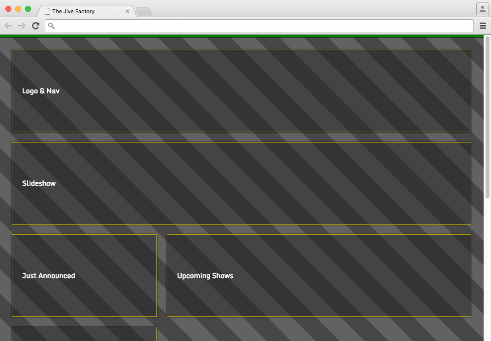
Exercise Overview
Now that we have a working wireframe, we can start adding real content to it. In this exercise, we’ll add a background pattern using pure CSS gradients. We’ll also choose a couple of Google-hosted fonts to enhance the typographic style of the site. Let’s get started!

Getting Started
-
If you completed the previous exercises, you can skip the following sidebar. We recommend you finish the previous exercises (2D–3A) before starting this one. If you haven’t finished them, do the following sidebar.
If You Did Not Do the Previous Exercises (2D–3A)
- Close any files you may have open.
- On the Desktop, go to Class Files > yourname-Mobile and Responsive Class.
- Delete the Jive folder if it exists.
- Select the Jive Wireframe Done folder.
- Duplicate the folder.
- Rename the folder to Jive.
-
In your code editor, open main.css if it isn’t already open (Jive > css).
The main objective of the exercise is to create a background pattern for the page using CSS gradients. That said, we’d still like there to be a noticeable color change when moving from breakpoint to breakpoint, so instead of using background colors on the body, let’s change the visual aid to a colored border.
-
As shown below, edit the body rule in the PROJECT STYLES section (around line 13):
body { margin: 0; padding: 25px 15px 5px; border-top: 5px solid red; } -
Edit the body rule in the min-width: 480px media query (around line 36):
body { border-color: yellow; } -
Edit the body rule in the min-width: 740px media query (around line 47):
body { border-color: green; } -
Edit the body rule in the min-width: 1024px media query (around line 65):
body {
   border-color: blue;
}
Save and preview index.html in a browser. Resize the window to see the new border at the top change colors.
Preparing the Page for a CSS Gradient Background
It’s worth noting that a CSS gradient is not a series of CSS color values. Instead, the CSS gradient function creates an image that represents a gradient of colors. The CSS gradient image has no set dimensions. Its size will match the size of the element it applies to.
We often set the body element as the target of the background style but, technically, body is a child of the html element. The html element is a more reliable target for backgrounds. It represents the root of the HTML document.
-
Return to main.css. Let’s start by adding a new rule for html at the top of the PROJECT STYLES section (around line 13):
html { } body { margin: 0; padding: 25px 15px 5px; border-top: 5px solid red; } -
We should specify a default background color for the page. This will be our fallback color in case a browser doesn’t support the repeating gradient pattern. Add the following property to the rule for html:
html {
   background-color: #333;
}
Save the file.
- Preview index.html in a browser. You should see a dark gray background, but let’s finalize the module style so we’ll be able see the background gradient as it will truly look in the final page.
-
Back in main.css, edit the .module rule (around line 21) as shown below:
.module {
   background: rgba(15,15,15,.5);
   border: 1px solid #b08101;
   box-shadow: 0 3px,000;
   padding: 20px;
   margin: 0 10px 20px;
   line-height: 9;
}
Save and preview index.html in a browser. Now we’ll be able to see the gradient, but the text is kind of getting lost. Let’s set the default text color and font-size for the content.
-
Back in main.css, edit the html rule in the PROJECT STYLES section (around line 13):
html {
   color: #fff;
   font-size: 14px;
   background-color: #333;
}
Save and preview index.html in a browser. We’re ready to build the gradient background pattern.
Creating a CSS Gradient Pattern
-
Return to main.css. Let’s first have some fun with learning the syntax for CSS gradients. Add the following new background-image property declaration:
html {
   color: #fff;
   font-size: 14px;
   background-color: #333;
   background-image: radial-gradient(red, orange, yellow, green, blue, violet);
}
NOTE: We are writing longhand for background-color and background-image so that browsers that do not support the gradients we are using will properly fall back to the solid hex value. The gradient pattern is just a progressive enhancement to the aesthetics of the page; its absence will not negatively affect the user experience.
Save and preview index.html in a browser. Woah. Very Ben & Jerry’s, but let’s tone that down. We can also try a linear, rather than radial gradient.
-
Return to main.css. Edit the gradient style and trim down the rainbow as follows:
background-image: linear-gradient(red, orange, yellow); Save and preview index.html in a browser. The gradient fills the page and goes from top to bottom by default. Let’s change the gradient to go from left to right.
-
Return to main.css. Edit the gradient as follows:
background-image: linear-gradient(to right, red, orange, yellow); Save and preview index.html in a browser. Cool. Let’s try to put this on an angle.
-
Return to main.css. Edit the gradient as follows:
background-image: linear-gradient(45deg, red, orange, yellow); Save and preview index.html in a browser. Fancy that. And you can use any angle you like. What about specifying the size of each gradient color to create less of a rainbow gradation and more of a stripe effect? We can do that.
-
Return to main.css. Let’s start with red, and continue with red until 40px. Edit the gradient as follows:
background-image: linear-gradient(45deg, red, red 40px, orange, yellow); -
Next, set orange to start at 40px (exactly where the red ends) and continue to 80px:
background-image: linear-gradient(45deg, red, red 40px, orange 40px, orange 80px, yellow); -
Then set yellow to start at 80px (exactly where the orange ends) and continue to 120px:
background-image: linear-gradient(45deg, red, red 40px, orange 40px, orange 80px, yellow 80px, yellow 120px); Save and preview index.html in a browser. If needed, scroll to the bottom of the page to see the small red and orange stripes (the rest of the page should be yellow). We want this to repeat as a pattern, not just appear as a single tiny stripe effect in the bottom-left corner.
-
Return to main.css and add repeating, as follows:
background-image: repeating- linear-gradient(45deg, red, red 40px, orange 40px, orange 80px, yellow 80px, yellow 120px); Save and preview index.html in a browser. Yowza. Now that we know how to make stripes, let’s tone this down a bit. Let’s create a series of gray stripes by using the gray background of the page and alternating it with stripes that are a semi-transparent overlay.
-
Return to main.css. Replace the color red with transparent, as follows:
background-image: repeating-linear-gradient(45deg, transparent, transparent 40px, orange 40px, orange 80px, yellow 80px, yellow 120px); Save and preview index.html in a browser. You can see through to the gray background in these transparent areas. Great! We only want two colors for the pattern, dark gray and a not-so-dark gray. Let’s get rid of the yellow stripe to pare things down.
-
Return to main.css. Delete the yellow values as follows:
background-image: repeating-linear-gradient(45deg, transparent, transparent 40px, orange 40px, orange 80px); Save and preview index.html in a browser. Spooky. But closer to what we want. Now let’s use RGBA to create a lighter gray in the second stripe.
-
Return to main.css. Replace the orange value with the following RGBA values:
background-image: repeating-linear-gradient(45deg, transparent, transparent 40px, rgba(0,0,0,.3) 40px, rgba(0,0,0,.3) 80px); -
Save and preview index.html in a browser. Sweet! Cool stripes. Feel free to experiment with the width of the stripes and the angle. Here are a couple of nice options to try:
-
Thin vertical stripes:
background-image: repeating-linear-gradient(to right, transparent, transparent 5px, rgba(0,0,0,.3) 5px, rgba(0,0,0,.3) 10px); -
Thinner horizontal stripes:
background-image: repeating-linear-gradient(transparent, transparent 2px, rgba(0,0,0,.3) 2px, rgba(0,0,0,.3) 4px);
-
-
Here’s the final pattern we want for our design:
background-image: repeating-linear-gradient(45deg, transparent, transparent 35px, rgba(0,0,0,.3) 35px, rgba(0,0,0,.3) 70px); - Save and preview index.html in a browser.
- If your screen is tall enough to show some space below the content, notice the zig zag in the stripes just below the content. As we’ve seen in an earlier exercise, that’s because the background does not fill the entire screen. It ends at the bottom of the content and then repeats.
-
The fix is the same as we saw before. Add the following code shown in bold:
html {
   color: #fff;
   font-size: 14px;
   background-color: #333;
   background-image: repeating-linear-gradient(45deg, transparent, transparent 35px, rgba(0,0,0,.3) 35px, rgba(0,0,0,.3) 70px);
   background-attachment: fixed;
}
Save the file and reload the browser to see your final background.
Adding Google Fonts
Our design calls for custom fonts. We’ll use Google Fonts, the leader in free web fonts. Google hosts hundreds of fonts and provides the code to make it all work.
- In a new browser tab, go to Google Fonts at: fonts.Google.com
- In the search at the top right of the page, type in the font we want to add: Monda
- Click the
 button to the right of the Monda font name.
 - At the bottom of the page, notice there’s a bar that says 1 Family Selected.
- In the search at the top right of the page, search for Bree Serif.
- Click the button to the right of the Bree Serif font name.
- At the bottom of the page, click the 2 Families Selected bar to open it.
- Click on the CUSTOMIZE tab.
- Under Monda, check the box next to bold 700.
- Go back to the EMBED tab.
-
Under Embed Font, copy the link:
<link href="https://fonts.googleapis.com/css?family=bree+serif|monda:400,700" rel="stylesheet"> - Return to index.html in your code editor.
-
Paste the link around line 7, as shown in bold below:
<title>The Jive Factory</title> <link href="https://fonts.googleapis.com/css?family=bree+serif|monda:400,700" rel="stylesheet"> <link rel="stylesheet" href="css/normalize.min.css"> <link rel="stylesheet" href="css/main.css"> - Save the file.
-
Switch to main.css and apply the Monda font to everything in the page by adding the following code shown in bold:
html { font-family: 'Monda', sans-serif; color: #fff; - Save and preview index.html in a browser to see the new font.
If you get done early, check out the Animating a CSS Background Gradient bonus exercise (near the end of this book) for more fun with CSS gradients.
