Dive into the essentials of mobile and responsive web design with this detailed tutorial covering Bootstrap 3, a dynamic front end framework designed to streamline web development; learn to add content, work with Bootstrap’s grid system, create and adjust columns, and more.
This exercise is excerpted from Noble Desktop’s past web design training materials. We now teach Figma as the primary tool for web and UX & UI design. To learn current skills in web design, check out our Figma Bootcamp and graphic design classes in NYC and live online.
Topics covered in this Mobile & Responsive Web Design tutorial:
Adding content & laying out the page, Using Bootstrap’s grid system, Creating & adjusting columns, Adding a navbar & other components
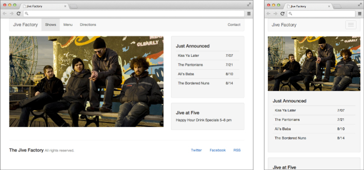
Exercise Preview
Exercise Overview
Bootstrap 3 is a powerful front end framework that can make web development faster and easier. Its core feature is a grid system for creating columns and rows. Grids help keep a design consistent and make it easier to be responsive. In this exercise, you’ll start coding a page using Bootstrap’s basic elements. Over the next few exercises you’ll continue building the page and learning about Bootstrap.

Hello Bootstrap!
To get started, go to getbootstrap.com. We’ve already downloaded the files for you, but here you can learn about its features, see code examples, and read the documentation.
-
Let’s see what’s included in the download. Navigate to the Desktop. Then go into Class Files > yourname-Mobile and Responsive Class > Bootstrap.
NOTE: In addition to Bootstrap’s files, we have added a basic index.html, images, jquery (in the js folder), and snippets that you’ll be using in this series of exercises.
For this exercise we’ll be working with the Bootstrap folder. Open that folder in your code editor if it allows you to (like Sublime Text does).
Open index.html in your code editor.
-
We’ll start at the top and work our way down. On line 6 add a title:
<title>Jive Factory</title> -
We need to link to the Bootstrap CSS file, which will provide us with many of the components for our layout. Below the title, link to their CSS with the following code:
<link rel="stylesheet" href="css/bootstrap.min.css"> At the bottom of the file notice that we have linked to jQuery. We’ll make use of this later, in combination with Bootstrap’s JavaScript library.
Adding Real Content & Laying Out the Page
We’re ready to start laying out the page using Bootstrap’s pre-made classes. You can find out more about the pre-defined CSS rules at getbootstrap.com/css
Bootstrap requires a specific nested structure: container > row > column. Let’s start by adding a .container div to hold all the content.
-
As shown below, inside the body tag, add the following code:
<body> <div class="container"> </div> <script src="https://ajax.googleapis.com/ajax/libs/jquery/2.1.4/jquery.min.js"></script> -
Next we must add a row. This is a pre-defined class (that is explained in the Bootstrap documentation). Add a .row div inside the .container div:
<body> <div class="container"> <div class="row"> </div> </div> -
In this row, we need a div for the slideshow and a placeholder image. Add the following code:
<body>
   <div class="container">
      <div class="row">
         <div>
            <img src="img/slideshow-low-lustre.jpg">
         </div>
      </div>
   </div>
NOTE: It’s important that the image does not have HTML attributes for width and height (so it can be flexible/responsive). For now we’ll use this single image to represent the slideshow, but we’ll add the complete slideshow in a later exercise. In these exercises we won’t worry about alt attributes on images. Some images are placeholders anyway, so we’ll skip them for the sake of expediency.
- To save you some time we’ve already written the HTML code for a sidebar. In your code editor, open sidebar.html from the Bootstrap > snippets folder.
- Select all the code.
- Copy it.
- Close the file.
-
You should be back in index.html. Paste the code after the div containing the slideshow image, around line 15, keeping the new code inside the .row div. (If using Sublime Text, use Paste and Indent.)
<body>
   <div class="container">
      <div class="row">
         <div>
            <img src="img/slideshow-low-lustre.jpg">
         </div>
         <div>
            <div>
               <h4>Just Announced</h4>
Code Omitted To Save Space
               <p>Happy Hour Drink Specials 5–8 pm</p>
            </div>
         </div>
      </div>
   </div>
In the content you just pasted, notice that we’ve already added Bootstrap’s table class to the table tag. This will apply some nice formatting to the table.
Save and preview index.html in a browser. There are several problems, but you should immediately notice that the slideshow placeholder image is huge! It’s too big because it is a HiDPI image that has not been scaled down to fit the page.
-
Switch back to your code editor and add the following class to the image:
<img class="img-responsive" src="img/slideshow-low-lustre.jpg"> Save the file and preview index.html in a browser. Resize the window and notice that the image is now scaling and adjusting to fit the browser window. Notice that the content below the image looks better at a mobile device’s narrow width, but not very good at larger widths because it stretches too much.
Creating & Adjusting Columns
-
To get the photo and text content to display next to each other (as two columns in a row) we have to add classes to the divs. Bootstrap uses a 12-column grid. Let’s make the slideshow take up 8 columns and the text content take up 4 columns (8+4=12). Add the following classes to the slideshow and text divs:
<div class="row"> <div class="col-md-8"> <img class="img-responsive" src="img/slideshow-low-lustre.jpg"> </div> <div class="col-md-4"> <div> <h4>Just Announced</h4> -
Save and preview index.html in a browser and notice the following:
At a small mobile size the page is still one column but it looks better with some margin space around the content.
At a larger size the design changes to two columns and the text is now a sidebar.
It looks pretty good, but the proportions seem a little off. If we make the image bigger, the text in the sidebar won’t have to stretch as much. Instead of column widths of 8 and 4 we can use 9 and 3 (9+3=12).
-
Switch back to your code editor and change the number of columns:
<div class="col-md-9"> <img class="img-responsive" src="img/slideshow-low-lustre.jpg"> </div> <div class="col-md-3"> -
Save and preview index.html in a browser. Better!
Bootstrap uses a mobile first approach. The -md- in column classes refers to the size of the breakpoint at which columns will appear. It tells the columns to appear on Medium devices (starting at 992 px) and larger. Here’s how Bootstrap categorizes device sizes.
Code Device Breakpoint xs Extra Small Devices: Phones Smaller than 768 px sm Small Devices: Tablets 768 px & Larger md Medium Devices: Desktops 992 px & Larger lg Large Devices: Desktops 1200 px & Larger Currently the columns do not appear until the window is 992 px wide. It might be nice to have the columns appear at a narrower width.
-
Return to your code editor and change the md to sm:
<div class="col-sm-9"> <img class="img-responsive" src="img/slideshow-low-lustre.jpg"> </div> <div class="col-sm-3"> - Save and preview index.html in a browser. Now the sidebar column will appear starting at 768 px and larger. At this smaller size the text in the sidebar is getting a bit tight. Let’s change it back to 8 and 4 columns, but keep the smaller breakpoint so we see them at this smaller size.
-
Return to your code editor and change the number of columns as shown below:
<div class="col-sm-8">
   <img class="img-responsive" src="img/slideshow-low-lustre.jpg">
</div>
<div class="col-sm-4">
Save and preview index.html in a browser. That’s a small improvement. In the next exercise we’ll explore the grid in more detail.
Using More Components
The two divs that make up the sidebar need to be distinguishable from each other. We can easily do this by applying one of Bootstrap’s component classes to our Just Announced and Jive at Five sections. You can browse available components at getbootstrap.com/components
Switch back to your code editor.
-
Let’s use the well component, which is described in the documentation as a simple inset effect. Add a well class to the Just Announced div as shown below:
<div class="col-sm-4"> <div class="well"> <h4>Just Announced</h4> <table class="table"> -
Add a well class to the Jive at Five div (around line 39) as shown below:
   <div class="well">
      <h4>Jive at Five</h4>
      <p>Happy Hour Drink Specials 5–8 pm</p>
Save and preview index.html in a browser. The two sections should now have a light gray background and a subtle border to visually separate them.
Adding a Footer
Switch back to your code editor.
-
Let’s add another row for the footer content that will include the copyright and social links. Add the following code below the first row (around line 45):
</div> <hr> <footer class="row"> </footer> </div> <script src="https://ajax.googleapis.com/ajax/libs/jquery/2.1.4/jquery.min.js"></script> -
Let’s add a copyright div. Inside the footer row add the following:
<hr> <footer class="row"> <div> <h4>The Jive Factory <small>All rights reserved.</small></h4> </div> </footer> -
After that div, add the following code for the social links:
<footer class="row"> <div> <h4>The Jive Factory <small>All rights reserved.</small></h4> </div> <div> <ul> <li><a href="#">Twitter</a></li> <li><a href="#">Facebook</a></li> <li><a href="#">RSS</a></li> </ul> </div> </footer> -
We want each of these divs to take up equal amounts of the 12 columns so we’ll set each to have a class of col-sm-6. Add the following bold code:
<footer class="row"> <div class="col-sm-6"> <h4>The Jive Factory <small>All rights reserved.</small></h4> </div> <div class="col-sm-6"> <ul> - Save and preview index.html in a browser. Notice that the social links are currently in a list. Bootstrap has some pre-made classes we can use to turn this into a nav.
- Return to your code editor.
-
Edit the social links list by adding the following bold code:
<div class="col-sm-6">
   <ul class="nav nav-pills pull-right">
      <li><a href="#">Twitter</a></li>
      <li><a href="#">Facebook</a></li>
      <li><a href="#">RSS</a></li>
   </ul>
</div>
NOTE: The nav class removes the bullets, nav-pills styles them, and pull-right aligns them to the right.
Save and preview index.html in a browser. The footer is looking good. Mouse over the social links to see that they even have hover styles! The page looks best at tablet and desktop sizes. We’ll improve the mobile layout later.
Adding a Navbar
Let’s add the navigation at the top of the page. To start, let’s use some code we copied from the Bootstrap website.
-
In your code editor, open navbar-simplified.html from the snippets folder.
NOTE: This code is an edited version of the provided example found at getbootstrap.com/components/#navbar. To save you some time, we removed extra stuff that we won’t be using for our site.
- Select all the code.
- Copy it.
- Close the file.
- You should be back in index.html.
-
Paste the code inside the container div, before the first row div as follows:
<div class="container">
   <nav class="navbar navbar-default">
Code Omitted To Save Space
</nav> <div class="row"> <div class="col-sm-8"> -
Starting around line 20, replace the nav placeholder text with real Jive Factory content as shown below:
<a class="navbar-brand" href="#">Jive Factory</a> </div> <!-- Collect the nav links and other content for toggling --> <div class="collapse navbar-collapse" id="bs-example-navbar-collapse-1"> <ul class="nav navbar-nav"> <li class="active"><a href="#">Shows</a></li> <li><a href="#">Menu</a></li> <li><a href="#">Directions</a></li> </ul> <ul class="nav navbar-nav navbar-right"> <li><a href="#">Contact</a></li> </ul> -
This navbar collapses on smaller sized screens, creating a menu icon that expands when you click on it. This effect uses JavaScript, so we need to add the Bootstrap JS file to our page.
At the bottom of the page, below the jQuery links, add the Bootstrap JS, as shown below in bold:
<script>window.jQuery || document.write('<script src="js/jquery-2.1.4.min.js"><\/script>')</script> <script src="js/bootstrap.min.js"></script> - Save and preview index.html in a browser and notice:
On larger screens the navbar will appear across the top of the page. We want there to be some space above the navbar, but we’ll take care of that in the next exercise.
On smaller screens the navbar will collapse and you click/tap the three lined menu button at the top right of the page to expand it. (This button is often called the hamburger because it’s like a hamburger patty in a bun.)
Isn’t it awesome what you can do only using the provided CSS and JS? So far we’ve only written HTML code and never had to touch any CSS or JavaScript to make this layout!
