Learn to refine Bootstrap's grid layout to fit content better at various breakpoints in this Mobile & Responsive Web Design tutorial, including how to change the grid at specific sizes and show and hide elements as needed.
This exercise is excerpted from Noble Desktop’s past web design training materials. We now teach Figma as the primary tool for web and UX & UI design. To learn current skills in web design, check out our Figma Bootcamp and graphic design classes in NYC and live online.
Topics Covered in This Mobile & Responsive Web Design Tutorial:
Changing the Grid at Specific Sizes, Showing & Hiding Elements at Specific Sizes
Exercise Preview
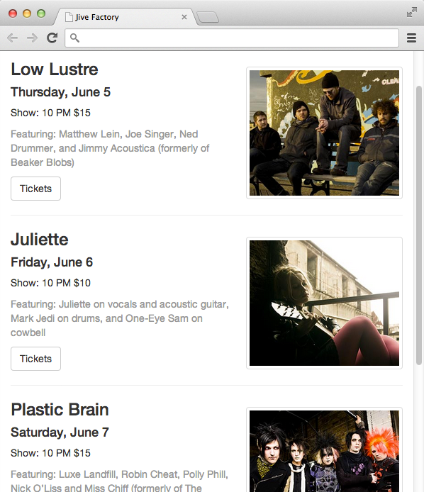
Photos courtesy of istockphoto, Hakan Çaglav, Image #14393929, Renee Keith, Image #7827478.

Exercise Overview
In this exercise you’ll take a closer look at Bootstrap’s grid. You’ll refine the layout so the content fits better at various breakpoints.
-
If you completed the previous exercises, you can skip the following sidebar. We recommend you finish the previous exercises (5C–6A) before starting this one. If you haven’t finished them, do the following sidebar.
If You Did Not Do the Previous Exercises (5C–6A)
- Close any files you may have open.
- On the Desktop, go to Class Files > yourname-Mobile and Responsive Class.
- Delete the Bootstrap folder.
- Select the Bootstrap More Elements & Nesting Grids Done folder.
- Rename the folder to Bootstrap.
For this exercise we’ll be working with the Bootstrap folder. Open that folder in your code editor if it allows you to (like Sublime Text does).
Preview index.html in a browser. Notice that the navbar is touching the top of the browser window. Let’s add some space above it as well as extra space at the bottom of the page so the text isn’t quite so close to the bottom.
In your code editor, open main.css from the css folder.
-
Above the img rule add the following:
body {
   margin: 15px 0;
}
Save main.css.
- Preview index.html in a browser and note the following:
The navbar should look better with space around it.
Resize the browser to the largest width (1200px or larger). Even at this size the four columns of upcoming shows are each a little narrow.
Slowly make the window narrower until the column widths reduce at the next breakpoint. At this width the four columns are definitely too narrow. At this smaller width, it would be better to have 2 rows of 2 columns instead of one row with four columns. We can accomplish this by adding a new class to our columns. Keep the page open at this size in the browser so we can reload it and see the change in a moment.
Changing the Grid at Specific Sizes
Switch back to your code editor.
If index.html is not already open, open it now.
-
Starting around line 41 find the code for the four columns.
At the smallest Bootstrap size (under 768 px) divs are 100% wide (this is the xs class). In other words, each div is 12 columns wide (out of the total 12 columns that are available). Each of our four divs currently offers a class of col-sm-3. The sm-3 says the divs should be 3 columns wide starting at the sm size (which is 768 px & larger). That’s too small of a screen to have that many columns (they end up being too narrow). We should make the divs 6 columns wide at that sm size. 6+6=12 so only two columns will fit next to each other. The remaining divs that don’t fit will flow onto the next line and appear like a second row below.
-
Change the col class number to 6 as shown below in bold.
<div class="col-sm-6">
   <img class="img-thumbnail" src="img/thumb-low-lustre.jpg">
   <h3>Low Lustre</h3>
Code Omitted To Save Space
</div>
<div class="col-sm-6">
   <img class="img-thumbnail" src="img/thumb-juliette.jpg">
   <h3>Juliette</h3>
Code Omitted To Save Space
</div>
<div class="col-sm-6">
   <img class="img-thumbnail" src="img/thumb-plastic-brain.jpg">
   <h3>Plastic Brain</h3>
Code Omitted To Save Space
</div> <div class="col-sm-6"> <img class="img-thumbnail" src="img/thumb-dusty-shoes.jpg"> <h3>Dusty Shoes</h3> - Save and preview index.html in a browser. Resize the window to see that at the mobile size the upcoming shows stack on top of each other, but at larger sizes they break into two columns with two rows. That looks better, but as we get larger we could probably switch back to the 4-column layout.
- Return to your code editor.
-
We changed to a 2-column layout at Bootstrap’s sm size. The lg class is the largest size (screens 1200px and wider). At this size we’ll switch back to the 4-column layout (which means each div should be 3 columns wide, 4x3=12). Add a col-lg-3 class to each of the 4 divs:
<div class="col-sm-6 col-lg-3">
   <img class="img-thumbnail" src="img/thumb-low-lustre.jpg">
   <h3>Low Lustre</h3>
Code Omitted To Save Space
</div>
<div class="col-sm-6 col-lg-3">
   <img class="img-thumbnail" src="img/thumb-juliette.jpg">
   <h3>Juliette</h3>
Code Omitted To Save Space
</div>
<div class="col-sm-6 col-lg-3">
   <img class="img-thumbnail" src="img/thumb-plastic-brain.jpg">
   <h3>Plastic Brain</h3>
Code Omitted To Save Space
</div> <div class="col-sm-6 col-lg-3"> <img class="img-thumbnail" src="img/thumb-dusty-shoes.jpg"> <h3>Dusty Shoes</h3> - Save and preview index.html in a browser and note the following:
Resize the browser from extra small to large. The upcoming shows should start as one column, then change to two, and finally four columns at the largest size. That’s much better!
Resize the browser to the largest width (1200px or larger). At this size the Just Announced table of shows gets a bit too wide, and the four columns of upcoming shows are a bit narrow.
Switch to index.html in your code editor.
-
Around line 38 find the following div:
<div class="col-sm-8"> -
As shown below, add a new class for the lg size that changes the columns for that breakpoint and larger:
<div class="col-sm-8 col-lg-9">NOTE: The sm and lg indicate the minimum size/breakpoint for those columns to take effect. We start with no columns at the smallest size (xs) but then sm-8 says to change to an 8-column width starting at the sm size (which is 768 px & larger). By adding the lg-9 we tell it to change to a column width of 9 starting at the lg size (which is 1200 px & larger).
-
Around line 76 find the following div:
<div class="col-sm-4"> -
As shown below, add a new class for the lg size that changes the columns for that breakpoint and larger:
<div class="col-sm-4 col-lg-3"> -
Switch back to index.html in your browser and reload the page. At the largest 1200 px size the right column should get smaller and the left column should get wider. At the sm size the column sizes will be 8 + 4 (which equals 12) and at the lg size they will be 9 + 3 (which equals 12).
Bootstrap’s classes make it easy to go responsive. We didn’t even have to write any CSS!
Showing & Hiding Elements at Specific Sizes
-
The slideshow (which is just a placeholder image for now) is going to be small on mobile devices, so let’s just hide it using the handy hidden-xs class. Back in your code editor, around line 39 add the following bold code:
<img src="img/slideshow-low-lustre.jpg" class="hidden-xs"> - Save and preview index.html in a browser. Now when you shrink the browser window to a mobile size less than 768 px, the slideshow placeholder image goes away. Oops, the horizontal rule below that isn’t needed now that the slideshow placeholder is gone, so we’ll have to hide that as well.
-
Back in your code editor, add the same class to the hr tag right below the slideshow placeholder image:
<img src="img/slideshow-low-lustre.jpg" class="hidden-xs"> <hr class="hidden-xs"> -
At the mobile size the Tickets button is too close to the photo below it. Let’s add separators between the shows. We only want the divider lines to appear in the single-column mobile version though. We can do this with
<hr>tags that rely on a similar class: visible-xs.<div class="row"> <div class="col-sm-6 col-lg-3"> <img class="img-thumbnail" src="img/thumb-low-lustre.jpg">Code Omitted To Save Space
<a href="#" class="btn-default">Tickets</a>
      <hr class="visible-xs">
   </div>
   <div class="col-sm-6 col-lg-3">
      <img class="img-thumbnail" src="img/thumb-juliette.jpg">
Code Omitted To Save Space
<a href="#" class="btn-default">Tickets</a>
      <hr class="visible-xs">
   </div>
   <div class="col-sm-6 col-lg-3">
      <img class="img-thumbnail" src="img/thumb-plastic-brain.jpg">
Code Omitted To Save Space
<a href="#" class="btn-default">Tickets</a>
      <hr class="visible-xs">
   </div>
   <div class="col-sm-6 col-lg-3">
      <img class="img-thumbnail" src="img/thumb-dusty-shoes.jpg">
Code Omitted To Save Space
<a href="#" class="btn-default">Tickets</a>
      <hr class="visible-xs">
   </div>
</div>
Save and preview index.html in a browser. Resize the browser window to a mobile size less than 768 px, so you notice the very light line between our upcoming shows in the single-column version.
Refining the Layout
This design looks good at extra small sizes like a small mobile phone, but at slightly larger sizes (when it’s wider than the 330 px wide photos) the design doesn’t look as nice. Once the photo no longer fills the width of the screen, it would be nice if the images got smaller and floated to the right—making better use of the available screen space. Bootstrap’s smallest media query is for screens under 768 px, so we’ll need to create our own media query for this screen size.
- Switch to main.css in your code editor.
-
Below the existing CSS rules, add the following media query:
@media (min-width: 371px) and (max-width: 767px) {

}
NOTE: How did we come up with 371? The image is 330px. Bootstrap’s img-thumbnail style adds 4px of padding and 1px of border on the left and right sides. Bootstrap’s column style adds 15px of padding on both sides as well. So here’s the math: 15 + 1 + 4 + 330 + 4 + 1 + 15 = 370
If we used min-width: 370px the new styles would kick in at the 370px width, but it doesn’t have to kick in until 1px wider. We add 1px to equal 371px.
-
The band photos have a class of img-thumbnail applied to them. Because we are only using that class on these specific photos, let’s target that class. Add the following rule:
@media (min-width: 371px) and (max-width: 767px) { .img-thumbnail { float: right; width: 40%; margin: 10px 0 20px; } } - Save the file.
-
Preview index.html in a browser. Resize the browser window and notice:
Below 768px the photos start floating to the right.
Below 371px the photos will not float. Instead everything should stack. Some browsers do not let you resize the window that small. If your browser does not resize small enough, open the DevTools, and dock them to the right side. Resize the leftover space and you should be able to make it small enough to see this!
In some cases (when the photo is floated to the right and larger), the photo will come down into the divider line’s space and start messing up the layout. We need to make sure the horizontal rules clear these floats.
- Switch back to main.css in your code editor.
-
In the general styles, after the img rule add the following:
hr.visible-xs {
   clear: both;
}
Save the file.
Preview index.html in a browser. The grid layout is looking pretty good, except at the in-between sizes when the upcoming shows are 2 columns and 2 rows. The Tickets buttons need more space below them. These have a btn class, but we don’t want to add space below all the buttons on the page, just buttons in this div. We’ll need to add a class (of our own choosing) to the container div.
Switch to index.html in your code editor.
-
Around line 41 add an upcoming-shows class to the row container div.
<hr class="hidden-xs">
<div class="upcoming-shows row">
   <div class="col-sm-6 col-lg-3">
Save the file.
Switch to main.css in your code editor.
-
Below all the existing CSS, add the following media query:
@media (min-width: 768px) and (max-width: 1199px) {

}
NOTE: How did we decide on this px range for the media query? At the smallest xs size we use the default 1-column layout. At the sm and md sizes we switch to the 2-column layout. The sm size starts at 768px, so that gives us the min-width. At the lg size we switch to the 4-column layout. The lg size starts at 1200px, so we won’t need the extra margin when we hit that, thus the 1199px max-width.
-
Add the following rule:
@media (min-width: 768px) and (max-width: 1199px) { .upcoming-shows.btn { margin-bottom: 30px; } } - Save the file.
-
Preview index.html in a browser. Now every size should look good.
We’ve only scratched the surface of the classes available in Bootstrap. Even if you don’t use any of its pre-made components and only use it for a responsive grid, it can be very useful. Don’t forget that you can learn more about Bootstrap and get code examples at getbootstrap.com
If you have time, be sure to check out the Bootstrap bonus exercises toward the end of this workbook.
