Dive into this Sketch tutorial and learn the ins and outs of creating, editing and controlling symbols, and how symbols can enhance your design workflow through global content changes.
This exercise is excerpted from Noble Desktop’s past web design training materials and is compatible with Sketch updates through 2021. Noble Desktop now teaches Figma as the primary tool for web and UX & UI design. To learn current skills in web design, check out our Figma Bootcamp and graphic design classes in NYC and live online.
Topics covered in this Sketch tutorial:
Creating & editing symbols, Customizing content inside a symbol, Controlling the layout & resizing of symbols, Renaming symbols, Moving symbols between pages
Exercise Preview

Exercise Overview
In previous exercises, you’ve seen how styles let you reuse visual appearance, but what if you want to globally change content, such as text and graphics? In this exercise, you’ll learn how symbols let you reuse the content (as well as appearance).

Using Symbols to Update the Navigation Bar
Let’s replace two identical elements with a symbol so we can quickly edit both instances of that element as we iterate on our design.
- In Sketch, go to File > Open Local Document.
-
Navigate into Desktop > Class Files > Sketch Class > iTastify and double–click on iTastify Mobile Menus.sketch to open it.
This file contains two potential designs for the iTastify site’s mobile layout. The right artboard also contains a mockup of the mobile site’s navigation menu. Before we send these to the client for evaluation, let’s tweak some of the design elements.
- In the Sidebar, expand the Phone with Menu artboard if it isn’t already open.
- Hover over the mobile menu layer and an eye icon
 will appear. Click directly on that icon to temporarily hide the layer.
 -
We want to make some changes to the black navbar at the top of the artboards. We’ll convert the navbar into a symbol so we can update it across both artboards.
In the Sidebar, just below mobile menu select the nav layer group (which should be the nav on the right artboard).
- In the Toolbar, click the Create Symbol button
 (or choose Layer > Create Symbol).
 -
In the dialog that appears:
- Name it nav
- Set the menu below the name to No Layout. (We’ll explain this later.)
- Check on Send Symbol to “Symbols” Page. (We’ll explain this later.)
- Click Create.
- In the Sidebar, notice the nav layer has a new icon
 indicating it’s a symbol.
 - We need to replace the nav on the left artboard with the symbol we just made. In the Sidebar, in the top Phone artboard Right–click (or Control–click) on the nav group (folder) and choose Replace With > nav.
- Look at the left artboard to see the nav looks exactly the same, because the symbol uses the same position as the previous elements.
- To edit the symbol, in the canvas double–click on the black navbar (in either artboard, it does not matter which).
- Notice that you’re now on the Symbols page, editing the nav symbol (which has its own little artboard).
- Click somewhere outside the artboard so nothing is selected.
- Click on the black background rectangle to select it.
- In the Inspector, click the Fills color box and choose white.
- Hit Esc to close the color picker.
-
Click on the mobile menu icon
 on the artboard. It’s a group, so all three lines should become selected.
NOTE: This is often called the hamburger menu because it looks like a patty sandwiched between two buns.
- Currently the hamburger menu is a bit narrow. Drag the right-middle resize handle out a bit until it looks nice (you may need to zoom in to see a middle resize handle). Around 25 pixels wide looks nice, but it’s up to you.
- At the top left of the canvas, click the Back to Instance button.
Notice that the nav on both artboards has been updated. Sweet!
Customizing Content Inside a Symbol
-
In the Sidebar, show the mobile menu group by clicking the eye icon
.We want to make two buttons that look the same, but have different text. Even though symbols are designed to look the same everywhere you use them, Sketch allows for some flexibility. Sketch will let us override the text, photos, nested symbols, and nested styles for each instance of a symbol! Let’s see how.
- On the artboard, click on the Buy text to select it.
- Hold Shift and click on the button’s rounded rectangle.
- In the Sidebar, notice that Buy and button bg should both be selected.
- In the Toolbar, click the Create Symbol button .
-
In the dialog that appears:
- Name it button
- Set the menu below the name to No Layout.
- Check on Send Symbol to “Symbols” Page.
- Click Create.
-
With the Buy button still selected, in the Inspector, under Overrides, notice there is a Buy field.
It’s named Buy because that’s the text currently in the symbol. We’ll rename the field to something that makes more sense in a moment.
-
In the Buy field type Get App and hit Return to apply it.
Notice the button’s text (on the artboard) now says Get App, but we’d like more space on the left and right sides.
-
Let’s improve that override label and spacing. Double–click on the Buy button’s background (not the text) to edit the symbol.
You should now be on the Symbols page.
- On the artboard, double–click on the Buy text a couple times (until it becomes editable), and change it to Label
- Click in an empty area of the canvas to deselect the text.
- At the top left of the artboard, click on button (the symbol’s name) to select the artboard.
-
In the Inspector, under Layout:
- Click on Horizontal.
- Below that, make sure the Left to Right button is selected as shown below:

- At the top left of the canvas, click the Back to Instance button.
- With the Get App button still selected, notice in the Inspector that the override is now called Label. That’s better, but on the artboard the text is no longer on one line.
- In the Inspector, to the right of Overrides click on
 Size Instance to fit content.
 - In the Inspector, change the label from Get App to Download and hit Return to apply it.
- On the artboard notice that the button got wider so the space on the left and right looks good!
- Let’s insert a new instance of our button symbol. In the Toolbar, click the Insert button
 and under Symbols choose This Document > button.
 - The cursor will now contain an instance of the symbol. Hover over the space below the Download button and click to place it there (between Download and Text >).
-
Drag it into position as shown below:

- While we can use the Inspector to override the text, there’s another way. We can edit it directly on the artboard! On the artboard, double–click on the Label text.
- Type Tell a Friend and watch how the button grows as you type. How smart!
- Click outside the button to finish editing the text.
- Let’s make the rectangle more rounded. To edit the symbol, double–click on the button’s background rectangle (alternatively, you could select the symbol and hit Return or click the Edit Source button
 in the Inspector).
 - Click in an empty area of the canvas to make sure nothing is selected.
- Click on the burgundy rounded rectangle to select it.
- In the Inspector, drag the Corners slider all the way to the right.
- At the top left of the canvas, click the Back to Instance button.
Notice both buttons are now rounded.
Manually Resizing a Symbol
We like these buttons how they are, but what if we wanted the Download button to be as wide as Tell a Friend below?
- Select the Download button.
- Drag the right side’s middle resize handle out to match the width of the button below.
- Notice how the text remains centered, because the text is currently center aligned and aligned to the center of the button.
-
What if we wanted to left align the text, so both buttons had the text on the left with extra space on the right?
To edit the symbol, double–click on the button’s background rectangle (alternatively, you could select the symbol and hit Return).
- Click in an empty area of the canvas to make sure nothing is selected.
- Click on the Label text to select it.
- In the Inspector set the text alignment to Left.
-
In the Inspector’s Resizing options, in Pin to Edge click the left pin as shown below:

NOTE: Pinning tells Sketch to use a fixed pixel offset when positioning the element, rather than a variable percentage.
- At the top left of the canvas, click the Back to Instance button.
- Notice the text is now left aligned and the extra space is on the right.
-
While it’s good to know how manually resizing works, we don’t like the extra space to the right, so let’s reset the Download button’s width to match the content.
Select the Download button.
In the Inspector, to the right of Overrides click on
Size Instance to fit content .
More About Symbols
- Let’s make another symbol to learn more about them. In the canvas, below the Tell a Friend button, click on Text to select it.
- Hold Shift and click on the arrow to the right of Text.
- With both the text and arrow selected, in the Toolbar, click the Create Symbol button .
-
In the dialog that appears:
- Pay attention! This time uncheck Send Symbol to “Symbols” Page.
- Name it button/secondary (Now that we have multiple buttons, we’ll organize them into a folder, as we did with styles.)
- In the menu below the name choose Left to Right Layout.
- Click Create.
NOTE: Unlike before, the artboard for this symbol has been added to this page instead of the Symbols page.
-
Let’s make a copy of the button (on the mobile menu). In the canvas, hold Option and drag the Text > button down, so you end up with two buttons as shown below:

- Select the top Text button.
- In the Inspector, under Overrides, in the field under Text, type About and hit Return to apply.
- On the artboard, notice that About is longer than our initial text, but Sketch moved the arrow over and kept the same space between the text and the arrow.
- Select the remaining Text button.
- Double–click on the word Text, type Testimonials and click outside the button to finish.
- Once again notice that the arrow is adjusted properly.
- Make sure you can see the Phone with Menu artboard and the button/secondary artboard to its right.
- On the small button/secondary artboard, we can’t see the white text on the white background, so let’s change the artboard’s background color. To select the symbol’s artboard, click on the name of the artboard: button/secondary.
- In the Inspector on the right, check on Background color.
- Click the color box
 and choose black.
 - Hit Esc to close the color picker.
- Click in an empty part of the canvas to deselect the artboard.
- We’d like to scale the button’s arrow down a bit. On the button/secondary artboard, click on the arrow to select it.
-
To scale it:
- In macOS Big Sur & later: In the Toolbar, click the Tools button
 and then choose Scale. (You can also find this in Layer > Transform > Scale.)
 - Prior to macOS Big Sur:: In the Toolbar, click the Scale button
 . (You can also find this in Layer > Transform > Scale.)
- In macOS Big Sur & later: In the Toolbar, click the Tools button
-
In the Sidebar:
- Set Scale to 70%. (The Width and Height values will change to match that scale.)
- Click the middle point to choose Scale from center
 .
. - Click Finish to apply the change.
- To nudge the arrow down slightly, press the Down Arrow key twice and notice that both buttons on the mobile menu update as you work. That’s the benefit of having the symbol on this page (instead of sending it to the Symbols page).
The arrow is a little too thin. With it still selected, in the Inspector, under Borders set Width to 2.
Renaming Symbols & Moving Symbols Between Pages
-
At the top-left of the Toolbar, click on the Components button
 .
.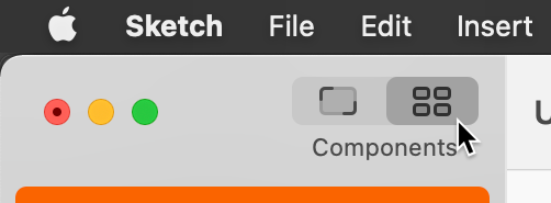
- In the middle of the Toolbar, click on the Symbols
 .
. - Select the button symbol.
- In the Inspector on the right, rename it to primary
- Drag the primary symbol into the button group in the Sidebar on the left.
-
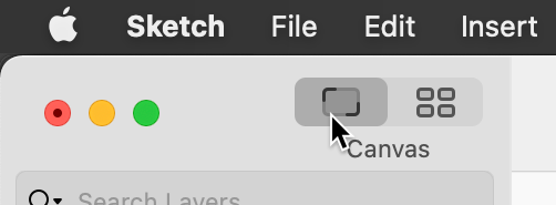
At the top-left of the Toolbar, click on the Canvas button
 .
.
-
The button/secondary symbol is still on Page 1. Let’s move it to the Symbols page.
In the Sidebar, Right–click (or Control–click) on the button/secondary symbol artboard name and choose Send to “Symbols” Page.
NOTE: Another way to move a symbol is in the Sidebar, drag the symbol’s artboard up onto a different page in the pages list.
Save and close the file.
Should You Send Symbols to the “Symbols” Page?
When you create a symbol, Sketch will create a new artboard with the symbol’s contents. You edit a symbol by changing the content on this artboard, renaming the artboard, resizing the artboard, etc. So the question is: where will Sketch put the symbol’s artboard? Here are the two options and their pros and cons:
-
Check Send Symbol to “Symbols” Page and the symbol’s artboard will be placed on the Symbols page.
- Advantage: Symbols are easy to find (because they’re all in one place). They do not clutter the current page with extra artboards.
- Disadvantage: You can’t edit the symbol in the context of other page elements, so you can’t sample colors or see it update in real-time.
-
Uncheck Send Symbol to “Symbols” Page and the symbol’s artboard will be placed on the current page.
- Advantage: You can edit the symbol while seeing other page elements, so you can sample colors and see it update in real-time.
- Disadvantage: Symbol artboards can clutter up the current page with extra artboards.
