Discover how to create a stunning hotel brochure in InDesign and learn techniques such as placing graphics and text, setting text wrap, and handling bleed and strokes, by following our comprehensive tutorial.
This exercise is excerpted from Noble Desktop’s past Adobe InDesign training materials and is compatible with InDesign updates through 2020. To learn current skills in InDesign, check out our InDesign Bootcamp and graphic design classes in NYC and live online.
Topics covered in this InDesign tutorial:
Placing text, photos, & illustrations, Gradient swatches, Drop shadows, Alignment, Text wrap
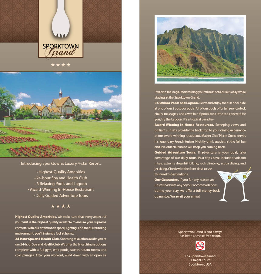
Exercise Preview
Exercise Overview
In this exercise, you’ll create a hotel brochure. We’ll show you how to place multiple graphics, link text from one page to another, and set text wrap, as well as how to handle bleed and strokes.

Creating the Document
- Go to File > New > Document and set the following:
- Set Width to 4 in and Height to 9 in.
- If the number of Pages and the Start # aren’t already 1, change them now.
- Uncheck Facing Pages.
- Expand the Margins section if needed, and make all Margins 0.5 in.
- Expand the Bleed and Slug section if needed, and make all Bleed options 0.125 in.
Click Create.
In the InDesign menu (Mac) or Edit menu (Windows), choose Preferences and then Units & Increments.
Change both Horizontal and Vertical to Picas. Click OK.
Go to File > Save As and name it yourname-sporktown-grand.indd.
Laying Out the Backgrounds
Go into File > Place.
-
From the InDesign Class folder, then the Sporktown Brochure folder, select
background-pattern.ai and click Open.The cursor is now a loaded image icon
 with a preview of the background.
 Position the top left of this cursor at the red bleed guide (which is 1⁄8 in off the top left of the page) and click once to place the background.
Choose the Rectangle Frame tool
 .
.Click and drag a rectangle from the top left bleed to the bottom right bleed.
In the Control panel, click the bottom center reference point
 .
.Enter an H (Height) of 46p4 and press Return (Mac) or Enter (Windows) to make the change.
Make sure the rectangle is still selected.
Open the Swatches panel (Window > Color > Swatches).
-
As shown below, at the top left of the Swatches panel, make sure the Fill swatch is in front (active). If it’s not, click it to make it active.

- Now we can create a gradient swatch. From the Swatches panel menu
 at the top right, choose New Gradient Swatch.
 -
Enter the following:
Swatch Name: text background Type: Linear In the Gradient Ramp section, click on the left slider
 to select it.
Make sure the Stop Color is set to CMYK and set the color: 48% Cyan, 47% Magenta, 60% Yellow, 16% Black.
In the Gradient Ramp section, click on the right slider
 to select it.
Make sure the Stop Color is set to CMYK and set the color: 63% Cyan, 62% Magenta, 67% Yellow, 57% Black.
Click OK.
Let’s change the direction of the gradient. Make sure the rectangle is still selected.
Choose the Gradient Swatch tool
 .
.Hold Shift and drag from the top of the rectangle to the bottom.
Go to Object > Effects > Drop Shadow.
-
Check on Preview and set the following:

Click OK.
Open the Pages panel (Window > Pages).
Select page 1.
-
Hold Option (Mac) or Alt (Windows) and drag page 1 down, then let go to make a copy of the page as shown below.

Choose the Selection tool
 .
.On page 2, move the gradient box up to the top of the bleed guide.
In the Control panel, select the top left reference point
 .
.In the Control panel, change the H (Height) to 44p3 to make it a little shorter.
Making the Front Page
Scroll up to page 1.
Click in the empty space off the page to make sure nothing is selected.
Go to File > Place.
From the Sporktown Brochure folder, double–click Sporktown-grand-logo.ai.
The cursor should now have the image loaded. Click once, slightly off the top edge of the page, to place the logo.
-
Now let’s perfect the position of the logo. Mouse over the image and notice (don’t click) the circle that appears in the center of the image (which is called the content grabber).
An image in InDesign consists of a frame and the image inside the frame. You can use the Selection tool
to either move the frame and the image, or adjust the position of the image inside the frame. The content grabber is used to move the image inside of the frame. Clicking anywhere on the image except for the content grabber allows you to move the image and the frame together. -
Using the Selection tool
, click anywhere on the logo except for the content grabber in the center, and move it so the bottom of the spork sits near the top of the gradient rectangle and centered between the margins, as shown below.NOTE: Almost half the spork should be cut off at the top of the page.

Let’s make sure the spork is centered horizontally. With the logo still selected, hold Shift and click on the pattern.
Open the Align panel (Window > Object & Layout > Align).
Click the button next to Align To and from the menu choose Align to Selection.
Click the Align horizontal centers button
 .
.Click on the pasteboard off to the side to deselect all.
Press Cmd–D (Mac) or Ctrl–D (Windows), which is the keystroke for File > Place.
From the Sporktown Brochure folder, choose hotel-exterior.tif.
Click once off the left side of the page, but make sure you don’t accidentally click into the gradient rectangle!
Enter X: –0p9 and Y: 14p3
Making the Back Page
Scroll to page 2.
Click on the pasteboard off the left side to make sure nothing is selected.
Go to File > Place.
- Hold Cmd (Mac) or Ctrl (Windows), and select the following three files:
- coastline.psd
- martinis.ai
- no-smoking.ai
Click Open.
The files are now loaded in the cursor next to a 3 and a preview of the current file. The number shows how many images are loaded to place. The currently loaded image should be the coastline photo (press any Arrow key until it is).
Click once off the left side of the page to place the photo.
The cursor should now display (2) and show a preview of the martinis image.
Click once off the right side of the page to store the martinis for later use.
Click once slightly off the bottom of the page to place the no-smoking sign.
Move the no-smoking sign upwards so it’s in the middle of the pattern section.
Move the coastline photo to the top of the page, fitting into the margin guides.
Bringing in the Text
To save time, we’ve typed and styled all the text for you in another InDesign file.
Go to File > Open and choose the InDesign file Sporktown-text.indd from the Sporktown Brochure folder.
Choose the Type tool
 .
.Click inside the top text frame and select all (Cmd–A (Mac) or Ctrl–A (Windows)).
Copy it (Cmd–C (Mac) or Ctrl–C (Windows)).
Switch back to the yourname-sporktown-grand file.
Go to page 1.
Inside the margin guides below the photo, click and drag a box following the margin guides to the bottom of the page (purple guide). Leave some space between the photo and text.
Paste the text (Cmd–V (Mac) or Ctrl–V (Windows)).
Notice the red text overflow symbol
 on the bottom right of the text frame. That means there’s too much text to fit inside this box. We want the extra text to flow from this box to the back page.
Go down to page 2.
Inside the margin guides below the photo, click and drag another text box following the guides to the end of the gradient box (blue guide).
Go back up to page 1.
Choose the Selection tool
.Click directly on the text overflow symbol
. The cursor will load up a preview of that box’s text. (If you don’t see the cursor loaded with text, try clicking it again.)Scroll down to page 2.
Position the cursor over the text box you just created, and when it changes into a chain
 , click to link the boxes. The text should flow freely from page 1 to 2.
Switch back to the Sporktown-text file. If you closed it earlier, open it again.
Choose the Type tool
.Select the text (not the box) at the bottom of the page.
Copy it (Cmd–C (Mac) or Ctrl–C (Windows)).
Switch back to the yourname-sporktown-grand file.
Make sure that you are on page 2.
At the bottom of the page, click and drag a new text box filling the margins over the pattern (a little bit below the gradient).
Paste the text (Cmd–V (Mac) or Ctrl–V (Windows)) into the box.
Text Wrap
The text is covering over the no-smoking graphic at the bottom. Fortunately we can easily fix that with text wrap.
Choose the Selection tool
.Try to select the no-smoking image. If the text is on top of the image, you’ll find that you can’t click to select the image beneath.
-
Hold Cmd (Mac) or Ctrl (Windows) and click on the no-smoking image.
NOTE: Holding Cmd (Mac) or Ctrl (Windows) lets you click through boxes to whatever is underneath. It might take a few clicks to select the no-smoking sign.
Go to Object > Arrange > Bring to Front to move it in front.
Open the Text Wrap panel (Window > Text Wrap).
-
At the top of the panel, click the Jump object button
 .
.This will make the text jump to the line below the image.
Make the text frame taller; it’s OK that it goes below the bottom margin guide.
Position the no-smoking sign so that the text jumps after “smoke-free resort.”
- The no-smoking sign is too large. Do the following:
- Click once on the sign to select it.
- We want to scale the photo as we resize the frame, so hold Cmd–Shift (Mac) or Ctrl–Shift (Windows).
- Position the cursor over the bottom right resize handle.
- Click and hold for about a second before you move the mouse to resize the graphic (so you get a live preview).
- Resize it down to roughly 3⁄4 the size of a pattern element.

With the no-smoking sign selected, Shift–click the surrounding text to select it too.
Visually center it between the top and the bottom of the pattern area.
Go to Window > Object & Layout > Align.
-
As shown below, click the button next to Align To and from the menu choose Align to Page.

Click the Align horizontal centers button
to make sure everything is centered in the middle of the page.On the pasteboard, select the martinis.
Go to Object > Arrange > Bring to Front so we can easily select them in the future (they were created earlier and therefore would be behind the text).
Move them over the lower-right corner of the body text.
Open the Text Wrap panel (Window > Text Wrap).
At the top of the panel, click the third button Wrap around object shape
 .
.-
Set the remaining options as shown:
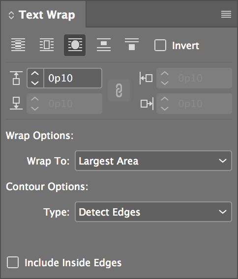
NOTE: Choosing Detect Edges wraps the text around the edges of the artwork, not the box.
-
Move the martinis around until you get it looking nice. You should be able to get everything fitting together nicely as shown.

Press W to switch into Preview mode and enjoy your work.
Save your work.
Bonus Goodies (If You Have Extra Time)
Press W to switch back to Normal mode.
Go to page 1.
Choose the Type tool
.Below the Sporktown Grand logo, click and drag a box from margin to margin.
-
Go to Type > Glyphs.
NOTE: The Glyphs panel shows all the available characters for any given font.
At the bottom left of the Glyphs panel, from the font menu, choose Wingdings.
Scroll down until you locate the star
 and double–click it. You should see the star appear in the text box. (If you can’t find the star, make sure the Show menu at the top says Entire Font.)
In the Glyphs panel, double–click the star three more times to have four stars in total.
Select the stars.
In the Control panel, center
 the stars and make them size 14 pt.
Open the Swatches panel (Window > Color > Swatches).
Give them the light brown color swatch.
Choose the Selection tool
.Select the hotel exterior photo.
-
In the Control panel, make the Stroke weight 2 pt.

In the Swatches panel, make sure the stroke swatch is in front
 . If it’s not, click it to make it active.
We want the stroke to be the same color as the logo’s stroke, but we don’t have that color yet. From the Swatches panel menu
at the top right, choose New Color Swatch.-
Leave Name with Color Value checked and set the following:
Color Type: Process Color Mode: CMYK Color Values: 47% Cyan, 67% Magenta, 78% Yellow, 55% Black Add to CC Library: Uncheck this option if shown NOTE: If you completed the previous exercise, InDesign should remember that you don’t want to add this swatch to a CC Library.
Click OK.
Open the Stroke panel (Window > Stroke).
-
The stroke doesn’t quite go off the edge of our bleed, so for safety’s sake, click the Align Stroke to Outside button.

Go to page 2.
Select the coastline photo.
Open the Swatches panel.
Make sure the stroke icon is active and give it a [Paper] color stroke.
Open the Stroke panel.
Give it a 5 pt stroke.
-
As shown below, click the Align Stroke to Inside button.

Take a look at the pattern at the bottom. Notice that it doesn’t quite line up perfectly in the corners?
Select the pattern.
Move it down until the pattern’s squares fit perfectly into the corners, like they do on the top of page 1.
Press W to switch into Preview mode and enjoy your work.
-
Save your work.
That’s it! You’ve mastered this piece.
