Learn the advanced techniques of InDesign such as placing transparent art, defining and using color swatches, and typing on a path, through a detailed and interactive tutorial.
This exercise is excerpted from Noble Desktop’s past Adobe InDesign training materials and is compatible with InDesign updates through 2020. To learn current skills in InDesign, check out our InDesign Bootcamp and graphic design classes in NYC and live online.
Topics Covered in This InDesign Tutorial:
Placing Transparent Art, Defining & Using Color Swatches, Type on a Path
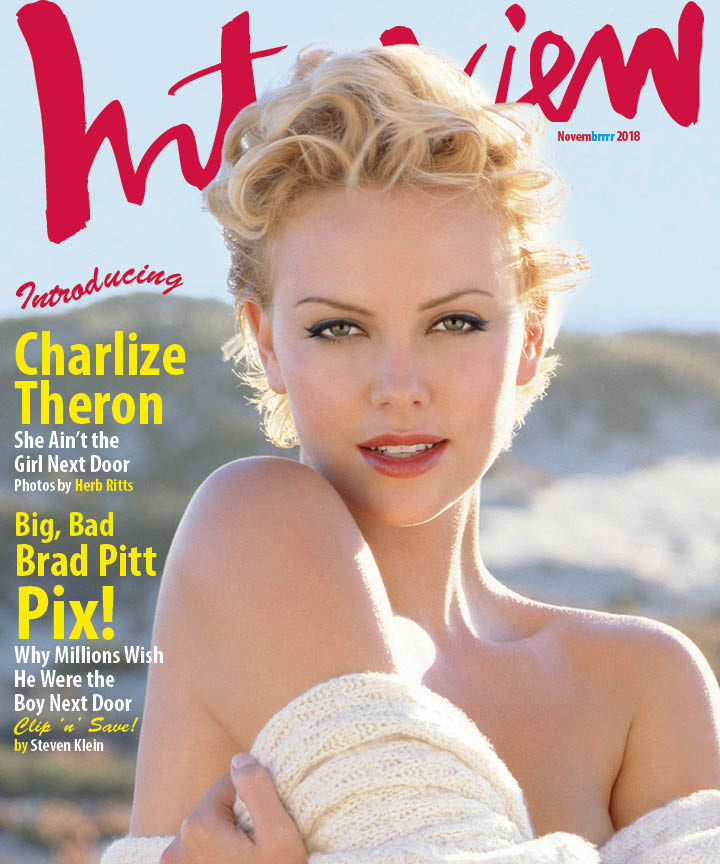
Exercise Preview
Exercise Overview
How did we get the head in front of the logo? In this exercise, we’ll show you that trick, as well as the Type on a Path tool.

Creating the Document
- Create a new document:
- Set Width to 10 in and Height to 12 in.
- Uncheck Facing Pages if it isn’t already.
- If the number of Columns isn’t already 1, change it now.
- Expand the Margins section if needed, make sure the link button
 is checked on, and make all Margins 0 in.
 - Expand the Bleed and Slug section if needed, and make all Bleed options 1/8 in.
- Click Create.
Importing the Graphics & Text
We have a couple images and a text file we need to import. We can do this all in one shot. Go to File > Place (Cmd–D (Mac) or CTRL–D (Windows)).
- Navigate into the InDesign Class folder, then into the Interview Magazine folder and do NOT click Open until we say!
- Click once on charlize.tif to highlight it.
- Hold Shift and click on Magazine.txt. This should also highlight InterviewLogo.eps.
- Click Open.
-
A thumbnail image of Charlize should currently be loaded in the cursor. It should have a number (3) since this image and two other files are loaded in the cursor. If the cursor is showing a different thumbnail, use the Arrow keys on your keyboard to cycle through the loaded images until Charlize shows up.
As shown below:- Position the cursor at the top left bleed guide.
- Click once to place the Charlize image.
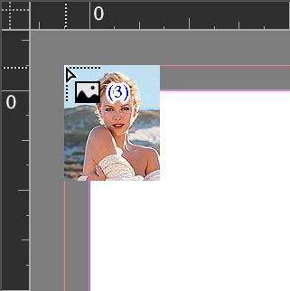
The image should fill out the red bleed guides and the cursor should now be loaded with the Interview logo.
Position the cursor near the top left of the page and click once to place the logo. Do not worry about the exact placement for right now.
The cursor should now be loaded with some text. Drag out a text frame to the left of Charlize, on the mountains just below the sky. Refer to the exercise preview as needed.
With the text frame still selected, choose the Type tool
 and make the font Myriad Pro Bold Condensed.
-
Let’s refine the position of things. Choose the Selection tool
 and:
and:- Make the text frame start 1p2 from the left of the page and make it about 16p wide.
- If needed, move things around until it looks like the exercise preview.
- Let’s center the Interview logo. Select it and go to Window > Object & Layout > Align.
- Click the button next to Align To and from the menu choose Align to Page.
Click the Align horizontal centers button
 .
.
Bringing Charlize’s Head in Front of the Logo
Notice that the Interview logo is covering Charlize’s head. This is simply unacceptable! We need to bring in another file, in which the background has been removed leaving only Charlize’s forehead and hair, so that we can place it in front of the logo without the background showing up. Thankfully, this has already been done in Photoshop, which is the best place to do it. All you must do is import the silhouette and place it just right. It’s easy if you follow these steps.
With the Selection tool
, click on the Charlize picture frame to select it.Copy it (Edit > Copy).
Go to Edit > Paste in Place.
The type and logo will look like they’ve disappeared, but don’t worry. We’ve just made a second picture frame in front of everything, so it’s only temporarily covering over the type and logo.
Now we can replace the Charlize picture by importing a silhouetted Charlize forehead into this latest frame. With the frame still selected, go to File > Place and choose charlize silo.psd.
Selecting an Object Behind Another
- Because the forehead frame is now on top of everything, you won’t be able to select the text, logo, etc. just by clicking on them. Hold Command (Mac) or Control (Windows) and click on it. Wow, you reached right through that top frame!
- With the text frame still selected, go to Object > Arrange > Bring to Front so you won’t have to use the keystroke to select it each time.
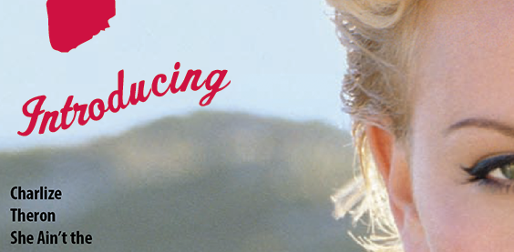
Adding Type on a Path
As shown below, let’s add the word Introducing above the words Charlize Theron. In a twist, we’ll make the type flowing along a path that follows the mountain range.
Do an Edit > Deselect All.
Let’s make sure we have a stroke color, but no fill. Near the bottom of the Tools panel, below the Fill/Stroke swatches, click the Default Fill and Stroke button
 .
.Select the Pen tool
 .
.-
This can be tricky, but we’ll do our best. To get the curve we are looking for, you need to create three anchor points, dragging to the right every time, but sometimes up, sometimes down. Below, you see what the path should look like. If you have trouble, ask the instructor for help.

Once you have the right path going along the mountain range, select the Type on a Path tool
 . Click and hold on the Type tool to choose this tool.
Click once on the path you just drew and type in the following text: Introducing
Make that word 38 pt Brush Script Std and set its color to Pantone 200 CVC.
Choose the Selection tool
.- The stroke (and fill if there is one) must be removed. At the top of the Swatches panel:
- Make sure the Formatting affects container button
 is selected.
 - Make the Stroke (or Fill) active.

- Click the
 [None] swatch to remove it.
- Make sure the Formatting affects container button
- Now that you see the type by itself, you may find you want to adjust the path. Go ahead and do it using the Direct Selection tool
 .
. If you want, save the file as yourname-magazineCover.
Bonus (More Practice): Styling the Type
You will now select various lines of text and set size/leading values. Remember that when we say 14/16, that means 14 pt Size, 16 pt Leading!
-
Apply these specs to the appropriate text:
Charlize: 62/49 Theron: 62/49 She Ain’t the: 24/24 Girl Next Door: 24/24 Photos by Herb Ritts: 17/19 Big, Bad: 35/45 Brad Pitt: 46/40 Pix!: 79/63 Why Millions Wish: 24/24 He Were the: 24/24 Boy Next Door: 24/24 Clip ‘n’ Save!: 21/21 [Make font Brush Script Std] by Steven Klein: 17/19 Draw a small text frame under the “ew” of the Interview logo. This is for the date of the issue.
Type the following into that text frame: Novembrrrr 2020 (or the current year).
Change it to 14 pt Myriad Pro Bold Condensed.
Bonus (More Practice): Coloring the Type
Make sure nothing is selected in the document by choosing Edit > Deselect All.
-
It’s time to create some colors for the text, but first let’s get rid of InDesign’s default colors that we won’t be using. Open the Swatches panel.
We have the standard InDesign colors such as a cyan, magenta, etc., but we also have Pantone 200 CVC. How did that get there? When we imported the Interview logo, it brought with it the spot color Pantone 200 CVC. Wow, what will they think of next?
Go into the Swatches panel menu
 and choose Select All Unused.
Click the Delete button
 at the bottom of the panel.
We need to create two colors. Go into the Swatches panel menu
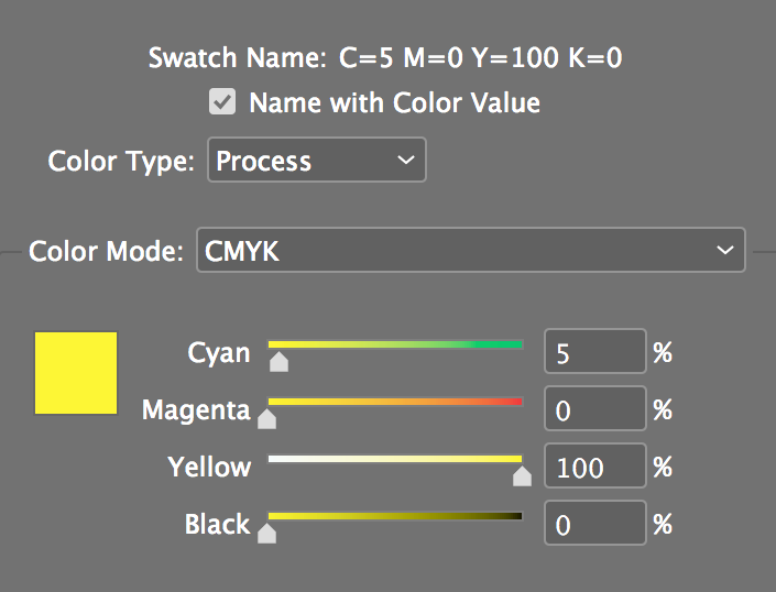
and choose New Color Swatch.-
With Add to CC Library unchecked if shown, set the following but DON’T click OK until we say!
Once you’ve entered the above color, click Add once (do not click OK!). This way you are still in the New Color Swatch window and we can make the second color.
-
Mix up the following color:
Click OK.
We’ll start by making all the text on the left white (the color of the paper we’re printing on). Select the text.
-
As shown below, at the top left of the Swatches panel, make sure the type’s Fill swatch is in front (active). If it’s not, click it to make it active.

In the Swatches panel, click the [Paper] swatch to apply it.
Now we’ll add dollops of color by selecting some text and choosing the appropriate swatch in the Swatches panel. Select the text Charlize Theron.
Click on the yellow swatch named (C=5 M=0 Y=100 K=0). The text color might look weird, but it will be yellow when you deselect.
-
Make the following words the same yellow swatch:
- Herb Ritts
- Big, Bad Brad Pitt Pix!
- Clip ‘n’ Save!
- The “by” on the bottom line
See that Novembrrrr 2020 (or current year) in the upper right of the page? Make that Pantone 200 CVC.
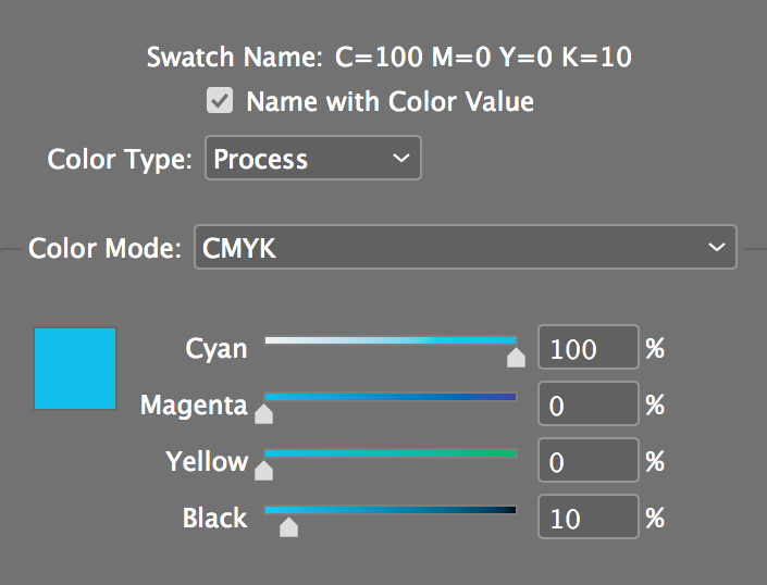
Select only the brrrr and make it the blue swatch (named C=100 M=0 Y=0 K=10).
Printing (Optional)
-
This file is 10x12 inches, so you’ll either need to print on 11x17 paper or reduce it to fit on Letter (8.5x11) paper. Go to File > Print and set the following:
- Under Printer, choose [the name of your printer].
- On the left, click on the Marks and Bleed section.
- Check Crop Marks.
- Under Bleed and Slug, check Use Document Bleed Settings.
- On the left, click on the Advanced section.
- Under Transparency Flattener, choose [High Resolution].
- On the left, click on the Setup section.
Printing on Letter (8.5x11) Paper
- Under Paper Size, choose US Letter (Mac) or Letter (Windows).
- Under Scale, select Scale To Fit.
Printing on Tabloid (11x17) Paper
- Under Paper Size, choose 11x17.
- Under Scale, leave Width & Height: 100%. (Don’t select Scale To Fit.)
Look at the Preview on the left to make sure things look OK, then click Print.
