Learn how to create an optimized HTML Email layout that seamlessly transitions from a 2-column desktop setup to a 1-column mobile layout in this comprehensive tutorial, covering everything from coding tables for exclusive content to refining your CSS.
This exercise is excerpted from Noble Desktop’s HTML Email training materials and is compatible with updates through 2021. To continue learning HTML Email with hands-on training, check out our coding bootcamps in NYC and live online.
Topics covered in this HTML Email tutorial:
Coding the table for the 2-column content, Converting the mobile layout to 1-column, Adding the other date listings, Refining the CSS
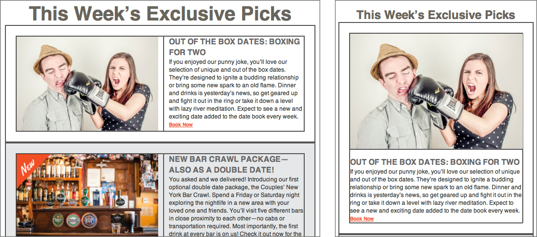
Exercise Preview
Exercise Overview
In this exercise, you’ll create a 2-column desktop layout and then turn it into a 1-column layout optimized for mobile devices.

Media queries are not supported in some mobile email clients, so this 2-to-1 column switch will not work everywhere. Gmail used to strip out the entire style tag and its media queries altogether, but now keeps them in most places. As of this writing, Gmail still strips out media queries in some cases though. Anyone who does not get the media queries will see the desktop version of the email, scaled down to fit onto their screen. It’s not ideal, but they can zoom in and read the email.
-
We recommend you finish the previous exercise (1C) before starting this one. If you haven’t finished it, do the following sidebar.
If You Did Not Do the Previous Exercise (1C)
- Close any files you may have open.
- On the Desktop, go to Class Files > yourname-HTML Email Class.
- Delete the 2-Column Layout folder if it exists.
- Duplicate the 2-Column Layout Banner Done folder.
- Rename the folder to 2-Column Layout.
Let’s look at the mockup again so we can strategize about what to do next. On the Desktop go into Class Files > yourname-Responsive Email Class
Double–click on 2-Column Email Design Mockup.pdf to open it.
-
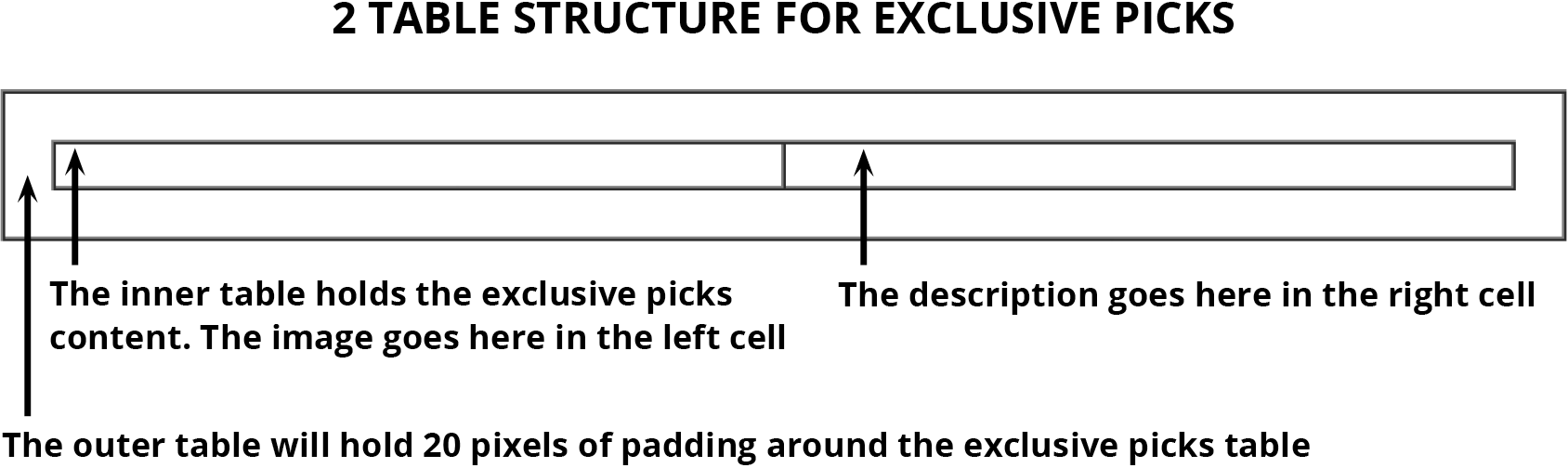
We need to add 3 exclusive picks that each have a picture, a heading, and a description. We want a 2-column desktop layout to change to a 1-column layout on mobile. Nesting tables will help us do this. While coding tables within tables may seem tedious and confusing at first, it’ll give us more control over the layout.
Let’s start by adding the 2-table structure for the first “exclusive pick” that advertises a boxing date. We’ll create a 1-column table in the current inner table that contains the heading about This Week’s Exclusive Picks. Inside that table, we’re going to insert another table that has 2 columns. The actual exclusive picks content will go in this table: the image will go in the left column and the heading and description for the listing will be displayed in the right column, as follows:
Coding Two Tables for the Exclusive Picks Content
-
In your code editor, open date-night-exclusive-picks.html from the 2-Column Layout folder if it isn’t already open.
NOTE: If your code editor allows you to open an entire folder (like Visual Studio Code does), open the entire 2-Column Layout folder.
Let’s grab the code for the first nested table we will add below the h1. In your code editor, open table-code.html from 2-Column Layout > snippets.
Copy all the code and leave the file open. We’ll copy it again later.
-
Switch back to date-night-exclusive-picks.html and below the h1 paste the code:
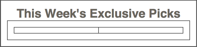
<td class="mainContent" align="center" width="100%"> <h1>This Week’s Exclusive Picks</h1> <table align="center" border="1" cellpadding="0" cellspacing="0" width="100%"> <tr> <td align="center" width="100%"> </td> </tr> </table> </td>NOTE: The 1-pixel border is for testing purposes only. We’ll remove it later.
-
We want to add 20 pixels of padding around the 2-column table we’ll nest inside this cell. Instead of creating a class for this cell, let’s add a quick and easy inline style attribute. Around line 53, add the following bold style attribute to the td:
<td align="center" width="100%" style="padding: 20px;"> -
You should still have the starter table code snippet in your clipboard. Around line 54, paste the code again as shown below:
<td align="center" width="100%" style="padding: 20px;">
   <table align="center" border="1" cellpadding="0" cellspacing="0" width="100%">
      <tr>
         <td align="center" width="100%">

         </td>
      </tr>
   </table>
</td>
This table will hold the first of 3 “exclusive picks.” Each exclusive pick table will have an image in the left column and the text-based information in the right column. Let’s have each column take up half the width of the table.
-
Change the width of the table cell and add a non-breaking space (
) so we can see what this cell looks like while testing, as shown in bold:<td align="center" width="50%"> </td> Copy the 3 lines of code shown in the previous step (the td around lines 56–58).
-
To make a second table cell, paste the code right below the td you copied:
<table align="center" border="1" cellpadding="0" cellspacing="0" width="100%"> <tr> <td align="center" width="50%"> </td> <td align="center" width="50%"> </td> </tr> </table> -
Save the file and preview date-night-exclusive-picks.html in a browser. You can see the nested tables under the heading!
Leave the file open in the browser, so you can reload the page to see your changes.
Let’s grab the content from a prepared snippet. In your code editor, open email-content.html from 2-Column Layout > snippets.
We’re adding the image right now, so copy only the code from line 6 (an image wrapped in a placeholder link).
Leave the file open. We’ll grab some of the other content later.
Switch back to date-night-exclusive-picks.html
-
Around line 57, replace the non-breaking space (
) by pasting the code inside the first column as show below:<td align="center" width="50%"> <a href="http://www.example.com" target="_blank"><img src="http://www.nobledesktop.com/nl-date-night/img/couple-boxing.jpg" width="290" alt="Couple Fighting"></a> </td> <td align="center" width="50%"> </td> - Switch over to email-content.html.
- Grab the h2 and paragraph by copying the code from lines 7–8.
- Keep the file open and switch to date-night-exclusive-picks.html.
-
Around line 60, paste the code over the non-breaking space (
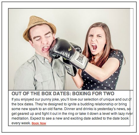
) inside the right column as shown below in bold:<tr> <td align="center" width="50%"> <a href="http://www.example.com" target="_blank"><img src="http://www.nobledesktop.com/nl-date-night/img/couple-boxing.jpg" width="290" alt="Couple Fighting"></a> </td> <td align="center" width="50%"> <h2>OUT OF THE BOX DATES: BOXING FOR TWO</h2> <p>If you enjoyed our punny joke, you’ll love our selection of unique and out of the box dates. They’re designed to ignite a budding relationship or bring some new spark to an old flame. Dinner and drinks is yesterday’s news, so get geared up and fight it out in the ring or take it down a level with lazy river meditation. Expect to see a new and exciting date added to the date book every week. <a class="bookLink" href="http://www.example.com" target="_blank">Book Now</a></p> </td> </tr> -
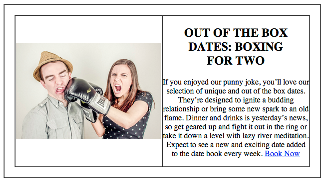
Save the file and reload the browser. Both table cells are filled in with content, with the image on the left and the text content on the right:
Fine-Tuning the 2-Column Code
Let’s style the content. The text content is currently centered because of the align attribute in the generic table code we copied, but it will look better left-aligned.
Return to date-night-exclusive-picks.html in your code editor.
-
Around line 56, change the left column’s alignment, as shown in bold:
<td align="left" width="50%"> <a href="http://www.example.com" target="_blank"><img src="http://www.nobledesktop.com/nl-date-night/img/couple-boxing.jpg" width="290" alt="Couple Fighting"></a> </td> -
Around line 59, change the right column’s alignment, as shown in bold:
</td> <td align="left" width="50%"> <h2>OUT OF THE BOX DATES: BOXING FOR TWO</h2> -
Save the file and reload the browser.
Better, but that the default vertical alignment in a table cell is middle. Let’s top-align both table cells so both the text and image start evenly at the top. The taller of the two will determine the table’s height.
Return to your code editor.
-
Add the following bold valign (vertical alignment) attribute to both table cells (around line 56 and 59):
<td align="left" width="50%" valign="top">
   <a href="http://www.example.com" target="_blank"><img src="http://www.nobledesktop.com/nl-date-night/img/couple-boxing.jpg" width="290" alt="Couple Fighting"></a>
</td>
<td align="left" width="50%" valign="top">
Save the file and reload the browser. There’s space above the heading in the right column that we’ll have to remove.
To save you some time, we coded the basic CSS for the h2, the paragraph, and the “Book Now” link at the bottom of the paragraph. Switch back to your code editor and open text-styles.css from the snippets folder.
Copy all the code.
Close the file. You should be back in date-night-exclusive-picks.html.
-
Because these styles mostly apply to the desktop version, we need to paste this code above the media query in the general styles that will later be inlined. Below the h1 rule, around line 19, paste the code as shown below:
   margin: 0;
}
h2 {
   color: #696969;
Code Omitted To Save Space
   margin-bottom: 0;
}
p {
   color: #363636;
Code Omitted To Save Space
   margin-top: 0;
}
.bookLink {
   color: #e74b34;
   font-weight: bold;
}
.mainContent {
Save the file and reload the browser. Nice, but the text is a bit too close to the image. Let’s add some padding on both columns.
Return to your code editor.
-
Add the following bold inline style attributes to the innermost table cells (around lines 76 and 79), giving both cells 10 pixels of padding:
<td align="left" width="50%" valign="top" style="padding-right: 10px;">
   <a href="http://www.example.com" target="_blank"><img src="http://www.nobledesktop.com/nl-date-night/img/couple-boxing.jpg" width="290" alt="Couple Fighting"></a>
</td>
<td align="left" width="50%" valign="top" style="padding-left: 10px;">
Save the file and reload the browser. The combination of both padding and text-based CSS styles produced a nice balance of image and text. We’re basically done with the desktop version!
To simulate what a mobile user would see, resize the browser window smaller.
The right column is getting smaller, but the left column isn’t budging because the image is not scaling down. We made a class for responsive images in the previous exercise, but we haven’t yet assigned it to this image.
Return to your code editor.
-
In the image of the couple fighting around line 77, add the resImage class:
<a href="http://www.example.com" target="_blank"><img class="resImage" src="http://www.nobledesktop.com/nl-date-night/img/couple-boxing.jpg" width="290" alt="Couple Fighting"></a> Save the file and reload the browser.
Resize the browser window. The image is sizing down!
Converting the Mobile Layout to 1-Column
Imagine trying to read this email on a narrow mobile phone. The columns would be too narrow, with a puny image and hard-to-read text. Not good!
While this 2-column layout works on the desktop, we want to switch over to a 1-column layout on mobile. To turn do that we have to tell the 2 table cells that hold the content to behave more like divs or block-level elements instead of table cells.
Return to your code editor.
-
Around lines 76 and 79, give both table cells the deviceWidth class, as shown in bold (named as such because these elements will switch over to take up the full width available to them on any mobile device):
<td class="deviceWidth" align="left" width="50%" valign="top" style="padding-right: 10px;"> <a href="http://www.example.com" target="_blank"><img class="resImage" src="http://www.nobledesktop.com/nl-date-night/img/couple-boxing.jpg" width="290" alt="Couple Fighting"></a> </td> <td class="deviceWidth" align="left" width="50%" valign="top" style="padding-left: 10px;"> -
In the media query under the rule for .wrapper, add the following new rule:
   display: block !important;
}
.deviceWidth {
   display: block !important;
   width: 100% !important;
}
.resImage {
NOTE: Just like in the previous exercise, we added the !important declaration so this rule will be powerful enough to override an inline style.
Save the file and reload the browser.
-
Resize the browser window. Pow! The page instantly turns into a 1-column layout once the width of the browser is 680 pixels, as shown below.
While the functionality is good, there are some minor layout issues we need to iron out. For one, the right edge of the content awkwardly sticks out. This is a remnant of the right and left padding attributes we added to the cells that hold the image and text content. To override this padding on mobile, return to your code editor.
-
In the rule for .deviceWidth, add the following bold rule that gets rid of the padding in the 1-column mobile layout:
.deviceWidth {
   display: block !important;
   padding: 0 !important;
   width: 100% !important;
}
Save the file and reload the browser.
Resize the browser window. The content fits much more nicely without the excess padding! However, now that the text is displayed directly underneath the image, the h2 is a bit too close to it.
Let’s add some space. Return to your code editor.
-
In the media query, under the h1 rule add a new h2 rule:
   font-size: 24px !important;
}
h2 {
   margin-top: 15px !important;
}
Save the file and reload the browser.
Resize the browser window. The image and text are now properly spaced, so we’re ready to add the images and info for the other 2 date listings!
Adding the Other Date Listings
Let’s copy and paste the code we now have for the boxing date, then change the content. Return to date-night-exclusive-picks.html in your code editor.
-
We’ll need to copy both the 2-column exclusive picks table as well as its parent table. Right under the h1, copy the entire table code from around lines 79–95, as shown below:
<table align="center" border="1" cellpadding="0" cellspacing="0" width="100%">
   <tr>
      <td align="center" width="100%" style="padding: 20px;">
         <table align="center" border="1" cellpadding="0" cellspacing="0" width="100%">
            <tr>
               <td class="deviceWidth" align="left" width="50%" valign="top" style="padding-right: 10px;">
Code Omitted To Save Space
</td> <td class="deviceWidth" align="left" width="50%" valign="top" style="padding-left: 10px;"> <h2>OUT OF THE BOX DATES: BOXING FOR TWO</h2>Code Omitted To Save Space
               </td>
            </tr>
         </table>
      </td>
   </tr>
</table>
Paste the code directly underneath that table twice to create 2 more date listings.
Save the file and reload the browser. We have 3 identical boxing date listings.
Let’s switch out the placeholder content. Return to your code editor.
Switch over to email-content.html.
We’re adding the image for the second listing right now, so copy only the code from line 12 (the Open Bar image).
Switch back to date-night-exclusive-picks.html.
-
Around line 102, paste the new img surrounded by an anchor tag, as shown below in bold, replacing the boxing image:
<td class="deviceWidth" align="left" width="50%" valign="top" style="padding-right: 10px;"> <a href="http://www.example.com" target="_blank"><img src="http://www.nobledesktop.com/nl-date-night/img/beer-bar-label.jpg" width="290" alt="Open Bar"></a> </td> -
We want this image to be responsive, so add the resImage class as shown:
<a href="http://www.example.com" target="_blank"><img class="resImage" src="http://www.nobledesktop.com/nl-date-night/img/beer-bar-label.jpg" width="290" alt="Open Bar"></a> - Switch over to email-content.html.
- To grab the h2 and paragraph text, copy the code from lines 13–14.
- Keep the file open and switch back to date-night-exclusive-picks.html.
-
Replace the code around lines 105–106 with the following bold code:
<td class="deviceWidth" align="left" width="50%" valign="top" style="padding-left: 10px;"> <h2>NEW BAR CRAWL PACKAGE—ALSO AS A DOUBLE DATE!</h2> <p>You asked and we delivered! Introducing our first optional double date package, the Couples’ New York Bar Crawl. Spend a Friday or Saturday night exploring the nightlife in a new area with your loved one and friends. You’ll visit five different bars in close proximity to each other—no cabs or transportation required. Most importantly, the first drink at every bar is on us! Check it out now for the special grab a date price! <a class="bookLink" href="http://www.example.com" target="_blank">Book Now</a></p> </td> -
Repeat the process to replace the last copied table with new content:
- Replace the img code around line 119 with line 18 of the email-content file.
- Make this image responsive by adding the resImage class attribute.
- Replace the h2 and p code around lines 122–123 with lines 19–20 of the email-content file.
- Close email-content.html
Save date-night-exclusive-picks.html and reload the browser. Feel free to resize the browser window as well. Both layouts look pretty nice.
Refining the Appearance
We want the middle row (and presumably every other row if we had more than three listings) to have a light gray background. We also need to add a red border below the listings. Let’s take care of the background color first.
- Switch back to your code editor.
-
On the table cell that contains the second exclusive picks table (around line 98), add a bgcolor attribute as shown below in bold. The listing should look like this:
<table align="center" border="1" cellpadding="0" cellspacing="0" width="100%"> <tr> <td align="center" width="100%" style="padding: 20px;" bgcolor="#eeeeee"> <table align="center" border="1" cellpadding="0" cellspacing="0" width="100%"> <tr> <td class="deviceWidth" align="left" width="50%" valign="top" style="padding-right: 10px;"> -
Save the file and reload the browser. Awesome, the second listing is nicely offset with a gray background.
The listings are done for now. (We’ll remove the ugly borders in an upcoming exercise, once we no longer need them for testing purposes.)
We’re ready to add the red border below the third listing. Switch back to your code editor.
-
In the rule for .mainContent (around line 39), add the following bold border property declaration:
.mainContent { border-bottom: 10px solid #e64a33; padding: 20px; } - Save the file and reload the browser.
- Resize the browser window to see that the fancy red border looks great in both versions.
Feel free to keep this page open in the browser as well as in your code editor. We’ll continue to build out the newsletter in the next exercise.
