Acquire the skills to convert a simple list of navigation links into a sleek navigation bar with this HTML & CSS tutorial, which covers semantically correct navigation, overriding default list styles, CSS navigation styles, and the use of descendant selectors.
This exercise is excerpted from Noble Desktop’s past front-end web development training materials and is compatible with updates through 2022. To learn current skills in web development, check out our coding bootcamps in NYC and live online.
Topics Covered in This HTML & CSS Tutorial:
Semantically Correct Navigation, Overriding Default List Styles, CSS Navigation Styles, Using Descendant Selectors
Exercise Preview

Exercise Overview
In this exercise you’ll start styling the list of links in the nav section so they look like a streamlined navigation bar instead of a clunky list of links. You’ll also learn about descendant selectors: a way to target elements based on how elements are nested inside one another.

-
If you completed the previous exercise, sanfran.html should still be open, and you can skip the following sidebar. If you closed sanfran.html, re-open it now. We recommend you finish the previous exercises (3B–4B) before starting this one. If you haven’t finished them, do the following sidebar.
If You Did Not Do the Previous Exercises (3A–4A)
- Close any files you may have open.
- On the Desktop, go to Class Files > Web Dev Class.
- Delete the Revolution Travel folder if it exists.
- Duplicate the Revolution Travel Ready for Nav Styles folder.
- Rename the folder to Revolution Travel.
Overriding Default List Styles
We semantically coded our navigation links as a list, but don’t want the bullets.
-
In sanfran.html, add the following new rule below the rule for nav:
nav { margin-bottom: 30px; } ul { list-style-type: none; } - Save the file and preview sanfran.html in Chrome. (We’ll use Chrome’s DevTools.)
- The navigation links no longer have bullets, but let’s investigate further. CTRL–click (Mac) or Right–click (Windows) on any link in the nav and choose Inspect.
-
If the DevTools are docked to the bottom of the browser window, at the top right of the DevTools panel click the
 button and choose Dock to right as shown below:
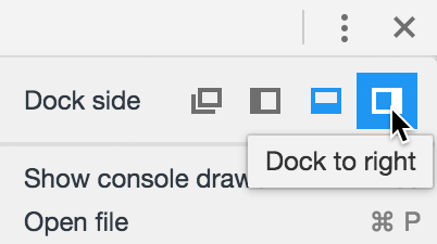
-
In the DevTools, click on (and stay hovering over) the
<ul>tag. As you do so, look at the colored highlights over the content. You should see an orange highlight above and below the list and a green highlight to the left. Orange indicates the margins of the element, while green indicates padding. Let’s remove all of this space.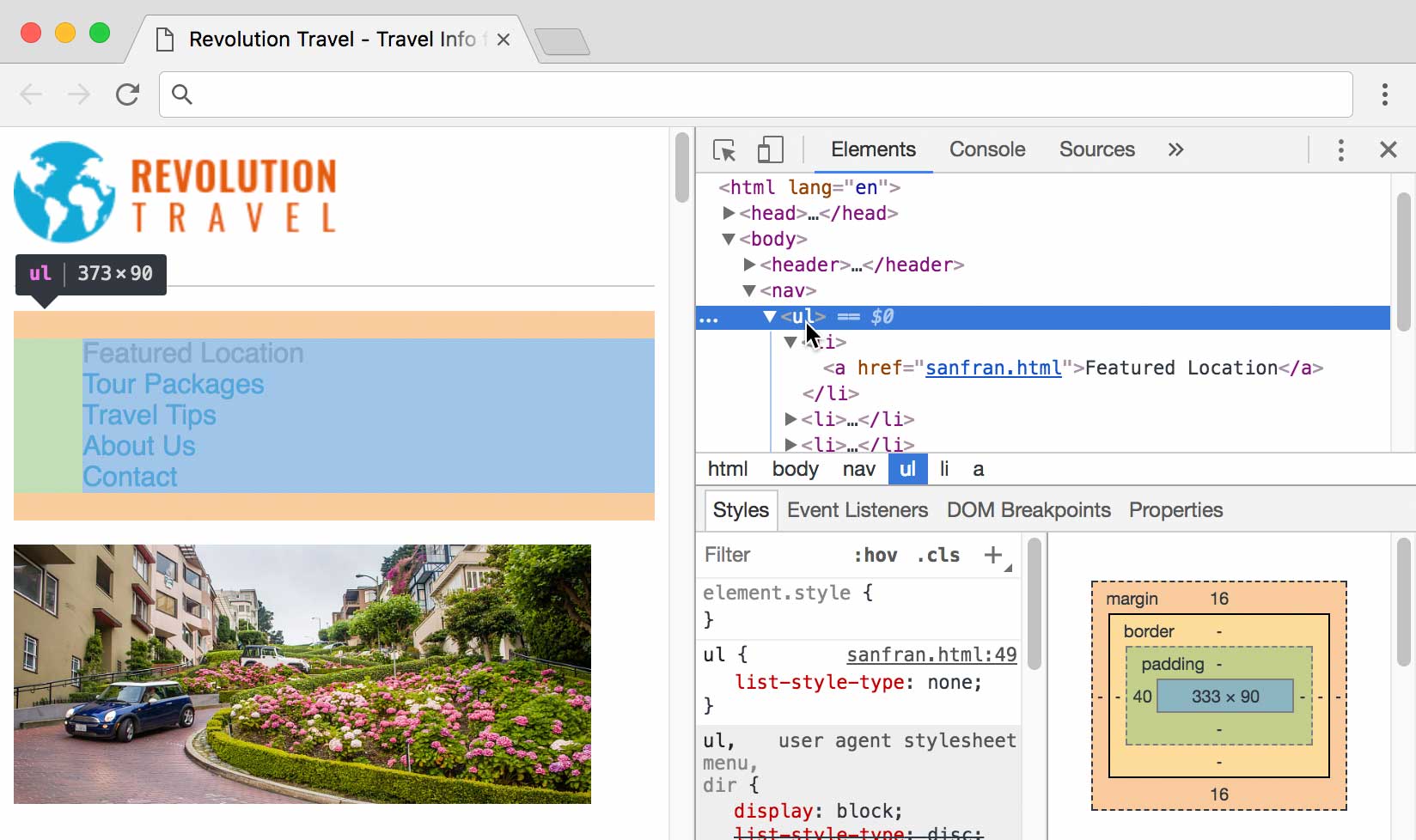
Leave this page open in Chrome, and return to sanfran.html in your code editor.
-
Add the following property declarations to the ul rule:
ul {
   list-style-type: none;
   margin: 0;
   padding: 0;
}
Save the file, return to Chrome, and reload the page. Next, we want the links in a horizontal row, rather than the vertical stack we have now. By default, each list item display as a stacked element (called block), but we can change that.
Return to sanfran.html in your code editor.
-
Add the following new rule below the rule for ul:
ul {
   list-style-type: none;
   margin: 0;
   padding: 0;
}
li {
   display: inline;
}
Inline Versus Block
Block elements stack on top of one another like a child’s building blocks. Paragraphs, headings, section elements, divs, and lists are some common block-level elements that we use on a regular basis.
Inline elements are rendered next to one another in a row. Anchors (links), images, and spans are some of the inline elements we’ve used so far in class.
The difference goes a bit further. Manipulating the box-model is more limited for inline elements. While block-level elements can be controlled by changing the width, height, padding, margin, and border of the element, inline elements are only as wide as their content. They do not respond to CSS changes to their width or height. Margin and padding are also handled differently: margin and padding will only work horizontally on inline elements (padding on the top and bottom of inline elements will be present, but often bleed into other lines above and below these elements).
- Save the file, return to Chrome, and reload the page. We need more space between the links, but first let’s take care of one other thing.
Close the DevTools panel by clicking the X at its top right.
Using Descendant Selectors
The rules we just wrote (ul and li) currently work fine for this page because it contains only one list. But if we added another unordered list, it would also be affected by these rules (which are really only appropriate with the site’s navigation list, not all lists). Let’s change these rules so they only apply to the nav.
- Return to sanfran.html in your code editor.
-
Scroll down to the nav (just after the start of the body tag):
<nav>
   <ul>
      <li><a href="sanfran.html">Featured Location</a></li>
Code Omitted To Save Space
<li><a href="contact.html">Contact</a></li>
   </ul>
</nav>
Notice that the
<nav>contains a<ul>, which in turn contains numerous<li>. We can use nav in our selectors to make sure our ul and li rules will only affect the ul and li tags within this section of the page. -
Scroll up to the styles and add nav before the ul and li selectors, as shown below in bold. (Be sure to type a space after nav!)
nav ul {
   list-style-type: none;
   margin: 0;
   padding: 0;
}
nav li {
   display: inline;
}
These selectors are officially known as descendant selectors. The ul sits inside the nav, so the nav is a parent (or ancestor), and the ul is its child (or descendant). The logic holds true for the li as well. The li is the grandchild of the nav (a more distant descendant, but a descendant nonetheless). A space between the parent and the descendant is required.
- Save the file, return to Chrome, and reload the page to see that nothing should have changed (the code still works). This code change was important to make, because we will have regular lists on other pages (and we want them to look like regular bulleted lists).
Hover over the links, paying attention to how close you have to be to the text until you see the pointer cursor
 which indicates the link is clickable. The clickable area is defined by the text in the anchor, but we can make the clickable area larger so these links will be even easier to click.
Increasing the Clickable Area of the Navigation Links
- Return to sanfran.html in your code editor.
-
Let’s temporarily add a background color to the links so we’ll be able to better see what’s going on. Below the nav li rule, add the following new rule:
nav a { background-color:,000; } - Save the file and reload the page in Chrome to see the black background behind the navigation links. This is the clickable area!
- Return to sanfran.html in your code editor.
-
Add the some padding, as follows:
nav a { background-color:,000; padding: 10px; } - Save the file and reload the page in Chrome.
- Notice there is more space within the black background of each nav link.
- Hover over the links in the nav to see that the clickable area is bigger as well.
- There’s a CSS rendering issue we need to address. Let’s use the DevTools to investigate. CTRL–click (Mac) or Right–click (Windows) on a link in the nav and choose Inspect.
- Resize the window (or the DevTools panel) to force the line of navigation links to break onto two lines.
- Notice how the bottom line of links covers over the top row, which is not good!
-
In the DevTools, click on an
<a>tag in the nav, and take a look at the styles. Click the checkbox next to padding to disable and enable this property a few times: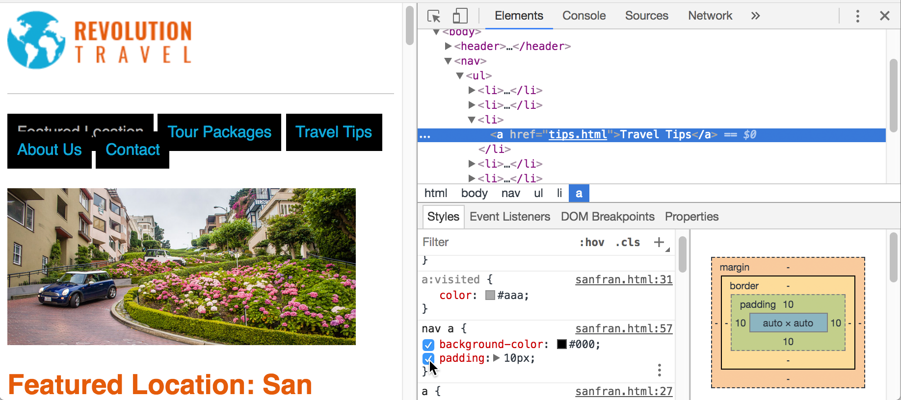
The top and bottom padding may not work as you’d expect. Adding padding makes the links get farther apart horizontally, but not vertically.
- Make sure padding is enabled (checked on) before continuing.
-
Also in the DevTools styles, click the checkbox next to background-color to disable and enable this property a few times. Notice that the color of the links in the second line covers over the links in the top line.
The links are acting this way because anchor elements are displayed inline. Inline elements are meant to be unobtrusive in the layout and do not respond to height or vertical modifications in padding or margin.
- Return to sanfran.html in your code editor.
-
In the nav a style, add the display property as shown below:
nav a {
   background-color:,000;
   padding: 10px;
   display: inline-block;
}
Using inline-block is a way to combine the best of both worlds: have block-level control over the padding (so it works more as you’d expect) but have the links display inline, horizontally across the top of the page.
- Save the file and reload the page in Chrome. That’s better! The second line of links no longer covers over the top line.
- Return to sanfran.html in your code editor.
-
Now that we’ve seen how inline-block and padding work we can remove the temporary background color. Delete background-color from the nav a style, so you end up with the following:
nav a { padding: 10px; display: inline-block; } -
While we’re here, let’s also make the text smaller and uppercase. Add the following code shown in bold:
nav a {
   padding: 10px;
   display: inline-block;
   font-size: 13px;
   text-transform: uppercase;
}
Adjusting the Surrounding Space
We just added 10px padding on the top and bottom of the links, so there is now more space than we originally wanted. Let’s remove some space from the surrounding area to compensate.
- Return to sanfran.html in your code editor.
-
A bit above that, edit the margin-bottom value for the nav rule as follows:
nav { margin-bottom: 20px; } -
Finally, edit the margin-bottom value for the header rule as follows:
header { padding-bottom: 20px; border-bottom: 1px solid #ccc; margin-bottom: 20px; } -
Save the file and reload Chrome to see the improved spacing of the content.
There’s still more we want to do to style the nav such as making the color of all links the same (we don’t need to indicate which pages have been visited), but we’ll do that in the next exercise.
You can keep sanfran.html open in the browser and the code editor. You’ll continue with this file in the next exercise.
