Dive into this comprehensive HTML and CSS tutorial that covers topics like setting a default font, removing default page margin, linking to an external style sheet, and much more while you build a small coffee subscription site.
This exercise is excerpted from Noble Desktop’s past front-end web development training materials and is compatible with updates through 2022. To learn current skills in web development, check out our coding bootcamps in NYC and live online.
Topics Covered in This HTML & CSS Tutorial:
Setting a Default Font, Removing Default Page Margin, Linking to an External Style Sheet, CSS Background Images, Background-position, Background-repeat, Background-size
Exercise Preview
Exercise Overview
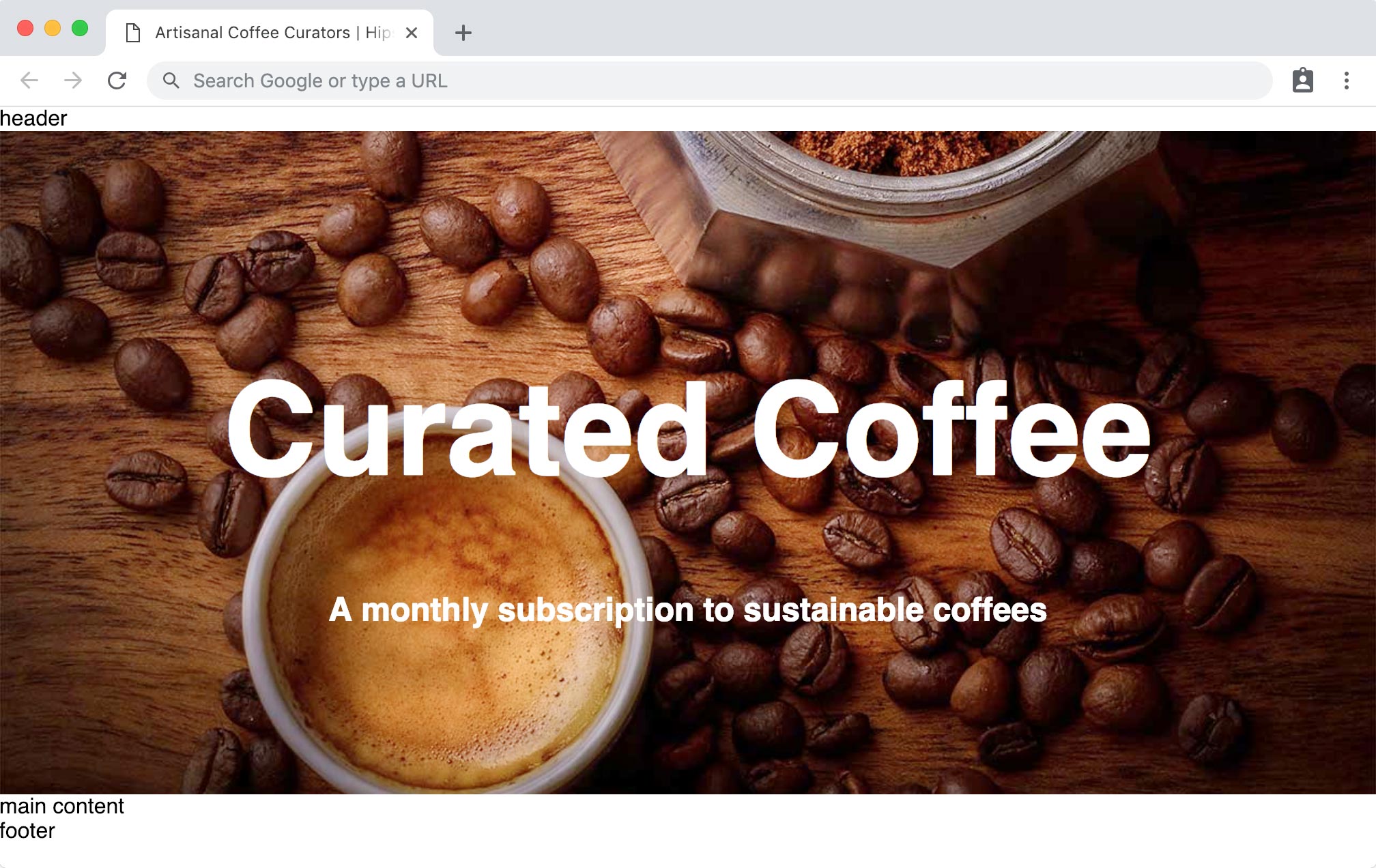
This is the first in a series of exercises where you’ll create a small coffee subscription site. In this exercise you’ll start by building one part of the home page. You’ll style the hero section where headings overlay an image background, allowing us to take a deep dive into the CSS background-image property.

Getting Started
- In your code editor, close any files you may have open.
-
For this exercise we’ll be working with the Hipstirred Hero folder located in Desktop > Class Files > Web Dev Class.
TIP: It’s beneficial to see the entire website folder as you work. Many code editors allow you to do so. If you’re in Visual Studio Code, go to File > Open (Mac) or File > Open Folder (Windows), navigate to Class Files > Web Dev Class > Hipstirred Hero and hit Open (Mac) or Select Folder (Windows).
In your code editor, open index.html from the Hipstirred Hero folder.
-
Title the page by editing the code as follows:
<title>Artisanal Coffee Curators—Hipstirred</title>
Coding up the Sections
The home page will feature a header, a prominent hero section where the headings will overlay an image background, a main content section that describes the product, and a footer that will contain the copyright and social media links.
-
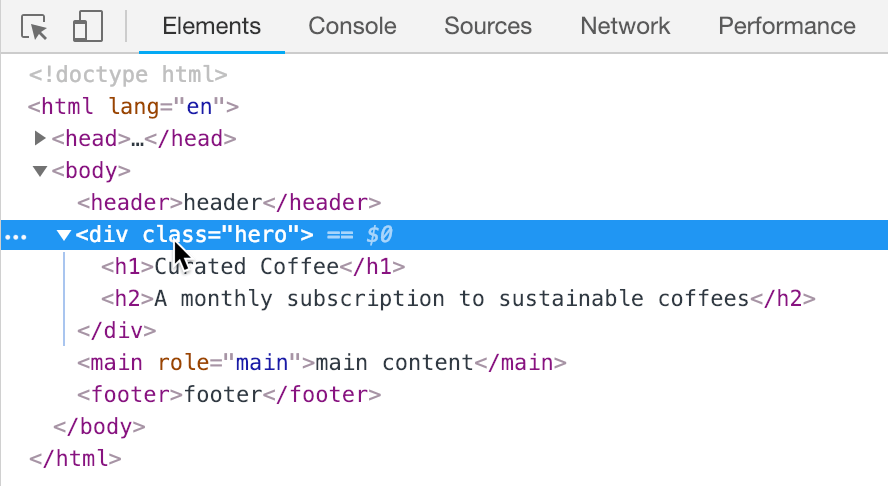
Inside the body tag, add the following sectioning tags with placeholder content (highlighted in bold):
<body>
   <header>header</header>
   <div class="hero">hero image</div>
   <main>main content</main>
   <footer>footer</footer>
</body>
NOTE: We’re using a div element for the hero section. There’s no semantic tag to describe this kind of content, so a div the most appropriate.
-
Save the file and preview index.html in Chrome (we’ll be using Chrome’s DevTools). There’s not much to see, but now we can start adding real content and styling these sections, beginning with the hero.
Leave index.html open in Chrome, so you can reload the page to see the changes you make in the code.
Return to your code editor.
Open main.css from the Hipstirred Hero folder. The provided file is completely empty. Let’s start by declaring some basic font defaults for the page.
-
Create the following new rule in main.css:
body { font-family: sans-serif; } -
The default of most browsers is to render the body element with 8px of margin. This puts space between the edge of the browser window and the content of the page. Let’s remove that, so we’ll only have space we choose to add. Add the following new property to the body rule:
body { font-family: sans-serif; margin: 0; } - Save main.css.
-
Return to index.html and add a link to main.css, as follows:
<head>
   <meta charset="UTF-8">
   <meta name="viewport" content="width=device-width, initial-scale=1">
   <title>Artisanal Coffee Curators—Hipstirred</title>
   <link rel="stylesheet" href="main.css">
</head>
Adding the Hero Content
Traditionally, the hero section of a webpage is the most prominent content a user will see when they visit the page. A hero image often consists of a large image and text, and its purpose is to give an overview of the site’s most important theme or content. Let’s code up some headings in this section.
-
Still in index.html in your code editor, find the
<div class="hero">on line 11. Replace the words hero image with real content as shown below in bold:<div class="hero"> <h1>Curated Coffee</h1> <h2>A monthly subscription to sustainable coffees</h2> </div> Save index.html.
Creating a Hero Style
- Return to main.css in your code editor.
-
We want to center the text in the hero, make the heading bigger (so we can see more of the background image behind it), add some space inside the div, and change the background color so we can see the size of the section we’re working with. Create the following new rules below the body rule:
h1 { font-size: 95px; }.hero { text-align: center; padding: 30px; color: #fff; background-color: #520; } - Save main.css.
Return to Chrome and reload the page. You should see the headings on a background color. Later we’ll need to adjust the space around and between the headings, but for now let’s add a background graphic to replace the solid background color.
Adding a CSS Background-Image
Before we add our hero photo, let’s see how CSS background images can be used to create a repeating pattern. We’ll start with a graphic (shown below) that is a single 60px by 60px square image.

- Return to main.css in your code editor.
-
Add the following new property to the .hero rule:
.hero {Code Omitted To Save Space
background-color: #520;
   background-image: url(images/pattern.png);
}
NOTE: Notice that we kept the background color? The background image will display on top of the background color so we usually won’t see the color. While users are waiting for the image to load, the darker background color will allow people to read the white text.
- Save main.css.
- Return to Chrome and reload the page. Notice the square graphic appears at its native size, and then repeats (in rows/columns) to fill the entire space of the div.
- Resize the browser window to see the pattern is cropped by the containing div. The pattern size remains constant, but how many rows and columns of repeats you see is determined by the size of the containing div.
- Let’s switch to our hero image. Return to main.css in your code editor.
-
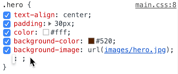
In the .hero rule, change the background image to the hero photo:
.hero {Code Omitted To Save Space
background-image: url(images/hero.jpg); } - Save main.css.
-
Return to Chrome, reload the page, and note the following:
This photo is large, so only the top left of the photo is visible. Here’s what the entire image looks like, so you can keep it in mind as you work through this exercise:

The photo currently appears at its native size and then repeats, but you’ll only be able to see the repeat (on the right side) if your monitor is wide enough.
Modifying Background-Position
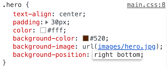
We can adjust the position of the background image within the hero div. Let’s use DevTools to see the changes as we make them. Still in Chrome, CTRL–click (Mac) or Right–click (Windows) on the hero section and choose Inspect.
-
In the Elements panel, select the hero div (you’ll see it highlighted in the browser):
-
You should now see the .hero rule in the Styles tab on the right side of the DevTools window. Click at the bottom of the stack of property declarations for the .hero rule. The cursor should be blinking, indicating that you’re ready to start typing to add a new property declaration:
-
Type background-position: right bottom into the DevTools:
-
You can see the image move behind the headings in the hero div as you modify the CSS in the DevTools. Excellent!
NOTE: The background-position property takes two values: the X position (horizontal offset) and the Y position (vertical offset) separated by a space. The default value is left top. Values can be keywords top, bottom, left, right, and center, but you can also use absolute pixel values or percentages (which we’ll experiment with a bit later).
Click on the right bottom value of the background-position property and change it to center (the image should center within the hero section both horizontally and vertically).
Proportional Sizing for the Hero Section
The size of the hero div defines the size of the “window” through which we can see the photo. With a fixed 30px of padding, the amount of padding is not proportional to the screen size. 30px is a lot on a mobile phone that’s 320px wide, but not much on a desktop that’s 1440px wide. Let’s switch to a flexible amount instead.
Return to main.css in your code editor.
-
In the .hero rule, change the padding to 10%. By using a percent instead of pixels, it will better adapt to different size screens.
.hero { text-align: center; padding: 10%; color: #fff; background-color: #520; background-image: url(images/hero.jpg); } -
While we’re here, set the background-position to center as follows:
background-image: url(images/hero.jpg);
   background-position: center;
}
NOTE: In this case background-position: center; would also work because when you specify one keyword, the other will be center.
- Save main.css.
-
Return to Chrome, reload the page, and resize the browser window (making it narrow and wide) and notice that the padding gets smaller when the window is narrow, and bigger when the window is wide.
This size and position looks pretty good, but the background image still repeats on wide monitors.
Background-Repeat
- In Chrome, CTRL–click (Mac) or Right–click (Windows) on the hero section and choose Inspect.
- In the Elements panel, select the hero div.
- In the Styles tab, find the .hero rule.
-
Click on the center value of the background-position property and change it to 400px 150px.
In case you couldn’t see the background repeating before, now that we’ve offset the X and Y position, you can certainly see that the background-image is repeating (like a pattern). We do not want the photo to repeat, so let’s modify this in our CSS file. We’ll edit the position a bit later.
- Return to main.css in your code editor.
-
Add the following new property declaration to the .hero rule:
background-image: url(images/hero.jpg);
   background-position: center;
   background-repeat: no-repeat;
}
NOTE: You can also set background-repeat to repeat-X (creates a row of repeating images horizontally) or repeat-y (creates a column of repeating images vertically).
Save main.css.
Setting the Background-Size
Currently the background image does not scale. When the window is wider than the native 1280 pixels of our image, we run out of image and see the solid background color of the hero div. Let’s use background-size to tell the image to scale up or down to always fill the hero div.
-
Add the following new property declaration to .hero:
background-image: url(images/hero.jpg);
   background-position: center;
   background-repeat: no-repeat;
   background-size: 100% auto;
}
Background-size accepts a width (first value) and height (second value) separated by a space. We can use fixed pixel sizes for the image or percentages that correspond to the containing element. Here, we’re setting the background image to be 100% of the width of the hero div and auto for the height to maintain the aspect ratio.
- Save main.css.
- Return to Chrome and reload the page. Resize the browser window to see how the background scales at different widths. It looks great on a wide window, but when the browser window is narrow, the image isn’t tall enough to fill the hero area, so we see some of the solid background color at the top and bottom.
- Return to main.css in your code editor.
-
Let’s try to fill the height of the hero area. Edit the background-size value:
background-size: 100% 100%;
}
Save main.css.
- Return to Chrome and reload the page. Resize the browser window again. Yikes, the image now squishes to fit the hero area! Not the look we want.
- Return to main.css in your code editor.
-
Let’s try one of the background size keyword values. Change the background-size value to cover:
background-size: cover; } - Save main.css.
-
Return to Chrome and reload the page. Resize the browser window. This looks nice!
The cover value scales the image up or down (maintaining the aspect ratio) and if necessary it crops off the top/bottom or left/right.
Perfecting the Background-Position
On wide screens we’d like to see more of the cup, so let’s tweak the position.
- Make the browser window wide.
- CTRL–click (Mac) or Right–click (Windows) on the hero section and choose Inspect.
- In the Elements panel, select the hero div.
- Find the .hero rule in the Styles tab.
- Click on the center value of the background-position property and change it to center 0%
- Now highlight just the 0% value.
-
Hold Shift and press the Up Arrow key on your keyboard to increase the value 10 percent at a time. Find a value that positions the image nicely behind the header text. Around 70–80% seems to work well.
NOTE: Percentage values are relative to the background positioning area. 0% 0% is left top. 100% 100% is right bottom. 50% 50% is center. We set the Y offset to 75% to move the image up, so we see more of the bottom part of the image.
Return to main.css in your code editor to lock this change into the final code.
-
Edit the background-position property value for the .hero rule as follows:
background-position: center 75%; background-repeat: no-repeat; background-size: cover; } - Save main.css.
Return to the browser, reload the page, and enjoy your nice looking hero image!
