Our HTML & CSS tutorial provides an in-depth guide on controlling how a webpage is displayed on mobile devices, including exercises on disabling mobile browser text size adjustment and understanding the viewport meta tag.
This exercise is excerpted from Noble Desktop’s past front-end web development training materials and is compatible with updates through 2022. To learn current skills in web development, check out our coding bootcamps in NYC and live online.
Topics Covered in This HTML & CSS Tutorial:
Disabling Mobile Browser Text Size Adjustment, the Viewport Meta Tag, Device-width, Initial-scale, Maximum-scale
Exercise Preview
Exercise Overview
The viewport meta tag controls how a webpage is displayed on a mobile device. Without the viewport set, mobile devices will render the page at a typical desktop screen width, scaled to fit the screen. Setting a viewport gives control over the page’s width and scaling on different devices.

-
If you completed the previous exercise, you can skip the following sidebar. If you closed sanfran.html, re-open it now. We recommend you finish the previous exercises (3B–4D) before starting this one. If you haven’t finished them, do the following sidebar.
If You Did Not Do the Previous Exercises (3A–4C)
- Close any files you may have open.
- On the Desktop, go to Class Files > Web Dev Class.
- Delete the Revolution Travel folder if it exists.
- Duplicate the Revolution Travel Ready for Viewport folder.
- Rename the folder to Revolution Travel.
Disabling Mobile Browser Text Size Adjustment
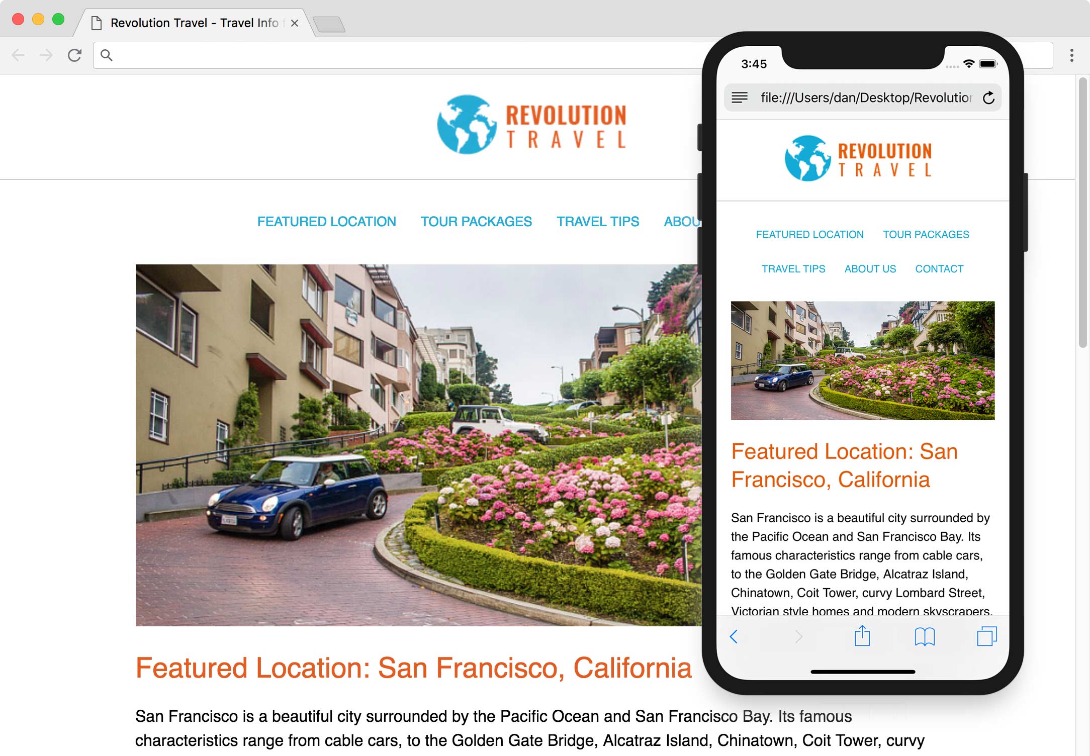
While the webpage responds properly in a desktop browser, we need to test how it will work on a mobile device. Thankfully, Chrome DevTools has a mobile simulator.
- Preview sanfran.html in Chrome.
- To open the DevTools, CTRL–click (Mac) or Right–click (Windows) on the page and choose Inspect.
- At the top left of the DevTools panel, click the Toggle device toolbar button
 to open the mobile simulator.
 -
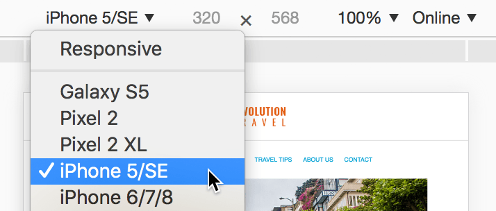
Above the webpage preview, select a device such as the iPhone 5/SE:
- Click the Reload button, or hit Cmd–R (Mac) or CTRL–R (Windows).
- The desktop layout has been scaled down (as you can see in the navigation at the top), but text in the main column is large so what’s going on? Some mobile browsers enlarge text they think is too small (if they think it doesn’t break the layout). We don’t want browsers arbitrarily overriding some font sizes, so let’s disable that.
- Switch back to your code editor.
- Go to Revolution Travel > snippets and open a code snippet we prepared for you, text-size-adjust.css.
- Hit Cmd–A (Mac) or CTRL–A (Windows) to select all the code.
- Hit Cmd–C (Mac) or CTRL–C (Windows) to copy it.
- Close the file.
-
At the top of main.css, paste the new code above the body rule:
html { -moz-text-size-adjust: 100%; -webkit-text-size-adjust: 100%; text-size-adjust: 100%; } body { - Save the file.
- Switch back to Chrome and reload the page.
The text is no longer being enlarged, so it looks like the desktop layout scaled down to fit a mobile phone. Now that the browser won’t be deciding what text it might enlarge, we must get it to display the layout appropriately for small screens, instead of scaling down the desktop layout.
The Viewport Meta Tag
Mobile devices assume websites were designed for desktops. They render the site on a large viewport (980px) and scale it down to fit their smaller screen. For responsive sites we must add a meta tag to tell it to render the page at the actual pixel width of the device, instead of the default 980px.
- Keep the browser open in device mode so we can come back to preview the changes we’re about to make.
- In your code editor, switch to sanfran.html.
-
In the
<head>tag, add the following bold code:<head> <meta charset="UTF-8"> <meta name="viewport" content="width=device-width"> <title>Travel Info for San Francisco, CA—Revolution Travel</title>This tells mobile browsers to make the width of the viewport equal to the width of the device. Like other meta tags, it goes in the head tag.
-
Save the file and reload the page in Chrome (which should still be in device mode).
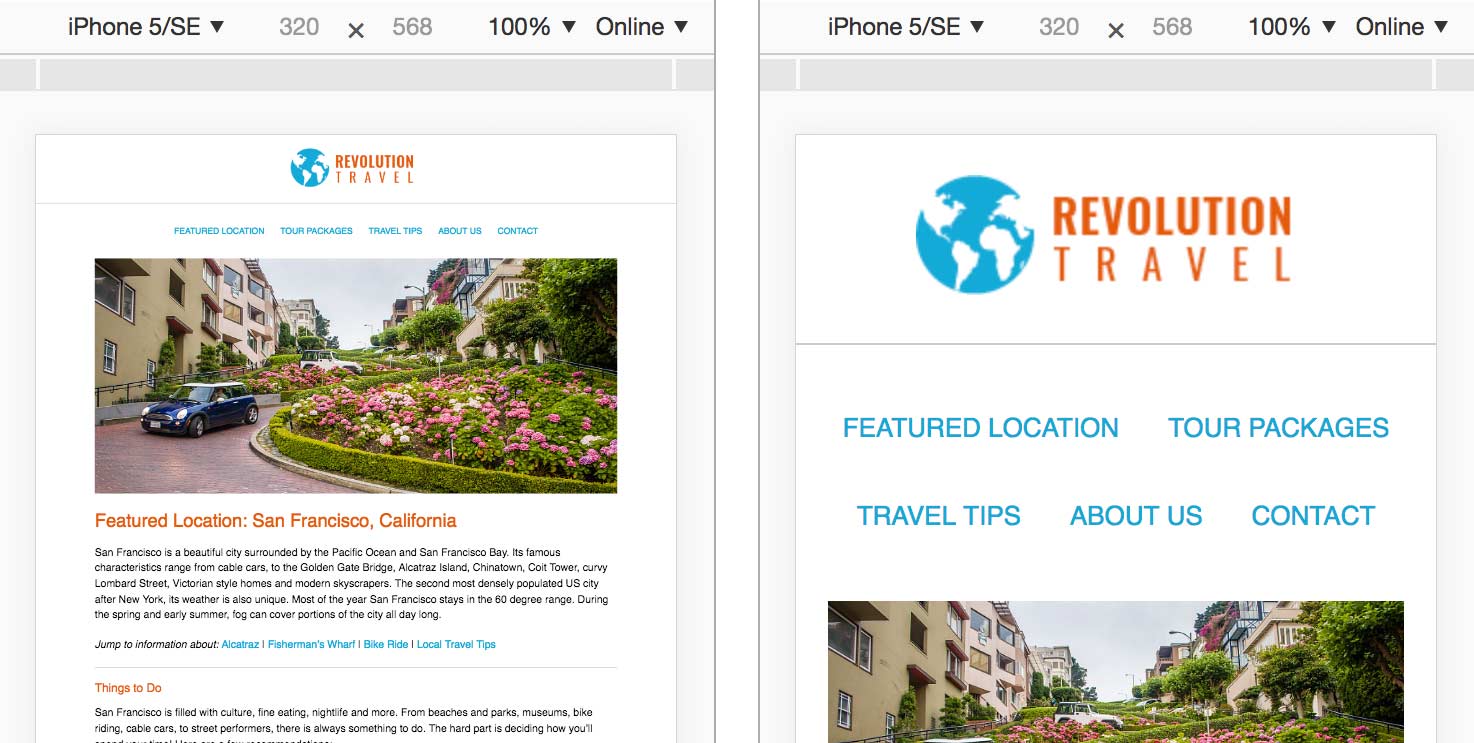
The layout and text size should now look a lot more appropriate for a small mobile phone! The viewport meta tag does not affect desktop browsers, only mobile browsers which employ the scaling behavior. As shown below, on the left is how the page looked before the meta tag, and on the right we see it with the meta tag!
-
What happens when we rotate the device to landscape? In Chrome, above the webpage preview, click the Rotate
 button to change the orientation.
That looks good. The portrait layout is recalculated to show more content in the wider, landscape preview.
If you viewed the page on a device running iOS 8 or older, you would see that the vertical layout is scaled up to fill the wider horizontal screen, so you actually see less of the content. Most users would probably expect to see more on a wider screen. Luckily we can add a little code to change this scaling behavior.
-
Back in sanfran.html, add the following bold code and don’t miss the comma!
<meta name="viewport" content="width=device-width, initial-scale=1">More About Initial-Scale
Setting initial-scale=1 sets the page zoom to 100%, or in other words… do not scale the page. For example, 1.5 would zoom in to 150%.
Some mobile browsers set initial-scale to 1 by default once you set the viewport meta tag width to device-width. As we mentioned with older iOS Safari, however, the portrait width will also be used for the landscape orientation unless specified with initial-scale.
-
Save the file. You won’t be able to preview the effect of this in many browsers, but it’s a best practice to have for those browsers that need it.
Please note that the viewport meta tag needs to be in every HTML file in a website. If you wanted to complete this site, you’d have to copy and paste it into the other.html files. We’re done with this site so we’re not going to make you do that busy work, but keep that in mind in the future. Make sure you have the viewport meta tag before making all the pages of your site!
Disabling Zoom
Mobile browser users can zoom in on a page. Adding maximum-scale=1 to the viewport meta tag limits how far a user can zoom in. When the maximum-scale and the initial-scale are both set to 1, the user will be unable to zoom. Because this is bad for usability, Safari on iOS ignores this code so users can still zoom. While it’s possible to disable page zooming in some browsers, we do not recommend it.
