Dive into this comprehensive HTML & CSS tutorial that covers a range of topics including img srcset and the picture element, providing exercises and step-by-step guides to create responsive images for optimized user experience.
This exercise is excerpted from Noble Desktop’s past front-end web development training materials and is compatible with updates through 2022. To learn current skills in web development, check out our coding bootcamps in NYC and live online.
Topics Covered in This HTML & CSS Tutorial:
Img Srcset, the Picture Element
Exercise Preview
Exercise Overview
In this exercise, you’ll learn how to create responsive images, so users will get the most optimized image for their screen size. This helps pages to load faster, which leads to happier users. Page loading speed also affects your website’s page rank in Google (faster loading pages rank higher)!

You’ll learn two techniques: the srcset attribute for img tags, and the picture element. Here’s a quick comparison:
Img Srcset: We use an img tag with srcset when we want the same image to work across various screen sizes, but with the optimal image size/resolution. Mobile users get a small file, desktop users get a large size, and users with hi-res or low-res screens get the appropriate image.
Picture Element: The picture element offers more control, or “art direction” over the images used across screen sizes. We use it when we want to provide different images, with different croppings or aspect ratios such as a vertical image for mobile devices, and a horizontal image for desktops.
Getting Started
- For this exercise we’ll be working with the Responsive Images folder located in Desktop > Class Files > Advanced HTML CSS Class. Open that folder in your code editor if it allows you to (like Visual Studio Code does).
- Open srcset.html from the Responsive Images folder.
-
Preview srcset.html in Chrome (we’ll be using its DevTools).
You should see one image with some text on the page. For this exercise we’re going to work in a bare-bones page so it will be easier to focus on the code required for this technique.
Leave the page open in Chrome.
Using Img Srcset for 1x & 2x (Retina) Graphics
We created a low-res (1x) and hi-res (2x) version of an image. Using the img tag’s srcset attribute, we can tell the browser about our 1x and 2x images, and it will choose the appropriate one based on our screen resolution!
- Switch back to srcset.html in your code editor.
-
Add the srcset attribute with our 1x and 2x images, as shown below in bold:
<img srcset="img/sunset-320.jpg 1x, img/sunset-640.jpg 2x" src="img/sunset-320.jpg" ALT="sunset">NOTE: The order of HTML attributes such as srcset and src do not matter, so srcset could come before or after src. The src attribute is for older browsers that don’t understand the newer srcset. Refer to caniuse.com/#search=srcset for browser support.
-
Save the file, reload the page in Chrome, and:
- If you’re on a 1x display, you should see an image that says 320px. This is displayed at 320px wide.
- If you’re on a 2x display, you should see an image that says 640px. This is displayed at 320px wide, making it a 2x image!
- Older browsers that don’t support srcset will fall back to the src img, which is a 320px image that would be the same width in the page.
It’s pretty awesome that the browser understands 1x and 2x and automatically chooses the proper image and size!
-
Let’s double-check both screen resolutions to see it working first hand. Still in Chrome, CTRL–click (Mac) or Right–click (Windows) anywhere on the page and select Inspect to open Chrome’s DevTools.
Once an image is downloaded, the browser may keep it in cache. This is good for users, but not for while we’re testing. Let’s disable Chrome’s cache.
- At the top right of the DevTools, click the gear button (Settings).
- Scroll down and under Network, check on Disable cache (while DevTools is open).
- Close the settings by clicking the X at the top right.
- In the upper left of the DevTools panel click the Toggle device toolbar button
 to enter device mode.
 - From the device menu above the webpage, select iPhone 6/7/8.
- Click the Reload button, or hit Cmd–R (Mac) or CTRL–R (Windows).
- This is a 2x device, so you should see the 640px image.
-
Let’s use with the device pixel ratio to change to a 1x display. This setting is not shown by default, so if you don’t see it, enable it by clicking the 3 dotted button
 and choosing Add device pixel ratio.
- You should see a DPR: 2.0 option to the right of the dimensions. It’s grayed out though. From the device menu (to the left of the dimensions) choose Responsive.
- The DPR menu will no longer be disabled. Click on the DPR menu and choose 1.
- Click the Reload button, or hit Cmd–R (Mac) or CTRL–R (Windows).
- You should now see the 320px image.
- Click on the DPR menu and set it back to Default: 2.0.
- Click the Toggle device toolbar button to leave device mode.
Keep the DevTools open.
Using Img Srcset with Sizes
There’s another way to use srcset. We saved our image at multiple pixel widths (320,640,1280, and 2560). Using the img tag’s srcset attribute, we can tell the browser about all the images and it will decide which is best to display… based on the size of the screen, size of the image in the page, screen resolution, and potentially the speed of the user’s internet connection!
- Switch back to srcset.html in your code editor.
-
Comment out the 1x vs. 2x heading and img tag below it.
<!— <h1>1x vs. 2x</h1> <img srcset="img/sunset-320.jpg 1x, img/sunset-640.jpg 2x" src="img/sunset-320.jpg" ALT="sunset"> —> -
Between the commented code and the paragraph below, add this heading and img:
<h1>Sizes</h1> <img src="img/sunset-1280.jpg" ALT="sunset"> -
Add the srcset and sizes attributes, as shown below in bold:
<img src="img/sunset-1280.jpg" ALT="sunset" srcset="" sizes=""> -
We’re going to be adding a lot of code, so break the new attributes onto new lines:
<img src="img/sunset-1280.jpg" ALT="sunset" srcset="" sizes=""> -
Add the list of images, as shown below:
<img src="img/sunset-1280.jpg" ALT="sunset"
     srcset="img/sunset-320.jpg 320w,
             img/sunset-640.jpg 640w,
             img/sunset-1280.jpg 1280w,
             img/sunset-2560.jpg 2560w"
     sizes="">
NOTE: After each image is a number with a w. The w stands for width, and refers to the px width of the image. We need to tell the browser how many pixels wide each file is, so it doesn’t have to download them to figure that out. It will use this info to determine which image it should download.
-
Add the list of sizes shown below in bold:
<img src="img/sunset-1280.jpg" ALT="sunset" srcset="img/sunset-320.jpg 320w, img/sunset-640.jpg 640w, img/sunset-1280.jpg 1280w, img/sunset-2560.jpg 2560w" sizes="(min-width: 800px) 50vw, (min-width: 640px) 75vw, 100vw"> -
With sizes we tell the browser how big the image will be in the page, in relation to the viewport. This is similar to setting a width in HTML, in that it makes the image that size (although that can be overridden with CSS). More importantly, this tells the browser how big the image will be so it knows which size image to download.
Why doesn’t the browser just figure out how big the image for us? The browser must decide which file to download before it renders the page and figures out how big the image will be. This is done to speed up the downloading of assets and rendering of the page. You can learn more about this (and responsive images) at tinyurl.com/dev-onri
Each size is a media condition, a space, and then the width will be in the final page layout. The width can be absolute (px, em) or relative (vw, which is viewport width), but cannot be percentages. You can even use CSS calc().
The first media condition that is met will be used. The last size does not have a media condition so it will be used when none of the other conditions are met.
- Save the file, and reload the page in Chrome.
- Make your window as wide as possible.
-
If the DevTools are not docked to the right side of the browser window, at the top right of the DevTools panel click the
button and choose Dock to right as shown below:
- Resize the DevTools panel to make the page area narrow (around 320px). You can see the size in the top right of the page as you resize the DevTools.
- Click the Reload button, or hit Cmd–R (Mac) or CTRL–R (Windows).
- You should see the 320px image if you’re on a 1x screen, or the 640px image if you’re on a 2x screen.
- Resize the DevTools area wider, and watch how the other sizes automatically load when appropriate.
-
Resize the DevTools area narrow, and notice the stays as the biggest image.
Once the higher quality image is loaded it’s already cached so there’s no need to switch to a smaller image. They look the same, but are lesser quality so the browser doesn’t bother switching.
- Resize the page area to around 600px.
- Click the Reload button, or hit Cmd–R (Mac) or CTRL–R (Windows).
- You should see the 640px image if you’re on a 1x screen, or the 1280px image if you’re on a 2x screen.
Close the DevTools, but keep the page open in Chrome.
Using the Picture Element for 1x & 2x (Retina) Graphics
Let’s look at the picture element, which is another way to create responsive images. This method is good when you don’t want the image to look the same across all screen sizes.
- Switch back to your code editor.
Let’s switch to another file in this folder. Open picture.html from the Responsive Images folder.
-
There’s no content in this file. In the body tag, create a picture element, as shown below in bold:
<picture>
   <source media="(min-width: 1280px)" srcset="img/model-desktop-1280.jpg">
   <source media="(min-width: 768px)" srcset="img/model-tablet-768.jpg">
   <img src="img/model-mobile-375.jpg" ALT="Model">
</picture>
NOTE: Browsers will pick the first source that matches. If none match, the img tag will be used.
“Unlike srcset and sizes, when you use the media attribute, you are dictating to the browser which source should be used. The browser has no discretion to pick a different source. It must use the first element whose media attribute matches the current browser conditions.”—Cloud Four, tinyurl.com/ri-part6
- Preview picture.html in Chrome.
-
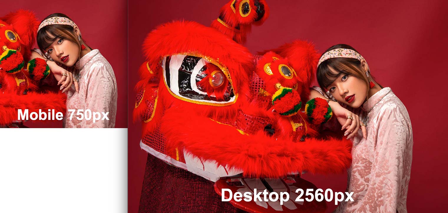
Resize the page from narrow to wide, and you should see 3 images (labeled Mobile 375px, Tablet 768px, and Desktop 1280px) which are all different sizes, aspect ratios, and croppings.
We’re seeing 1x images because those are the images we told it to use, but we can have the browser display the appropriate 1x/2x depending on our screen resolution.
- Switch back to picture.html in your code editor.
-
We’re going to be adding more code, so break the code onto new lines like this:
<picture> <source media="(min-width: 1280px)" srcset="img/model-desktop-1280.jpg"> <source media="(min-width: 768px)" srcset="img/model-tablet-768.jpg"> <img src="img/model-mobile-375.jpg" ALT="Model"> </picture> -
As shown below in bold, add 1x, a comma, and the 2x images:
<picture> <source media="(min-width: 1280px)" srcset="img/model-desktop-1280.jpg 1x, img/model-desktop-2560.jpg 2x"> <source media="(min-width: 768px)" srcset="img/model-tablet-768.jpg 1x, img/model-tablet-1536.jpg 2x"> <img src="img/model-mobile-375.jpg" ALT="Model"> </picture> -
Add srcset to the img tag, as shown below in bold:
<img src="img/model-mobile-375.jpg" ALT="Model" srcset=""> -
Move srcset down to its own line and add images to it:
<picture>
   <source media="(min-width: 1280px)"
           srcset="img/model-desktop-1280.jpg 1x,
                   img/model-desktop-2560.jpg 2x">
   <source media="(min-width: 768px)"
           srcset="img/model-tablet-768.jpg 1x,
                   img/model-tablet-1536.jpg 2x">
   <img src="img/model-mobile-375.jpg" ALT="Model"
        srcset="img/model-mobile-375.jpg 1x,
                img/model-mobile-750.jpg 2x">
</picture>
The img tag will be a fallback for when the other media conditions are not met, which would be screens less than 768px wide.
- Save the file and reload the page in Chrome.
- Resize the page from narrow to wide, and you should see 3 images, but this time you’ll see 1x sizes (375px, 768px, and 1280px) if you’re on a 1x display, or 2x sizes (750px, 1536px, and 2560px) on 2x displays.
- Let’s double-check both screen resolutions to see it working first hand. Still in Chrome, CTRL–click (Mac) or Right–click (Windows) anywhere on the page and select Inspect to open Chrome’s DevTools.
- In the upper left of the DevTools panel click the Toggle device toolbar button to enter device mode.
- From the device menu above the webpage, select iPhone 6/7/8.
- Click the Reload button, or hit Cmd–R (Mac) or CTRL–R (Windows).
- This is a 2x device, so you should see the Mobile 750px image.
- From the device menu (to the left of the dimensions) choose Responsive.
- Click on the DPR menu and choose 1.
- Click the Reload button, or hit Cmd–R (Mac) or CTRL–R (Windows).
- You should now see the Mobile 375px image. (If you don’t, your mobile preview may be too wide. Resize it narrower and refresh.)
- Click on the DPR menu and set it back to Default: 2.0.
- Click the Toggle device toolbar button to leave device mode.
Close the DevTools, but keep the page open in Chrome.
Using the Picture Element with Sizes
Currently our picture element is only considering screen resolution, and not how large the image will be in the page. We can use sizes to take that into consideration.
- Switch back to picture.html in your code editor.
-
As shown below in bold, add sizes:
<picture> <source media="(min-width: 1280px)" sizes="50vw" srcset="img/model-desktop-1280.jpg 1x, img/model-desktop-2560.jpg 2x"> <source media="(min-width: 768px)" sizes="75vw" srcset="img/model-tablet-768.jpg 1x, img/model-tablet-1536.jpg 2x"> <img src="img/model-mobile-375.jpg" ALT="Model" sizes="100vw" srcset="img/model-mobile-375.jpg 1x, img/model-mobile-750.jpg 2x"> </picture> -
Change the 1x and 2x to image sizes, as shown below in bold:
The browser will choose appropriately based on screen width, image size in the page, screen resolution, etc.:<picture> <source media="(min-width: 1280px)" sizes="50vw" srcset="img/model-desktop-1280.jpg 1280w, img/model-desktop-2560.jpg 2560w"> <source media="(min-width: 768x)" sizes="75vw" srcset="img/model-tablet-768.jpg 768w, img/model-tablet-1536.jpg 1536w"> <img src="img/model-mobile-375.jpg" ALT="Model" sizes="100vw" srcset="img/model-mobile-375.jpg 375w, img/model-mobile-750.jpg 750w"> </picture>- On screens 1280px and above, model-desktop-1280.jpg or model-desktop-2560.jpg will be displayed.
- On screens 768px to 1279px, model-tablet-768.jpg or model-tablet-1536.jpg will be displayed.
- On screens 767px or smaller, model-mobile-375.jpg or model-mobile-750.jpg will be displayed.
- Save the file and reload the page in Chrome.
-
Resize the page from narrow to wide, and you’ll see the images appear in the following order (which matches the bottom to top ordering in the picture element):
- Mobile 375px or 750px is 100% wide and appears on small screens (depending on your screen resolution. This is the img with srcset.
- Tablet 768px or 1536px appear starting at 768px (it’s 75% wide).
- Desktop 1280px or 2560px appear starting at 1280px (it’s 50% wide).
What’s important is that you’re seeing different images change as you resize the window. Here’s the big picture takeaway:
- With img srcset the image chosen by the browser will be used when the window is resized smaller. It does not automatically switch to the smaller images, because they are supposed to be the same images, just lower resolution.
- With the picture element, the image must change as the window gets smaller because those images are supposed to look different and you want to see those images because they look better at that size/aspect ratio, which effects the design.
Summary
While the picture element lets us control which images are displayed at various sizes, it requires precisely made images that will fit into the proper places within a design. That can be useful sometimes, but overkill when it’s not.
For most images, we simply want the browser to figure out which resolution image to use. So most of the time, an img tag with srcset will be the best choice. To learn more, read Cloud Four’s article Don’t use <picture> (most of the time) at tinyurl.com/dupmott
Media Queries & Sizes
The image sizes and media queries used in this exercise are not some magical set of numbers/sizes that you’ll always use. Every layout is different, so be sure to adapt these concepts to your site and content!
Remembering Which to Use
Having a hard time remembering which to use? This may help:
- Srcset = browser set (browsers are in charge of choosing the right file)
- Picture element = picture it your way! (art direction, you’re in charge and it will show every image you tell it to)
