Explore the differences between fixed and relative sizes in web design such as pixels, ems, and rems with our detailed HTML & CSS tutorial, complete with hands-on exercises and practical examples.
This exercise is excerpted from Noble Desktop’s past front-end web development training materials and is compatible with updates through 2022. To learn current skills in web development, check out our coding bootcamps in NYC and live online.
Topics Covered in This HTML & CSS Tutorial:
Em Units, Rem Units
Exercise Preview
Exercise Overview
In this exercise, you will learn the difference between a fixed size (such as pixels) and relative sizes (such as ems and rems).

Em Units
- We’ll be switching to a new folder of prepared files for this exercise. In your code editor, close all open files to avoid confusion.
- For this exercise we’ll be working with the Helping Hands Em vs. Rem folder located in Desktop > Class Files > Advanced HTML CSS Class. Open that folder in your code editor if it allows you to (like Visual Studio Code does).
- Open volunteer.html from the Helping Hands Em vs. Rem folder.
-
Preview volunteer.html in Chrome (we’ll be using its DevTools).
This page is similar to the previous exercise, but we’ve made a few adjustments for teaching this topic.
- In Chrome, CTRL–click (Mac) or Right–click (Windows) on the Sign Me Up button and choose Inspect.
-
If the DevTools are not docked to the right side of the browser window, at the top right of the DevTools panel click the
 button and choose Dock to right as shown below:
- In the Styles panel, the top style should be input[type=
"submit"] - In that style, click on the 20px value for font-size.
-
Use your Up and Down Arrow keys to make the text bigger and smaller. As you change the font-size, notice the green padding area around the type remains roughly the same size. It does grow a little bit, because the line height changes with the font-size, which affects the spacing around the type.
If we truly wanted to proportionally scale the button up or down, we’d need to adjust the padding amounts as well.
-
Leave the page open in Chrome.
About Em Units
One problem with using pixel sizes is when you decide to change the size of something (such as a sidebar or navbar) which contains many individually sized elements, you have to manually change each element’s pixel size. This can be tedious, but luckily we can use relative sizes such as ems.
In a webpage 1em is equal to the current font-size. If an element is in the body tag, then 1em is equal to the root font-size (browsers default to 16px unless you’ve changed it with CSS). If you have an article for which you’ve set a 20px font-size, inside the article 1em equals 20px.
While ems are based on font-size, you can use ems for other values such as padding, margin, etc. as you’ll see next.
- Return to your code editor.
- Open main.css from the css folder (in the Helping Hands Em vs. Rem folder).
-
Find the input[type=
"submit"] rule and change the padding to ems as shown below:input[type="submit"] { font-size: 20px; padding: .5em 1em;Code Omitted To Save Space
}This element’s font-size is 20px, therefore 1em currently equals 20px. The padding was 10px 20px, so:
- 10px is half of 20px, so that equals 0.5em.
- 20px is the same as the font-size, so that equals 1em.
-
Save the file and reload the page in Chrome.
The Sign Me Up button’s padding should still look good, but let’s see how the padding will now automatically adjust when we adjust the font-size!
-
The Sign Me Up button should still be selected with the input[type=
"submit"] at the top of the DevTools Styles panel.If it’s not, CTRL–click (Mac) or Right–click (Windows) on the Sign Me Up button and choose Inspect.
- Click on the 20px value for font-size.
- Use your Up and Down Arrow keys to make the text bigger and smaller. This time, notice the green padding area adjusts proportionally as you change the font-size!
- In the DevTools, if you see a Computed tab, click on it. Otherwise look at the panel (to the right of Styles) with a colored diagram of margin, border, and padding.
- Here you can see all the properties listed in alphabetical order. Instead of scrolling through them to find padding, click in the Filter field and type padding
- Here you can see how the padding’s em units have been translated into pixels.
- Hit the Esc key to remove the filter.
If needed, switch back to the Styles tab.
Using Em Units for Font-Size
Let’s switch to using ems for the font-size of the headings and paragraphs in aside (right column on desktop).
- Return to your code editor.
-
Near the top of the file, find the h3 rule and change font-size to 1.25em:
h3 { color: currentColor; font-size: 1.25em; margin: 0 7px; } -
Scroll down, and change the font-size of the aside section p rule:
aside section p { font-size: 1em; margin: 0; overflow: hidden; } -
Let’s set a font-size on the section tags which contain the h3 and p tags we just updated. Find the aside section rule and add a font-size as shown below:
aside section {
   font-size: 14px;
   background: #eee;
   border-radius: 8px;
   margin-top: 30px;
   padding: 30px;
   position: relative;
}
Within the aside’s section tags, 1em will now equal 14px.
- Save the file and reload the page in Chrome.
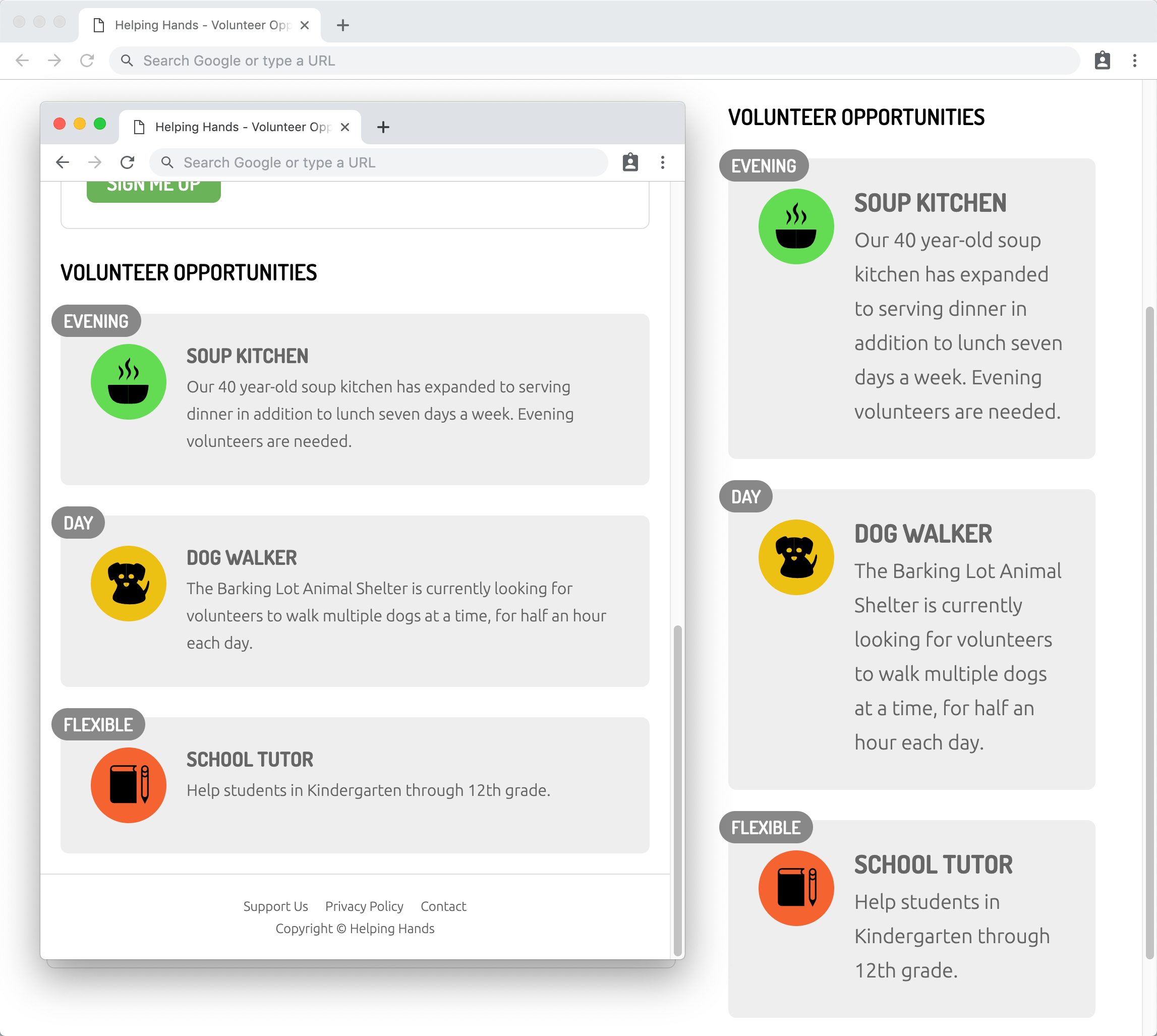
- CTRL–click (Mac) or Right–click (Windows) on the Volunteer Opportunities heading (at the top of the right column, or below the form if you’re only seeing one column) and choose Inspect.
- In the DevTools Elements panel, just below the selected h2 click on any of the 3 section tags to select it.
- In the Styles panel, the top style should be aside section
- Click on the 14px value for font-size.
-
Hit your Up Arrow key a few times to make the size bigger and notice:
- The headings and paragraphs in all 3 gray sections get bigger because they are using an em font-size.
- The time badges (Evening, Day, and Flexible) do not change size because they using a px font-size.
This is the strength of ems: Making one size change can affect multiple elements. Additionally, those relative sizes could help us across media queries.
Rem Units
This page is a fairly basic example, but imagine using ems throughout multiple nested elements with different font-sizes (each changing what 1em is). Unfortunately, this can get complex very quickly. The challenge of ems is the value of 1em is always changing, so matching a size across elements can be a huge pain. Ems are not the only relative unit. We can also use rem, which stands for r oot em.
- Em is relative to the current font-size, which changes throughout a page.
- Rem is relative to a page’s root font-size, which is consistent throughout a page.
In this page we have not yet set default a font-size, so 1rem will refer to the default 16px set by the browser (or whatever the user’s preference is if they changed the default size).
- Return to your code editor.
-
In the aside section p rule, add an “r” to change “em” to “rem”:
aside section p { font-size: 1rem; margin: 0; overflow: hidden; } -
In the h3 rule, add an “r” to change “em” to “rem”:
h3 { color: currentColor; font-size: 1.25rem; margin: 0 7px; } -
Let’s define a root font-size. We can set this on the html or :root element. At top of the file, just above the body rule, add this new rule:
:root {
   font-size: 1rem;
}
This will be used on all screen sizes, but next we’ll set a larger root size for desktops.
You might wonder why we’re not using pixels here. Keep in mind that users can change their browser’s default text size. If we used pixels we’re be overriding their preference, which is disrespectful. By using a relative size (such as rem, em, or %) we are creating a size relative to the user’s preference (which by default is 16px unless they have changed it). In this case, 1rem would normally be 16px.
-
Towards the bottom of the file, in the media query for min-width: 930px add this new rule:
@media (min-width: 930px) {
   :root {
      font-size: 1.25rem;
   }
NOTE: Assuming the browser’s default type size of 16px, this would set our base font size to 20px (1.25 X 16 = 20px).
- Save the file and reload the page in Chrome.
Resize the browser window to see the size of the heading and paragraph text in the aside is bigger on desktop and smaller on mobile.
