Learn from this comprehensive HTML & CSS tutorial that covers how to use Google Fonts, make improvements on line-height and margin for text legibility, and how to give your webpage a polished, professional look by embedding custom fonts.
This exercise is excerpted from Noble Desktop’s past front-end web development training materials and is compatible with updates through 2022. To learn current skills in web development, check out our coding bootcamps in NYC and live online.
Topics Covered in This HTML & CSS Tutorial:
How to Use Google Fonts, Safe Fallbacks in the Font Stack, Improving Line-height & Margin for Text Legibility
Exercise Preview
Exercise Overview
In this exercise, we’ll continue with the Hipstirred site. We’ll give the page a more polished, professional look by embedding custom fonts rather than sticking to the safe, bland list of fonts that ship with most operating systems. We’ll use Google Fonts, a popular source of free web fonts. Google hosts hundreds of fonts and provides the code to make it all work. Let’s get started.

- We’ll be using a new folder of provided files for this exercise. Close any files you may have open in your code editor to avoid confusion.
- For this exercise we’ll be working with the Hipstirred Font Fun folder located in Desktop > Class Files > Web Dev Class. You may want to open that folder in your code editor if it allows you to (like Visual Studio Code does).
Limiting the Text Content’s Width
- In your code editor, open index.html from the Hipstirred Font Fun folder.
-
Preview index.html in a web browser and notice:
- We’ve added some text content into the main tag, and a copyright line into the page’s footer.
- The text touches the edge of the page and the long lines of text are hard to read. Before we experiment with fonts, let’s limit the width of the main content and add some space around it.
- Return to your code editor.
- Open main.css from the Hipstirred Font Fun folder.
-
Below the .hero rule, add the following new rule:
main { max-width: 850px; padding: 25px; } - Save main.css.
- Return to the browser and reload index.html. The text is far more legible at this max-width but the main content should be centered in the page.
- Return to main.css in your code editor.
-
Add the following new properties to the rule for main:
main { max-width: 850px; padding: 25px; margin-right: auto; margin-left: auto; } - Save main.css.
-
Return to the browser and reload index.html.
The layout is better, so now we can turn our attention to the fonts! Let’s find a better font to use instead of the default.
NOTE: Don’t worry about the footer’s copyright text being aligned to the far left. We’ll finish the footer in a later exercise.
Experimenting with Google Fonts
-
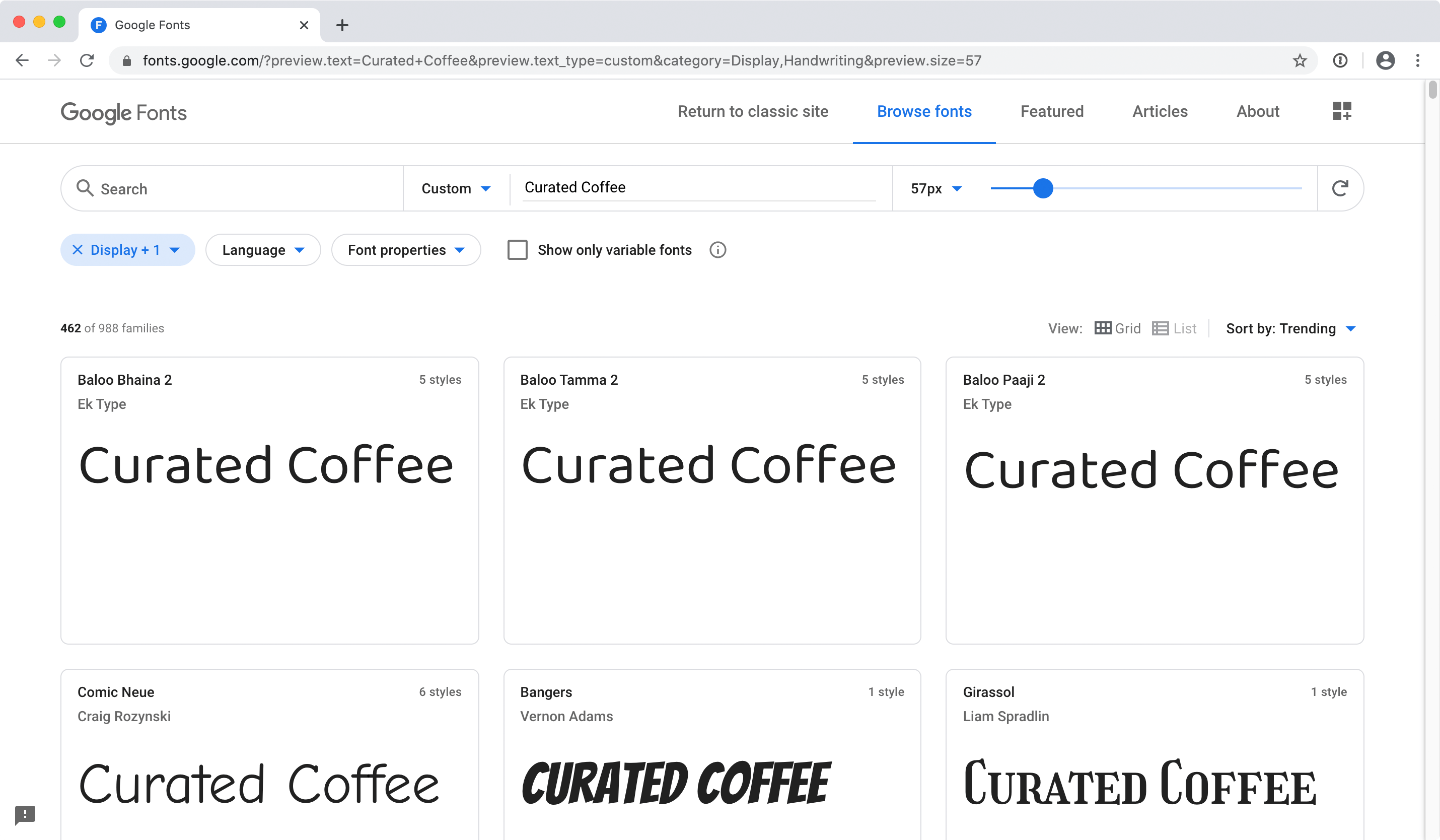
In a new browser tab, go to fonts.Google.com
This service from Google provides free fonts that you can use for any commercial project (websites, apps, etc.).
- We want to preview our specific Curated Coffee text. At the top of the page, click where it says Type something and type Curated Coffee.
- Take a moment to scroll through some of the available fonts.
- We have three fonts specific fonts we want to try. In the search field at the top of the page, search for Medula.
- Click on Medula One
-
Notice that this font has only one style: Regular 400.
Font weights for the web are numbered. Weights such as 100,200,300,400,500,600,700 go from thin (lower numbers) to bolder (higher numbers).
-
On the right, click on + Select this style.
A column should appear on the right of the page listing the Selected family.
NOTE: If you close this panel, you can reopen it by clicking the
 button at the top right of the page.
 -
Let’s find a second font:
- At the top of the page click Browse fonts.
- Search for Rancho.
- Click on Rancho in the search results.
- On the right, click on + Select this style.
-
Let’s find a third font:
- At the top of the page click Browse fonts.
- Search for Abel.
- Click on Abel in the search results.
- On the right, click on + Select this style.
NOTE: These 3 fonts only had regular versions, but other fonts may have bold, italic, light, black, etc. When deciding on which styles to include, keep in mind that each style increases the file size and slightly slow down the loading of the page. Only load styles you will actually be using.
Adding Fonts to Our Page
- You should see a column on the right of the page listing the Selected families. If you don’t see it, open it by clicking the button at the top right of the page.
- You should see 3 fonts listed: Abel, Medula One, and Rancho.
-
Copy the links which load the fonts from Google’s servers:
<link rel="preconnect" href="https://fonts.googleapis.com"> <link rel="preconnect" href="https://fonts.gstatic.com" crossorigin> <link href="https://fonts.googleapis.com/css2?family=abel&family=medula+one&family=rancho&display=swap" rel="stylesheet"> - Keep this page open in your browser, you’ll need to come back to it later.
- Return to index.html in your code editor.
-
Paste the link above the link to main.css, as shown in bold below:
<title>Artisanal Coffee Curators | Hipstirred</title>
<link rel="preconnect" href="https://fonts.googleapis.com">
<link rel="preconnect" href="https://fonts.gstatic.com" crossorigin>
<link href="https://fonts.googleapis.com/css2?family=abel&family=medula+one&family=rancho&display=swap" rel="stylesheet">
<link rel="stylesheet" href="main.css">
NOTE: Putting the link to Google Fonts before links to other CSS files will start the font download as soon as possible. To learn more about font loading and what the display=swap part of the link means, read css-tricks.com/font-display-masses
The rel=“preconnect” lines of code tell the browser to connect to the domain where Google stores its fonts. This will speed things up for when the CSS file goes to download the font files.
Save the file.
Applying the Fonts to Content
Now that the fonts are accessible to use in this page, let’s use them!
- Return to the Google Fonts website in your browser.
-
Under CSS rules to specify families, copy the code for the Abel font:
font-family: 'Abel', sans-serif; - Return to main.css in your code editor.
-
Edit the rule for body as follows:
body { font-family: 'Abel', sans-serif; margin: 0; } - Save main.css.
- Return to the browser and reload index.html. All the text should now be the new font. It’s nice, but a bit too small.
- Return to main.css in your code editor.
-
Edit the rule for body as follows:
body { font-family: 'Abel', sans-serif; font-size: 19px; margin: 0; } - Save main.css.
- Return to the browser and reload index.html. That’s better. Now let’s choose another font for the main heading.
- Return to Google Fonts in your browser.
-
Under CSS rules to specify families, copy the code for the Medula One font:
font-family: 'Medula One', cursive; - Return to main.css in your code editor.
-
Edit the rule for h1 as follows:
h1 {
  font-family: 'Medula One', cursive;
  font-size: 95px;
}
Save the file and reload index.html in the browser to see the new font. The heading should now be in a new font, but there’s an issue we need to fix.
Browsers make headings bold by default. This font does not have a bold version, so the browser is artificially making it bold. Let’s change it to the normal weight (400) so we can truly see how this font looks.
- Return to main.css in your code editor.
-
Add the following new property declaration to the h1 rule:
h1 {
   font-family: 'Medula One', cursive;
   font-size: 95px;
   font-weight: 400;
}
NOTE: We could have also used
font-weight: normal;because 400 equates to normal. We used 400 in this case because we saw the 400 weight listed on Google Fonts and wanted to make the connect to that. -
Save the file and reload index.html in the browser.
Notice that the heading font is thinner. This is how this font was designed. This font is interesting, but too similar to the other font we’re using. Let’s try a different font.
- Return to Google Fonts in your browser.
-
Under CSS rules to specify families, copy the code for the Rancho font:
font-family: 'Rancho', cursive; - Return to main.css in your code editor.
-
Edit the rule for h1 as follows:
h1 { font-family: 'Rancho', cursive; font-size: 95px; font-weight: 400; } -
There are no good cursive fallback fonts common to all platforms (Mac, PC, iOS, etc.). Change cursive to sans-serif:
font-family: 'Rancho', sans-serif; - Save main.css.
Return to the browser and reload index.html. Nice, we like this font!
Removing an Unused Font
We’re no longer using the Medula One font, but the page is still downloading it. That makes the page load a bit slower and wastes mobile users’ data! Let’s fix that.
- Return to index.html in your code editor.
-
In the link tag for Google fonts, remove
&family=Medula+Oneso you end up with:<link href="https://fonts.googleapis.com/css2?family=abel&family=rancho&display=swap" rel="stylesheet"> Save the file.
Styling the Subheading
- We want the subheading (under Curated Coffee) to be a bit smaller and not use the fake bold.
- Return to main.css in your code editor.
-
Add the following new rule below the h1 rule:
h2 {
   font-size: 20px;
   font-weight: normal;
   text-transform: uppercase;
}
Save the file and reload index.html in the browser to preview the change. This looks good, except the headings are too far apart. Let’s adjust the margin for the headings.
Improving Margins & Line-Height
- Return to main.css in your code editor.
-
Add the following new property declarations to the h1 rule:
h1 { font-family: 'Rancho', sans-serif; font-size: 95px; font-weight: 400; margin-bottom: 10px; } -
Add the following new property declaration to the h2 rule:
h2 { font-size: 20px; font-weight: normal; text-transform: uppercase; margin-top: 0; } -
Save the file and reload index.html in the browser to preview the change.
The headings look better with this amount of space between them, but if you pay close attention, there’s more space above the Curated Coffee than below the subheading. That’s because of the default margin on the Curated Coffee heading. Let’s reduce that.
- Return to main.css in your code editor.
-
Add the following new property declaration to the h1 rule:
h1 { font-family: 'Rancho', sans-serif; font-size: 95px; font-weight: 400; margin-top: 10px; margin-bottom: 10px; } - Save the file and reload index.html in the browser.
- Make your browser window wide and notice the headings look good.
-
Make the browser window narrow enough so Curated and Coffee each wrap onto a separate line and you’ll be able to see there’s too much line space:

- Return to main.css in your code editor.
-
Add the following new property declaration to the h1 rule:
h1 { font-family: 'Rancho', sans-serif; font-size: 95px; line-height: 90px; font-weight: 400; margin-top: 10px; margin-bottom: 10px; } - Save the file and reload index.html in the browser to preview the change. Resize the browser window to fully test the new line-height. Looks good.
- Now let’s style the h3 tags (the headings in the text below the hero image) to create more obvious topic breaks. Return to main.css in your code editor.
-
Add the following new rule below the h2 rule:
h3 { font-size: 28px; border-bottom: 1px solid #d17e32; padding-bottom: 10px; margin-top: 40px; margin-bottom: 10px; } - Save the file and reload index.html in the browser to preview the refined headings.
- The paragraphs could also use refinement. Return to main.css in your code editor.
-
Let’s increase the paragraph margin and line-height. Add the following new rule for p below the h3 rule:
p { line-height: 32px; margin-top: 0; margin-bottom: 20px; } - Save the file.
- Return to the browser to reload index.html. The type is looking good now that we have custom fonts and better spacing! We just have one last little tweak.
- Return to main.css in your code editor.
-
Let’s soften the contrast a little by making all the text a dark gray:
body { font-family: 'Abel', sans-serif; font-size: 19px; color: #555; margin: 0; } - Save the file.
Return to the browser to reload index.html.
Testing Custom Web Fonts (Such As Google Fonts)
Test your site on other computers/devices to make sure your custom web fonts load properly. Why? When designing the site you often install the font on your Mac/PC. If the embed code for the webpage doesn’t work, you wouldn’t know because the web browser can use the font installed in your system. You’d only see the problem when testing on another computer, phone, or tablet that does not have the font installed. It’s also good to test in various browsers/platforms as fonts may render a bit differently.
Google Fonts May Be Blocked
Corporate, campus, or even government firewalls may block Google Fonts. For instance, people in China will have to enjoy Hipstirred in Helvetica or Arial because Google Fonts are blocked there. While most users will see the page with your Google Fonts, it’s possible not everyone will.
Using Google Fonts in Design Apps
If you’re designing a website in Figma, Figma loads Google Fonts automatically, making it easy to use them in your designs.
If you need to use Google web fonts while designing in desktop apps like Adobe XD or Sketch, you’ll need to download Google fonts and install them on your Mac or PC. One way you could do this more easily (instead of manually getting them from the Google Font website) is using FontBase. FontBase is a free app that allows you to quickly install Google fonts (and more) onto your Mac or PC. Find out more at https://fontba.se
