Dive into this HTML & CSS tutorial to learn about CSS gradients, creating smooth color transitions, patterns, and even stripes, complete with detailed exercises and step-by-step instructions.
This exercise is excerpted from Noble Desktop’s past front-end web development training materials and is compatible with updates through 2022. To learn current skills in web development, check out our coding bootcamps in NYC and live online.
Topics Covered in This HTML & CSS Tutorial:
CSS Background Gradients, Creating a Striped Background Using Gradients
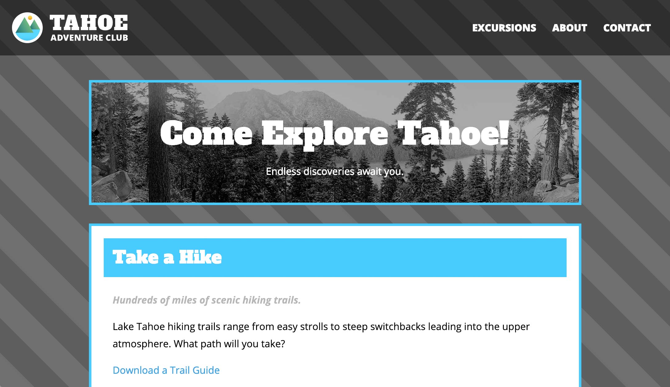
Exercise Preview
Exercise Overview
In this exercise, you’ll learn about CSS gradients. They can be used for smooth color transitions, or to create patterns such as stripes!

Getting Started
- In your code editor, close any files you may have open.
- We’ll be working with the Tahoe Gradients folder located in Desktop > Class Files > Advanced HTML CSS Class. Open that folder in your code editor if it allows you to (like Visual Studio Code does).
- Open index.html from the Tahoe Gradients folder.
-
Preview index.html in a browser.
This is the same page as we’ve been working with in previous exercises, but we removed some content to make it easier to see the background area that we’ll be working on.
Leave the page open in the browser so we can come back to it and reload as we make changes.
Creating a CSS Gradient
CSS gradients are a function which creates an image of a gradient. The CSS gradient image has no set dimensions. Its size will match the size of the element it applies to.
- Switch back to your code editor and open main.css from the css folder (in the Tahoe Gradients folder).
-
Let’s have some fun with learning the syntax for CSS gradients. Add the following new background-image property declaration:
body {
   background: #555;
   background-image: radial-gradient(red, orange, yellow, green, blue, violet);
   margin: 30px;
   font-family: 'Open Sans', sans-serif;
   line-height: 1.75;
}
NOTE: Really old browsers that don’t support gradients can fall back to the solid hex color. The main reason we are using this solid gray background color though, is because later we’ll be making the gradient partially transparent so it shows through to the background color!
- Save and preview index.html in a browser. Woah, very trippy! Let’s tone that down. We can also try a linear, rather than radial gradient.
- Return to main.css.
-
Edit the gradient style and trim down the rainbow as follows:
background-image: linear-gradient(red, orange, yellow); Save the file and reload the browser. The gradient fills the page and goes from top to bottom by default. Let’s change the gradient to go from left to right.
-
Return to main.css and edit the gradient as follows:
background-image: linear-gradient(to right, red, orange, yellow); Save the file and reload the browser. Cool. Let’s try to put this on an angle.
-
Return to main.css and edit the gradient as follows:
background-image: linear-gradient(45deg, red, orange, yellow); - Save the file and reload the browser. Fancy that. And you can use any angle you like. What about specifying the size of each gradient color to create less of a rainbow gradation and more of a stripe effect? We can do that.
Return to main.css.
Creating a Striped Pattern
-
Let’s start with red, and continue with red until 40px. Edit the gradient as follows:
background-image: linear-gradient(45deg, red, red 40px, orange, yellow); -
Next, set orange to start at 40px (exactly where the red ends) and continue to 80px:
background-image: linear-gradient(45deg, red, red 40px, orange 40px, orange 80px, yellow); -
Then set yellow to start at 80px (exactly where the orange ends) and continue to 120px:
background-image: linear-gradient(45deg, red, red 40px, orange 40px, orange 80px, yellow 80px, yellow 120px); Save the file and reload the browser. If needed, scroll to the bottom of the page to see the small red and orange stripes (the rest of the page should be yellow). We want this to repeat as a pattern, not just appear as a single tiny stripe effect in the bottom-left corner.
-
Return to main.css and add repeating as shown below:
background-image: repeating- linear-gradient(45deg, red, red 40px, orange 40px, orange 80px, yellow 80px, yellow 120px); - Save the file and reload the browser. Yowza. Now that we know how to make stripes, let’s tone this down a bit. Let’s create a series of gray stripes by using the gray background of the page and alternating it with stripes that are a semi-transparent overlay.
-
Return to main.css and replace the color red with transparent, as follows:
background-image: repeating-linear-gradient(45deg, transparent, transparent 40px, orange 40px, orange 80px, yellow 80px, yellow 120px); Save the file and reload the browser. You can see through to the gray background in these transparent areas. Great! We only want two colors for the pattern, dark gray and a not-so-dark gray. Let’s get rid of the yellow stripe to pare things down.
-
Return to main.css and delete the yellow values as follows:
background-image: repeating-linear-gradient(45deg, transparent, transparent 40px, orange 40px, orange 80px); -
Save the file and reload the browser.
This could work for a construction company… but we’re getting closer. Now let’s change the orange stripe to a partially transparent black stripe (which will darken the background gray).
-
Return to main.css and replace the orange value with the following RGBA values:
background-image: repeating-linear-gradient(45deg, transparent, transparent 40px, rgba(0,0,0,.2) 40px, rgba(0,0,0,.2) 80px); -
Save the file and reload the browser.
- Now we have some nice looking stripes.
- If your screen is tall enough to show some space below the content, at some window widths you may notice a zig zag in the stripes just below the content where the pattern does not align. That’s because the background does not fill the entire screen, it ends at the bottom of the content and then repeats.
-
Return to main.css and add the following code shown in bold:
body { background: #555; background-image: repeating-linear-gradient(45deg, transparent, transparent 40px, rgba(0,0,0,.2) 40px, rgba(0,0,0,.2) 80px); background-attachment: fixed; margin: 30px; font-family: 'Open Sans', sans-serif; line-height: 1.75; } -
Save the file, reload the browser, and:
- Notice the background gradient no longer repeats, because it’s now relative to the viewport rather than the page’s content.
- Make the window short enough so you can scroll.
- Scroll around to see the content moves over the background (which remains in a fixed position).
-
Return to main.css and try one more option for thinner stripes::
background-image: repeating-linear-gradient(45deg, transparent, transparent 4px, rgba(0,0,0,.2) 4px, rgba(0,0,0,.2) 8px); -
Save the file and reload the browser. Feel free to experiment and create different gradients and stripe patterns.
You can combine multiple CSS backgrounds (as you’ll learn about in the next exercise) and create many different effects. By combining multiple gradients you can create all sorts of interesting patterns. Check out leaverou.GitHub.io/css3patterns for some inspiration!
