Dive into this comprehensive HTML & CSS tutorial to understand the difference between border-box and content-box, learn best practices for applying border-box, and get hands-on with exercises for practical learning.
This exercise is excerpted from Noble Desktop’s past front-end web development training materials and is compatible with updates through 2022. To learn current skills in web development, check out our coding bootcamps in NYC and live online.
Topics covered in this HTML & CSS tutorial:
How border-box is different than content-box, Best practice for applying border-box to everything
Exercise Preview
Exercise Overview
In a previous exercise we saw how the default box model treats margins, padding, and widths. In this exercise you’ll learn about a newer (and often better) box model!

Getting Started
The files for this exercise are very similar to where the previous exercise left off, but we went ahead and did a little more text styling.
- In your code editor, close any files you may have open.
- For this exercise we’ll be working with the Tahoe Box Model folder located in Desktop > Class Files > Advanced HTML CSS Class. You may want to open that folder in your code editor if it allows you to (like Visual Studio Code does).
- Open index.html from the Tahoe Box Model folder.
Flexible Padding: Using Percentage Amounts
- Preview index.html in a browser.
- Currently there is 20px of padding in the header and 3 blue bordered sections below it. The header has plenty of padding on small screens, but we’d like to add more on large screens. While we could add media queries to increase the padding, let’s try something easier: using a flexible percentage amount instead of a fixed pixel amount.
- Keep the page open in the browser, but return to your code editor.
- Open main.css from the css folder.
-
In the header rule (near the bottom), add padding as shown below in bold:
header {
   background: url(../img/masthead-darkened.jpg) center / cover;
   color: #fff;
   text-align: center;
   padding: 7%;
}
NOTE: This will take 7% of the width of the element and adds that much padding to all 4 sides.
-
Save main.css and reload index.html in Chrome. Notice the following:
- Resize the browser and notice the header has less padding (space inside) when the window is narrow, and more padding when the window is wide.
- When the window is wide enough, the header is wider than the blue bordered section below it.
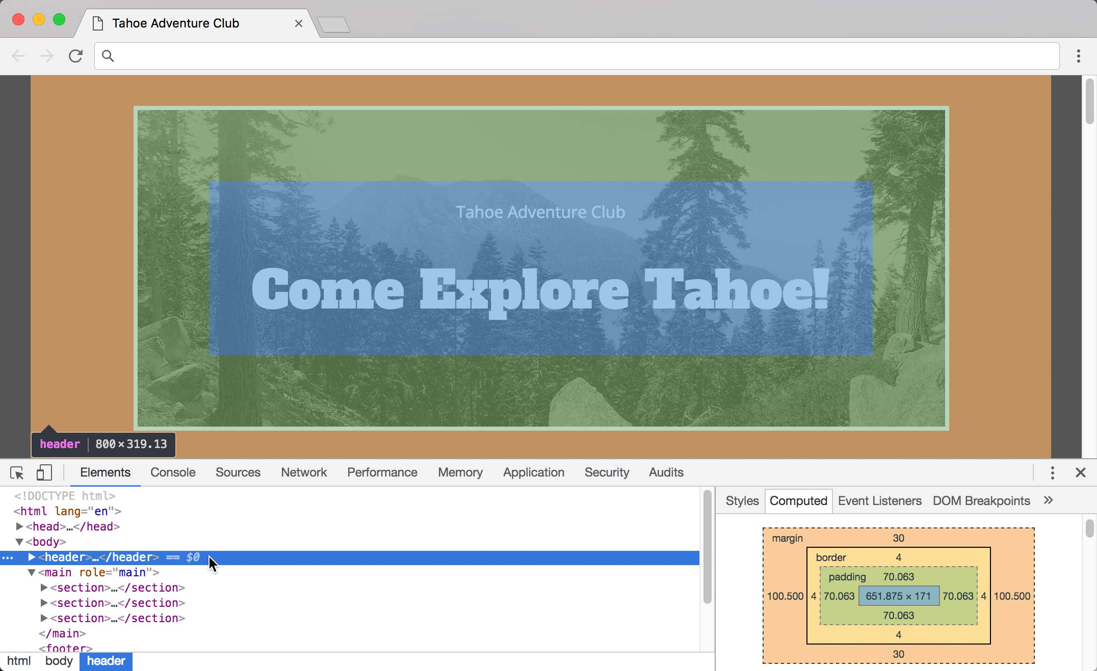
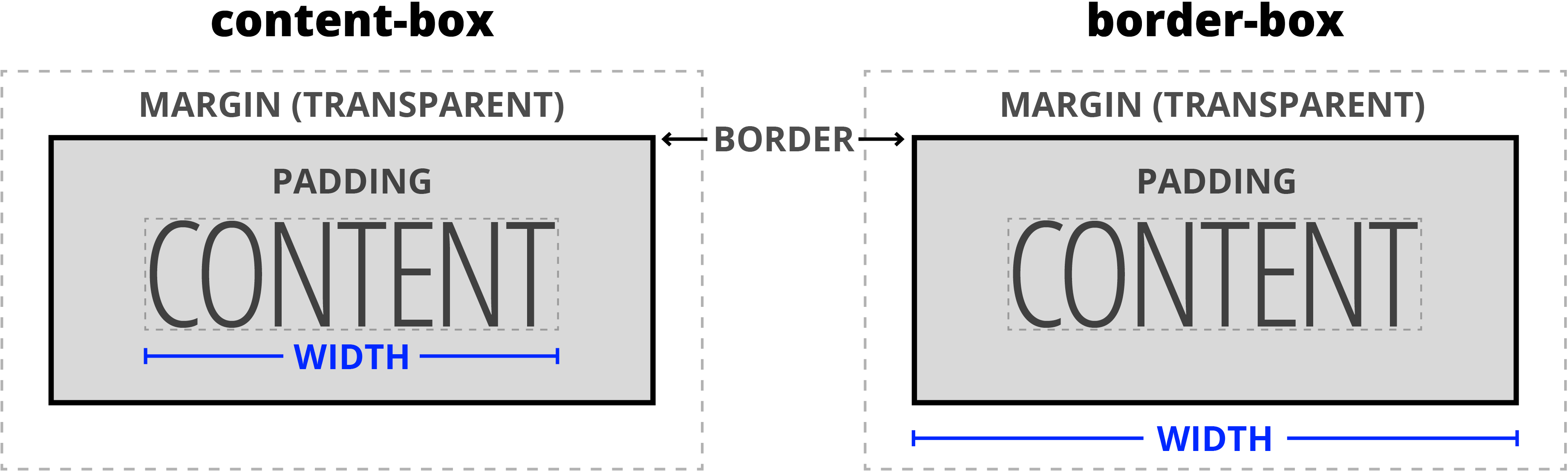
The header and 3 sections all have an 800px max-width, so why can the header get wider than the sections? To understand, let’s look at how the default box model (called content-box) works. CSS width is applied to the content. Padding and borders are then added, to end up with the final visual size for a box. That means a width of 800px plus 20px padding (on both sides) plus 4px borders (on both sides) ends up forming a box that is visually 848px (800 + 20
*2 + 4*2).Because padding is added to the max-width, when the 7% padding is bigger than 20px, the header ends up being wider than the sections below. Luckily there’s a newer box model (called border-box) that works differently. As illustrated below, with border-box the CSS width is applied to the visual size of the box, including the borders and padding!
Switching to Border-Box
- Still in Chrome, Ctrl–click (Mac) or Right–click (Windows) on the header’s photo at the top of the page and choose Inspect.
- Make sure the window is wide enough so you can see the header is wider than the section below.
- Make sure the header element is selected in the Elements panel on the left of the DevTools.
- In the Styles panel on the right of the DevTools, the top style should be header.
- Below that is the header, section rule that we want to edit. The last property should be max-width. Click once on the 800px value.
- Hit Tab to add a new property below that.
- Type box-sizing and then hit Tab to jump its value.
-
Type border-box and hit Tab to apply it so you end up with the following:

-
In the page notice the following:
- The sections got a little smaller, because the padding and border are now inside the 800px (instead of being added to it as it had been).
- The header and sections are now the same width, which is what we want!
- Now we must do this in our CSS file, so return to main.css in your code editor.
- We could add the same code we just did in Chrome, but we really want to use this new box model for everything in the page. We could target all elements using the asterisk (
*) selector, but there’s an even better way that web developers have figured out. We have the code in a snippet to make it easy for you to add. Let’s grab the CSS from our code snippet. From the snippets folder, open border-box.css. - Select all the code.
- Copy the code.
- Close the file. You should be back in main.css.
-
Paste the code above all the other rules (as shown below):
*, *::before, *::after { box-sizing: border-box; }

body {
NOTE: What does this code mean? The asterisk (
*) targets everything. We then also target content added before or after any element (which you’ll learn more about later in this training). This way everything gets border-box from a single CSS rule. -
Save main.css and reload index.html in the browser. When the browser window is wide, the header and 3 sections below should all be the same width.
We recommending including this code in every site you create.
