Learn how to build more flexible layouts in Figma through this tutorial that covers various features of auto layout, including nesting, spacing, padding, sizing, constraints, and negative spacing.
This exercise is excerpted from Noble Desktop’s Figma training materials and is compatible with Figma updates through 2023. To learn current skills in Figma with hands-on training, check out Noble Desktop's Figma Bootcamp, web design classes, and graphic design classes in-person or live online.
Topics Covered in This Figma Tutorial:
Nesting Auto Layouts, Auto Layout Spacing & Padding, Auto Layout Sizing & Constraints, Negative Spacing & Stacking Order, Absolute Positioning Elements
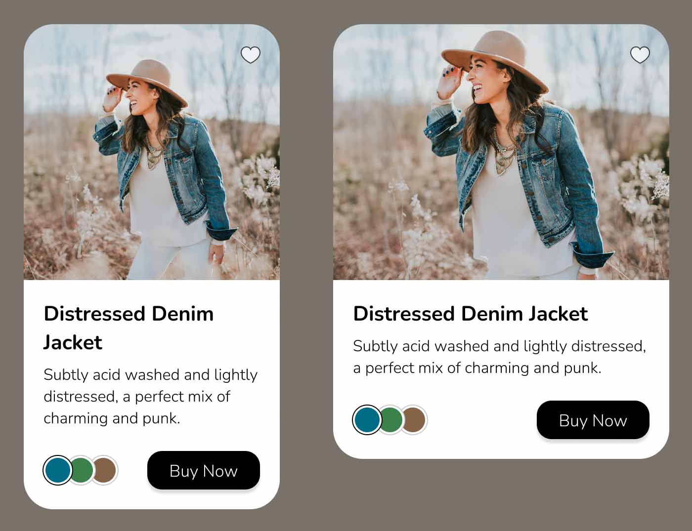
Exercise Preview
Exercise Overview
In this exercise, you’ll learn to build more flexible layouts using various features of auto layout.

Opening the File
-
In Figma, if you’re not on the homescreen (file browser), do the following:
- In the Desktop app: Click the
 Home tab (Mac users can also choose File > Open File Browser).
 - In the Web app: At the top left, click the Main menu button
 and choose Back to files.
- In the Desktop app: Click the
- To open a local file, click
 Import file (may be an icon near the top right).
 -
Navigate into Desktop > Class Files > Figma Class and double–click on Auto Layout.fig to choose it.
Once the file has uploaded, click Done and double–click on the file to open it.
Adding Auto Layout
- Select all the items on the Products Page except for the navbar at the top.
-
CTRL–click (Mac) or Right–click (Windows) on any of the selected objects and choose Add auto layout or hit Shift–A.
Don’t worry that the layout of the objects changed, we’ll be adjusting that.
- The contents have been put into a frame with auto layout applied. In the Layers panel rename the selected Frame to product.
-
Let’s add a background color. With the frame still selected, in the Design panel, to the right of Fill, click Plus(+) button.
- If the color did not default to white, change it to white.
- In the Design panel, below H (height) set
 Corner radius to 30.
 - We don’t see the rounding at the top, so in the Design panel, check on Clip content.
-
With the frame still selected, below width (W) change Horizontal resizing from Hug to Fixed width.
NOTE: We want a fixed width because we won’t want the objects inside to change the width of this container. We’ll size the container, which in turn will resize the things inside it.
Adding Auto Layout to the Content Inside
- Select the 3 color circles. To do so you’ll need to double-click into the frame. Once a color is selected, hold Shift and select the others.
-
CTRL–click (Mac) or Right–click (Windows) on any of the selected objects and choose Add auto layout or hit Shift–A.
- In the Design panel, under Auto layout click Horizontal direction
 .
. - In the Layers panel rename the selected Frame to colors.
- In the Design panel, under Auto layout click Horizontal direction
- With the colors frame still selected, hold Shift and click on the Buy Now button.
-
CTRL–click (Mac) or Right–click (Windows) on any of the selected objects and choose Add auto layout or hit Shift–A.
- In the Design panel under Auto layout click Horizontal direction .
- In the Layers panel rename the selected Frame to buttons group.
- In the Design panel under Auto layout click Horizontal direction
-
Notice how the circles not vertically aligned with the Buy Now button. Let’s fix that. In the Design panel click on center alignment as shown below:

-
Also in the Design panel:
- Below width (W) change Horizontal resizing from Hug to Fill container.
- On the right of Auto layout click the ••• button for Advanced layout settings.
- Change Spacing mode from Packed to Space between.
- Select the Distressed Denim Jacket text and the text below it.
In the Design panel below width (W) change Horizontal resizing from Mixed to Fill container.
Auto Width Spacing & Sizing
- We want to add space around all the content below the photo, so we need to put all of that content in its own auto layout frame. Select all that content (the 2 pieces of text and the buttons group frame.
-
CTRL–click (Mac) or Right–click (Windows) on any of the selected objects and choose Add auto layout or hit Shift–A.
- In the Layers panel rename the selected Frame to info.
- In the Design panel below width (W) change Horizontal resizing from Hug to Fill container.
-
In the Design panel under Auto layout there are 2 settings for padding, but we want them both to be the same.
- Hold Cmd (Mac) or CTRL (Windows) and click on Horizontal padding
 and the 2 settings will merge into one!
 - Type in 20 and hit Return (Mac) or Enter (Windows) to apply it.
- Hold Cmd (Mac) or CTRL (Windows) and click on Horizontal padding
-
The Buy Now button and text above it have not behaved as we’d like, because their width got reset to Fixed. This can happen when you put elements into a new auto layout container. To fix it:
- Select the 2 pieces of text and the buttons group.
- In the Design panel below width (W) change Horizontal resizing from Fixed to Fill container.
- Now their width should shrink so there’s an equal amount of padding around this section. Better!
- Choose the photo.
In the Design panel below width (W) change Horizontal resizing from Fixed to Fill container.
Spacing Versus Padding
- Select the info frame (the frame that contains the text and buttons group).
-
In the Design panel under Auto layout set Spacing between items
 to 7
to 7This space is added between the 2 pieces of text and the buttons group below it. All those spaces must be equal when using this setting.
We want more space above the buttons group, and we can add top padding to achieve that. Select the buttons group frame. Refer to the Layers panel as needed to make sure you have the correct thing selected.
- In the Design panel, at the bottom right of the Auto layout section, click the Independent paddings button
 .
. Set Top padding
 to 15 and hit Return (Mac) or Enter (Windows) to apply it.
Negative Spacing & Stacking Order
- Select the colors frame (remember you must double-click to go into other frames to select things inside them). You should also refer to the Layers panel as needed to make sure you have the correct thing selected.
-
In the Design panel under Auto layout hover over the Spacing between items
icon and drag left and right to change the spacing between all the sections.- Notice that positive amounts adds space, while negative amounts make the circles overlap.
- Once you’ve experimented, set Spacing between items to -6 so the circles overlap a bit.
-
We want the first circle to be on top, so let’s change the stacking order. On the right of Auto layout click the ••• button for Advanced layout settings.
- Change Canvas stacking from Last on top to First on top.
- We want to rearrange the circles, so select the blue circle (on the right).
Hit the Left Arrow key on your keyboard two times to move it to the far left.
Absolute Positioning Elements
- Select the product frame.
-
We want to add a heart icon to the top right of the photo. In the Toolbar at the top, click on Resources
 .
.- In the panel that pops up, make sure you’re viewing the Components tab.
- Click on favorite
-
The heart should have been added to the bottom of the card, but we want it at the top right of the photo. Near the top right of the Design panel, click the Absolute position button
 .
.- Drag the heart to the top right of the photo.
- In the Design panel under Constraints change Left to Right (so it will remain a fixed amount from the right side when we resize the product container).
- Select the product frame.
-
Let’s see how the layout reacts when we adjust the width. Drag the right side of the frame (drag anywhere that’s NOT the pink line, which is for changing padding).
- The heart should always stay at the top right.
- The Buy Now button will be right aligned.
- The text will reflow as needed and move the lower elements down/up as needed when the number of lines change. Sweet!
Dealing with Cropped Photos in Auto Layout
If this photo were set to Crop (instead of the current Fill), then resizing the parent Product frame would distort the photo. To avoid this, you could set the photo to a Fixed width instead of Fill container. Then you can adjust the width and positioning of that photo manually without it distorting.
Fixed Position & Auto Layout
If you add auto layout to a main (parent) frame, you won’t be able to set Position to Fixed (it will be grayed out in the menu) on elements in that frame. Therefore we recommend adding auto layout to elements inside a frame, rather than adding it to the parent frame.
