Explore this comprehensive tutorial on Adobe XD that covers creating and editing components, overriding content in one instance versus globally updating all components, and the comparison between components and Repeat Grids.
This exercise is excerpted from Noble Desktop’s past web design training materials and is compatible with Adobe XD updates through 2020. We now teach Figma as the primary tool for web and UX & UI design. To learn current skills in web design, check out our Figma Bootcamp and graphic design classes in NYC and live online.
Topics Covered in This Adobe XD Tutorial:
Creating & Editing Components, Overriding Content in One Instance Vs. Globally Updating All Components, Detaching from a Component, Components Versus Repeat Grids
Exercise Preview
Exercise Overview
What if you want to globally change an element such as a navigation bar or button? In this exercise, you’ll learn how components (formerly called symbols) let you reuse elements and quickly update them everywhere throughout a design.

Creating a Component
- In Adobe XD, go to File > Open from Your Computer or hit Cmd–Shift–O (Mac) or CTRL–Shift–O (Windows).
-
Navigate into Desktop > Class Files > Adobe XD Class > Pulse and double–click on Pulse—Ready for Components.xd to open it.
The design of the Home Page artboard is almost complete. We’ve also created some of the content on the other artboards but they are not finished. We want to reuse the navigation bar at the top of the Home Page on both of the other artboards. If we merely copied and pasted it onto the other artboards, changing the navbar would require updating all three places. Instead we can use components which are all linked together. Editing the component can update all places we use it!
- To open the Libraries panel, at the bottom left of the window, click the
 icon.
icon. - Notice that we have not created any components yet.
- Zoom to 100% by hitting Cmd–1 (Mac) or CTRL–1 (Windows).
- Let’s start by converting the navigation bar into a component so we can reuse it elsewhere in the file. Scroll so you can see the black navigation bar at the top of the Home Page artboard.
- Drag a selection around the navbar (so the black background and the icons on it are all selected).
- Let’s convert it into a component. In the Libraries panel, to the right of Components click the + button.
- Notice the new component has appeared in the Libraries panel with a generic name. We should give it an appropriate name.
-
Double–click on the Component 1 name, type in nav and hit Return (Mac) or Enter (Windows) to apply the change.
NOTE: In grid view you don’t see the name until you hover over the component.
- To use the component, drag it from the Libraries panel and drop it onto the top of the Autumn Collection artboard.
- Drag the navbar so it snaps into the top left of the artboard.
- We can also copy and paste components to reuse them. Select one of the navbars (it does not matter which).
- Copy it.
- Click on the Product Page artboard.
Paste. Nice, this way it remembered the position!
Editing Components
When editing a component, you have to decide if you want to edit them all, or make individual modifications to once instance.
- Click once on the navbar on the Autumn Collection artboard.
- Notice that all of its corners are white circle resize handles, except for the top left which is a diamond shape (which indicates this is an instance of a component).
- Click once on the navbar on the Home Page artboard.
-
This is the original content that we converted into a component. Notice that its top left handle is a solid green diamond.
The solid green diamond means this is the Main Component (the instance was a hollow white diamond). Changing this component will update all other instances of this component.
- The search and shopping bag icons on the right of the navbar are too dark. Let’s lighten them. In the navbar on the Home Page, double–click on the gray outline of the search icon to select it. If you missed and selected the black background instead, you should be in the component now so try clicking on the search icon once again.
- With the search icon selected, hold Shift and click on the shopping bag icon so both are selected.
- In the Property Inspector, under Appearance, set Opacity
 to 100%.
 - Notice that all the navbars have been instantly updated!
- Let’s enlarge the 3-line menu icon (often called a hamburger icon) on the left side of the nav. Zoom to 200% by hitting Cmd–2 (Mac) or CTRL–2 (Windows).
- Scroll so you can see the 3-line menu icon on the left side of the navbar on the Home Page.
- If you still have the other icons selected, you’re still editing the component so you should be able to click once on the menu icon to select the group. If you deselected, you will have to double–click on the menu icon.
- With the menu icon selected, drag the right-middle handle to make it a little wider.
-
To make it taller, hold Option (Mac) or ALT (Windows) and drag the bottom-middle handle down a bit.
NOTE: Holding Option (Mac) or ALT (Windows) resizes from the middle.
Click on an empty part of the canvas to deselect.
Editing the Main Component
What happens if you delete the Main Component or you forget which instance is the Main Component? Don’t worry, you can CTRL–click (Mac) or Right–click (Windows) on the component in the Libraries panel (or any instance in the document) and choose Edit Main component.
- If the Main Component exists in the file, you’ll be taken to it.
- If the Main Component has been deleted, a new Main Component will be created off to the side of the artboards and you can edit that.
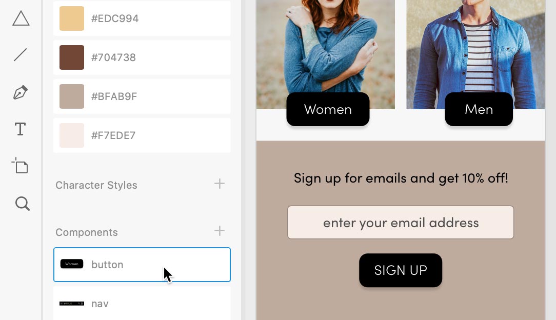
Making a Button Component: Overriding Content in One Instance Vs. Globally Updating All Components
Let’s make a reusable button component that can have any text, and see how we can resize it appropriately for different lengths of text.
- On the Home Page artboard find the Women button that’s a black square.
- Click once on the Women button to select the group (it’s a rectangle and text).
- CTRL–click (Mac) or Right–click (Windows) on the Women button and choose Make Component.
- In the Libraries panel, double–click on the women button name, type in button and hit Return (Mac) or Enter (Windows) to apply the change.
- Let’s make a button for Men to the right. Hold Option (Mac) or ALT (Windows) and drag a copy of the Women button to the right over the mens photo.
- In the copy on the mens photo, double–click on the text a couple times until it becomes editable. Then change Women to Men.
- Click off the Men button a couple times to fully deselect it.
- Click once on the Men button to select it.
-
Resize the width to make the width a bit narrower so the black space around the text better matches the Women button.
Notice the text was not distorted, so XD is not simply scaling the button. It’s intelligently resizing the elements in the component.
-
Undo that change by hitting Cmd–Z (Mac) or CTRL–Z (Windows).
There’s a better (automatic) way to make the spacing around the text match the original button (rather than this manual approach).
- Click once on the Women button to select it.
- In the Property Inspector on the right, click on the checkbox under Padding.
- Notice how the Men button’s width automatically was adjusted so the black space around the text matches the Women button!
- Let’s make another button. From the Libraries panel, drag the button component below the enter your email address slightly below the two buttons were you just working with.
- Double–click on the text of the new button a couple times until it becomes editable. Then change Women to Sign Up.
-
With the text selected, click the Uppercase button
 in the Property Inspector on the right.
Notice that only this button’s text become uppercase, and none of the others.
- Let’s round the corners of all the buttons and make the text bold.
-
The Women button is the Main Component, so changes to it will update all the other instances of this component (unless a individual component has overridden the particular thing we’re trying to change).
Double–click on the black background of the Women button.
-
There are four circles within the shape that are used to round the corners. As shown below, drag any of those circles in to round the corners.

- Notice how all 3 of the buttons (Women, Men, and SIGN UP) have been rounded!
- Select the Women text in the button.
- In the Property Inspector on the right, change the font weight from Bold to Light.
Again notice how all 3 of the buttons (Women, Men, and SIGN UP) have been updated.
Working with Components
Removing Local Changes (Reset to Main State)
If you’ve applied local changes to a component and want to remove them (so it again looks like the main component), CTRL–click (Mac) or Right–click (Windows) on the component and choose Reset to Main State.
Detaching from a Component
If you want to break the link between one instance and a component (so it will no longer update when the component is changed), select a component on the artboard, and choose Object > Ungroup Component.
Deleting Components
To delete a component, CTRL–click (Mac) or Right–click (Windows) on the component in the Libraries panel and choose Delete. All instances will turn into groups.
Component Versus Repeat Grids
Within a repeat grid, the content is repeated automatically so you don’t need to use components unless you’ll be using that content elsewhere in the design (outside of the repeat grid). Let’s take another look at repeat grids.
- If you’re not still zoomed in to 200%, hit Cmd–2 (Mac) or CTRL–2 (Windows).
- On the Autumn Collection artboard, find the repeat grid of four products (photos with descriptions and prices).
-
We built this product list as a repeat grid. Notice the first product Distressed Denim Jacket photo has a white heart at the bottom right, but the others do not.
This heart is so people can favorite items they are interested in. It should be on all products, but when we copied and pasted it from Illustrator into XD we didn’t put it into the group. Let’s fix that.
- Select the white heart at the bottom right of the Distressed Denim Jacket photo.
- Hit Cmd–X (Mac) or CTRL–X (Windows) to cut it.
- Double–click on the Distressed Denim Jacket photo to go into the repeat grid.
- Paste the heart (and notice it should now be added to all the photos).
- Drag the heart back into place at the bottom right of the photo.
- This looks good now, but other photos could have a light background, so let’s add a border. With the heart selected, in the Property Inspector check on Border.
Lastly, reduce Opacity
to 50%.
Optional Bonus: an Interesting Use of Repeat Grids
-
On the Product Page artboard below Distressed Denim Jacket, find the gray star.
We want to make 5 stars for people to rate the product. You might think about using a component, but a repeat grid will be more useful because we want multiple instances with equal spacing.
- Select the gray star.
- In the Property Inspector, click the Repeat Grid button (near the top).
- Pull the right handle out to show a total of 5 stars (don’t worry about it overlapping the text.)
- Hover over the space between the stars, and when you see the pink highlight, drag left to reduce the spacing so they fit within the alloted space.
- This product has not been rated, so we want these stars to look like they can be filled out. An outlined star would probably be better than a solid star. To change that, double–click on one of the gray stars.
-
In the Property Inspector, uncheck Fill.
All the stars should update. Nice!
Save the file and close it.
TIP: Swap One Component for Another
Drag a component from the Libraries panel onto a component on an artboard, and all instances of that component will be replaced with the new one.
