What Is Git & Why Should You Use It?
From web developers to app developers, Git is useful to anyone who writes code or track changes to files. So what’s it all about and why should you start using it?
What is Git?
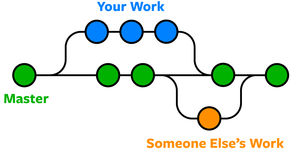
Git is the most commonly used version control system. Git tracks the changes you make to files, so you have a record of what has been done, and you can revert to specific versions should you ever need to. Git also makes collaboration easier, allowing changes by multiple people to all be merged into one source.
So regardless of whether you write code that only you will see, or work as part of a team, Git will be useful for you.

Git is software that runs locally. Your files and their history are stored on your computer. You can also use online hosts (such as GitHub or Bitbucket) to store a copy of the files and their revision history. Having a centrally located place where you can upload your changes and download changes from others, enable you to collaborate more easily with other developers. Git can automatically merge the changes, so two people can even work on different parts of the same file and later merge those changes without loosing each other’s work!


