Our in-depth web development tutorial covers a range of topics including display flex, alignment, distribution, and flex direction, with hands-on exercises designed to enhance your understanding of CSS flexbox.
This exercise is excerpted from Noble Desktop’s HTML & CSS training materials and is compatible with Flexbox, Grid, and Bootstrap updates through 2023. To learn current skills in HTML & CSS with hands-on training, check out our Front-End Web Development Certificate, Full-Stack Web Development Certificate, and coding classes in-person and live online.
Topics Covered in This Web Development Tutorial:
Display Flex, Alignment & Distribution on Main Axis & Cross Axis, Flex Direction (Row & Column), How Auto Margins Are Useful
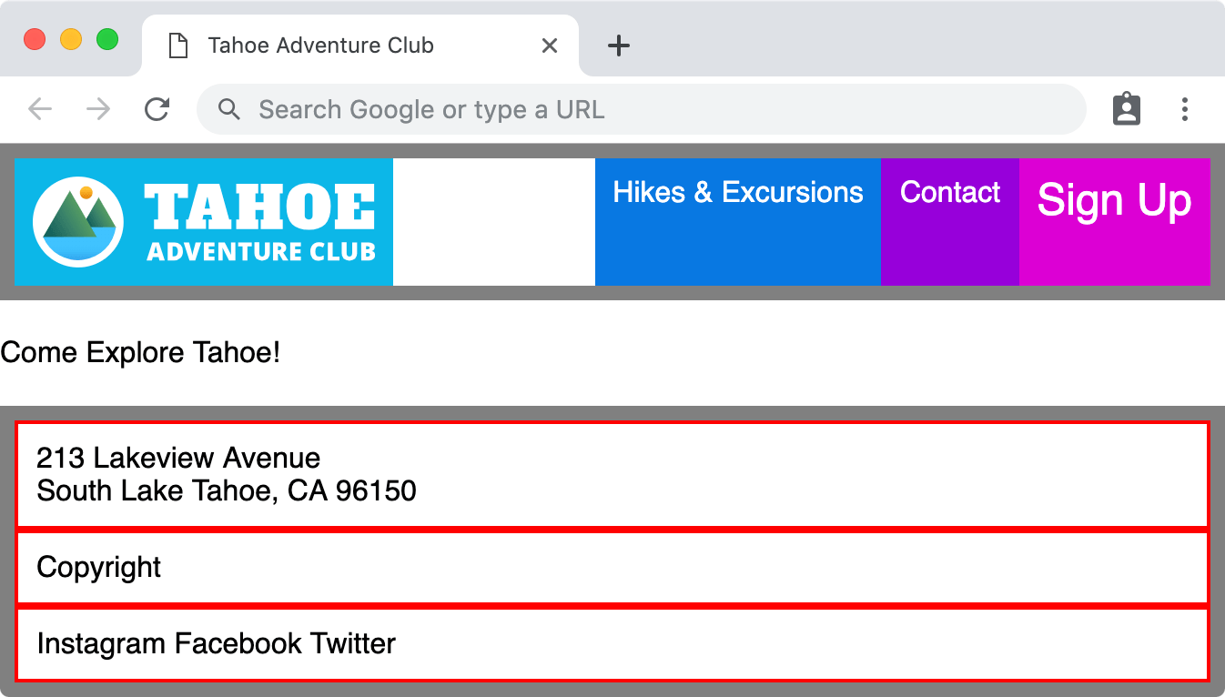
Exercise Preview
Exercise Overview
In this exercise you’ll get started with CSS flexbox, which is a way to lay out and align content.

Getting Started
- Launch your code editor (Visual Studio Code, Sublime Text, etc.). If you are in a Noble Desktop class, launch Visual Studio Code.
- We’ll be working with the Flexbox Intro folder located in Desktop > Class Files > yourname-Flexbox Grid Class > Flexbox Intro. You may want to open that folder in your code editor if it allows you to (like Visual Studio Code does).
- Open index.html from the Flexbox Intro folder.
-
Notice the following:
- There is a ul tag for a navbar.
- Below that is one line of text.
- There is a footer with 3 nested divs: address, copyright, and social.
- We kept this page simple with only a little content so it will be easier to understand what’s going on, and keep the CSS code that we’ll be adding simpler, so you can keep your focus on flexbox.
- In the head we’re linked to a main.css file where we’ve applied a little styling to make the page visually easier to understand.
- Preview index.html in Firefox. We’ll be using Firefox because (at the time of this writing) Firefox has better DevTools for inspecting flexbox.
-
Notice the following:
- The navbar ul and footer both have a gray border to help you see their size.
- We gave each list item in the navbar ul a different color to help you see their size.
- We gave the 3 div tags in the footer a red border to help you see their size.
Leave index.html open in Firefox as you work, so you can reload the page to see the code changes you’ll make.
Display Flex
The CSS display property has values such as block, inline, inline-block, etc. One of the newer values is flex which we’ll now explore.
- Switch back to your code editor.
- Open main.css from the css folder (in the Flexbox Intro folder).
-
In the .navbar rule add
display: flex;as shown below in bold:.navbar { display: flex; border: 8px solid gray;Code Omitted To Save Space
} -
Save the file, and reload the page in Firefox.
- Notice the navbar list is now horizontal (it was a vertical stack before).
- The width of the list items has collapsed to the width of the content inside them.
- The gray border that we applied to the navbar ul tag extends the full width of the page, indicating that the list didn’t collapse, just the elements inside.
Setting display to flex on an element makes it a flex container. The child elements automatically become flex items.
- CTRL–click (Mac) or Right–click (Windows) on anything inside the navbar and choose Inspect Element.
- In the DevTools you should see a
<ul class="navbar">element with nested li tags. Click on the<ul class="navbar"> - In the DevTools Flex Container area you notice the list of Flex Items (the items within this flex container).
- In the DevTools styles area you should see a .navbar style.
- For the display property, click on flex so it becomes editable.
- Change flex to inline-flex
-
Make the window wide enough to see that the navbar’s gray border has collapsed to the width of the content, and the Come Explore Tahoe! now can fit to the right of the navbar. If you need to close the DevTools to make see this, go ahead and do so.
Like block elements, flex elements fill the width of their parent element, whereas inline-flex elements do not (they are the width of their content). We don’t want the navbar to be inline for this page, but it’s good to know inline-flex exists.
Reload the page to get rid of this temporary change.
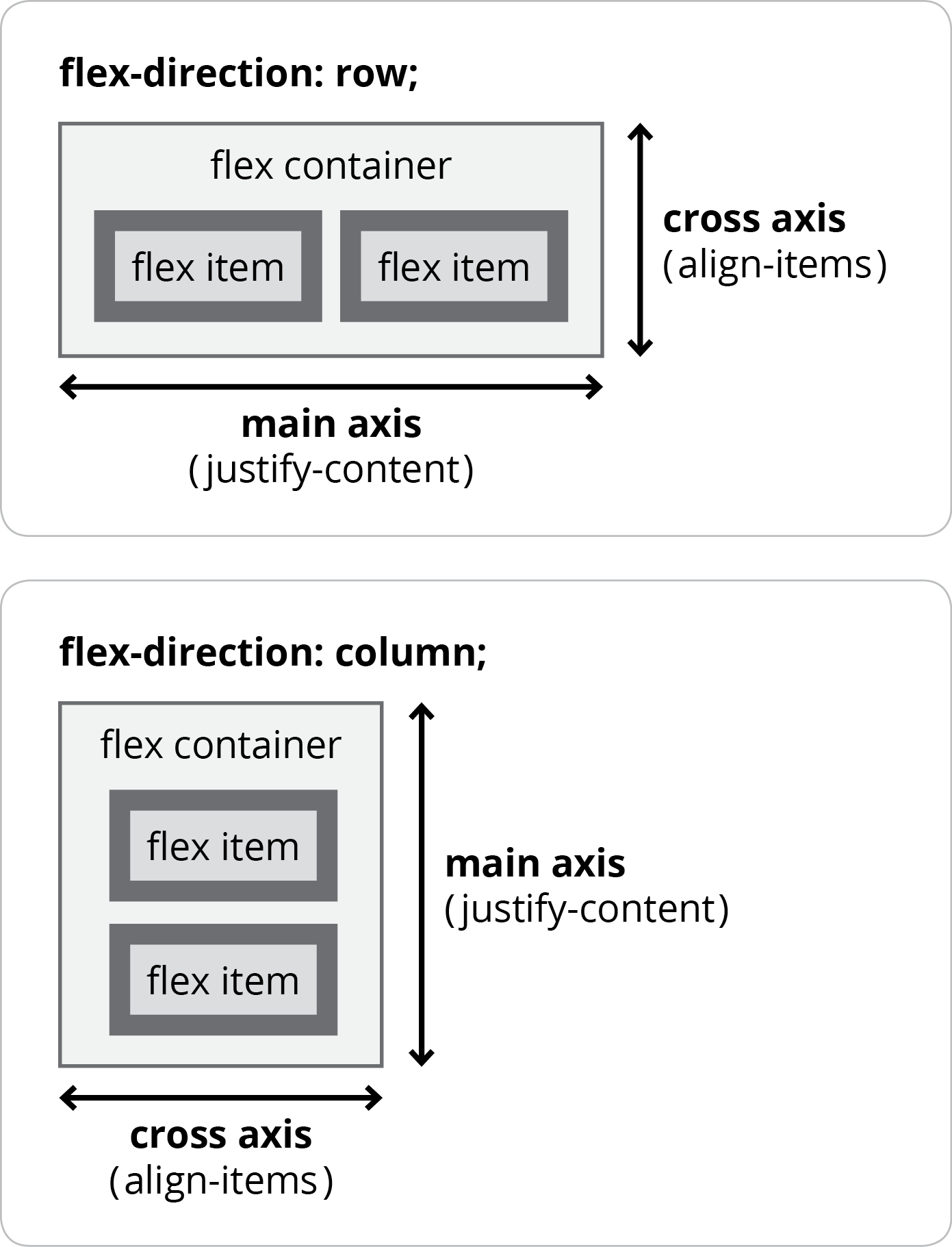
Alignment & Distribution on Main Axis & Cross Axis
Flexbox enables us to align or distribute flex items in multiple ways. To do this flexbox has a main axis and a cross axis. They are not called horizontal and vertical, because the direction of flexbox can be changed from the default row, to column (as you’ll soon see). Here’s an illustration of how they work:
- Switch back to main.css in your code editor.
-
In the .navbar rule add the code shown below in bold:
.navbar { display: flex; justify-content: center; border: 8px solid gray;Code Omitted To Save Space
} -
Save the file, and reload the page in Firefox.
- Notice the navbar items are centered horizontally.
- CTRL–click (Mac) or Right–click (Windows) on anything inside the navbar and choose Inspect Element.
- In the DevTools click on the
<ul class="navbar"> -
In the DevTools styles area, in .navbar style there’s a justify-content property. Click on center so it becomes editable and change it to the following values (noticing how each changes the navbar in the page):
- flex-start (the default value)
- flex-end
- center
- space-between
- space-around
- space-evenly
For a description/illustration of each, visit tinyurl.com/csstricks-justify-content
- Switch back to main.css in your code editor.
-
In the .navbar rule add the code shown below in bold:
.navbar { display: flex; justify-content: center; align-items: center; border: 8px solid gray;Code Omitted To Save Space
} -
Save the file, and reload the page in Firefox.
- Notice the navbar items are now centered vertically.
- CTRL–click (Mac) or Right–click (Windows) on anything inside the navbar and choose Inspect Element.
- In the DevTools click on the
<ul class="navbar"> -
In the DevTools styles area, in .navbar style there’s a align-items property. Click on center so it becomes editable and change it to the following values (noticing how each changes the navbar in the page):
- stretch (the default value)
- flex-start
- flex-end
- center
- baseline
For a description/illustration of each, visit tinyurl.com/csstricks-align-items
Remembering Justify-Content Vs. Align-Items
Here’s a way to remember the difference:
-
justify-content is a longer word, so main axis.
(horizontal for row, vertical for column) -
align-items is a shorter word, so cross axis.
(vertical for row, horizontal for column)
Marcus Herrmann remembers it in a more amusing way: “I memorize Michael Jackson = MJ = Main Axis -> justify-content”
Flex Direction (Row & Column)
By default, flex items are displayed as a row, but we make them a column.
- Switch back to your code editor.
-
In the .navbar rule add the code shown below in bold:
.navbar { display: flex; flex-direction: column; justify-content: center; align-items: center;Code Omitted To Save Space
} -
Save the file, and reload the page in Firefox.
- Notice the navbar is now displayed as a column.
- The align-items center is centering horizontally now.
- The height of the navbar ul is the height of the content inside, so justify-content center is not doing anything. We must set a larger height to see it work.
- Switch back to your code editor.
-
In the .navbar rule add the code shown below in bold:
.navbar { display: flex; flex-direction: column; min-height: 100vh; justify-content: center; align-items: center;Code Omitted To Save Space
}NOTE: To set the height, we can’t use 100% like you might expect. Instead we can use viewport units, which are relative to the size of the viewport (the visible portion of the page). Similar to percentages, 1 viewport unit = 1/100th of the viewport.
-
Save the file, and reload the page in Firefox.
- Notice the navbar fills the screen now, because we set the height to 100/100 of the visible height of the viewport.
- Now the justify-content works, so the navbar content is vertically and horizontally centered in the window. It’s awesome that we can create this layout with a few lines of code on a single element!
- CTRL–click (Mac) or Right–click (Windows) on anything inside the navbar and choose Inspect Element.
- In the DevTools click on the
<ul class="navbar"> -
In the DevTools styles area, in .navbar style experiment with different values for justify-content and align-items. As a reminder, here are the possible values for each:
Justify-Content Align-Items flex-start (default) stretch (default) flex-end flex-start center flex-end space-between center space-around baseline space-evenly NOTE: For flex-direction you can also use row-reverse and column-reverse if you want to reverse the order of content.
How Auto Margins Are Useful
- Switch back to your code editor.
-
In the .navbar rule remove the properties you added (except for display) so you end up with:
.navbar {
   display: flex;
   border: 8px solid gray;
Code Omitted To Save Space
} -
In the .navbar.signup rule add the bold code shown below:
.navbar.signup { margin-left: auto; background: #dc00d4; font-size: 1.5em; } -
Save the file, and reload the page in Firefox.
- Notice that Sign Up has moved all the way to the right of the page.
- Switch back to main.css in your code editor.
-
In the .navbar.logo rule add the bold code shown below:
.navbar.logo { margin-right: auto; background: #0db8e8; } -
Save the file, and reload the page in Firefox.
- Notice that the 2 middle nav items have an equal space around them, centered between the logo on the far left and Sign Up on the far right.
- Switch back to your code editor.
- In the .navbar.signup rule delete the margin code.
-
Save the file, and reload the page in Firefox.
- Notice that all the nav items to the right of the logo have moved all the way to the right of the page.
