Dive into this tutorial to explore the intricacies of iOS development, including incorporating design elements, enhancing UI design, differentiating view controllers, and setting view controller and table view cell classes.
This exercise is excerpted from Noble Desktop’s past app development training materials and is compatible with iOS updates through 2021. To learn current skills in web development, check out our coding bootcamps in NYC and live online.
Topics covered in this iOS Development tutorial:
Adding images from the designer, Improving the UI design on our Storyboard screens, Differentiating the two View Controllers, Setting View Controller & Table View Cell classes
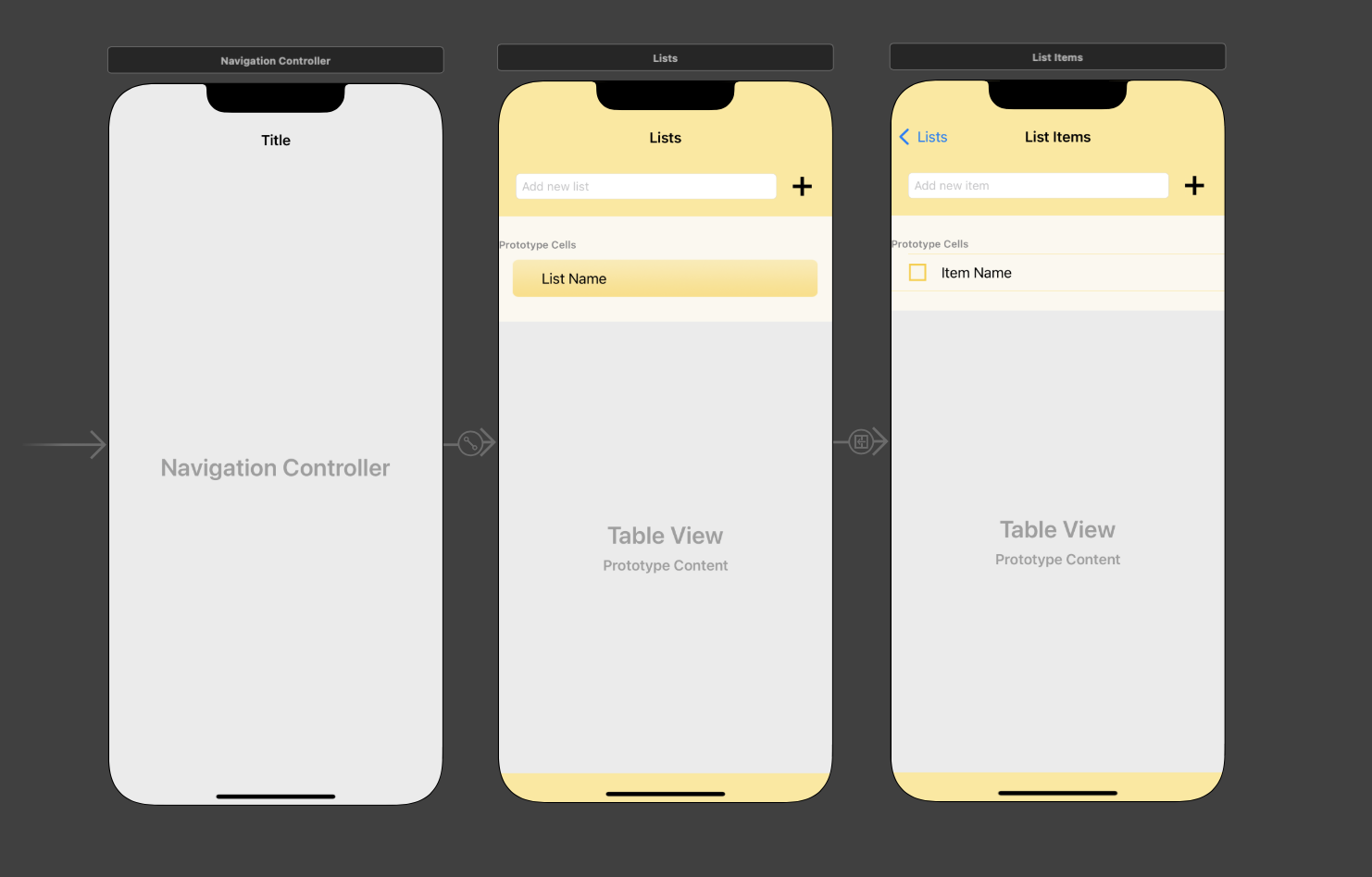
Exercise Preview

Exercise Overview
The designer we’re collaborating with has finished creating the final design! In this exercise, we’ll add the designer’s images to our project and incorporate them into the UI. Additionally, our two screens need to look slightly different. We’ll add a background image to the first screen, a checkbox to the second screen, and more.
Getting Started
Launch Xcode if it isn’t already open.
If you completed the previous exercise, Lists.xcodeproj should still be open. If you closed it, re-open it now.
-
We suggest you complete the previous exercise (5B) before doing this one. If you did not do the previous exercise, complete the following:
- Go to File > Open.
- Navigate to Desktop > Class Files > yourname-iOS App Dev 2 Class > Lists Ready for Refining the UI and double–click on Lists.xcodeproj.
Adding Images from the Designer
The Project navigator on the left is likely still hidden. To reshow it, go to the top right and click the Hide or show the Navigator icon
 .
.Let’s incorporate the image assets the designer gave us into our project so we can jazz up the UI’s aesthetic. In the Project navigator
 , click on Assets.
Switch to the Desktop and navigate to Class Files > yourname-iOS App Dev 2 Class > Lists Images.
Press Cmd–A to select them all.
With Xcode still visible, drag the selected images to either column in the Editor.
Adding New Images When Your Project Already Has Images
Luckily, we received our final images before we needed to incorporate graphic files into our UI. Because your design collaborator(s) might need to refine a design several times until the visuals and UX are just right, you may need to delete old images before adding new ones. To do so, you would follow a process similar to below:
In Xcode, click on Assets and select all of the images you want to delete.
Ctrl–click or Right–click on the selected images and choose Remove Selected Items. The images will be removed from your project’s Assets.xcassets folder as well.
Switch to the Finder, select all the new images you want to use and drag them into Xcode, dropping them into your Assets catalog.
If the new images have the same name as the old ones (which is often the case), you don’t have to switch the images, because the references are still there! Otherwise, select the UI element(s) that display images and in the Attributes inspector change the Image, Background, etc.
- For the affected element(s), edit the preexisting constraints or create new ones if needed.
Improving the UI Design on Our Storyboard Screens
The final design is comprised of cheery yellow colors and bold buttons that add some motivational oomph to the app. Let’s jazz up our drab gray View Controllers by changing some of the colors and other options we set in the last exercise.
If Main.storyboard isn’t showing in the Editor area, navigate there now. If the Document Outline is not showing, click its button
 .
.Now that we no longer need to see the Project navigator, go back to the top left (next to the Maximize/Minimize button) and click the Hide or show the Navigator button
 to hide it once more.
Go to the Document Outline. If the Lists Scene and List Item Scene aren’t expanded, go to the Editor and click anywhere on each controller in turn. Alternatively, you can click the down arrows in the Document Outline.
-
Notice that each Scene has a main View. They both have a lot of child objects, including other types of view. Let’s rename them accordingly so we don’t get confused:
- Under Lists Scene > Lists, select the View and press Return so we can rename it.
- Name it superView and press Return.
- Select the View under List Items Scene > List Items and rename it to superView.
First off, that drab gray background has got to go! In the Document Outline under Lists (the first of our two View Controllers
 ), click on the superView.
Luckily, we can change the color for both View Controllers at once. Under List Items, Cmd–click on its superView so both superViews are selected (and nothing else is).
At the top right, make sure you are in the Attributes inspector tab
 .
.In the Attributes inspector next to Background, click once on the bar (not the word Light Gray Color!).
The designer has a specific yellow in mind, so we won’t use default colors or crayons this time. In the Colors panel that appears, click the second button to show the Color Sliders. Make sure the palette menu below the buttons says RGB Sliders.
-
In the Hex Color field, type FCE586 (a sunshiny yellow). Press Return and close the panel.
Ahh, that’s a nice summery background! Much nicer.
-
We have a bolder, custom Plus button to replace the default Add Contact button. So we can swap them, go to the Document Outline and select the following:
- Under Lists > superView, click on the Button. This should deselect the two superViews, so only the Button is selected.
- Under List Items > superView, Cmd–click on its Button to add to the selection.
In the Attributes inspector
 next to Image type AddButton and press Return.
To mimic a yellow memo pad, let’s make the rows in our table pale yellow with darker yellow lines between them. Under the superView for both Scenes, select each Table View. (Remember to Cmd–click on the second one.)
-
In the Attributes inspector, do the following to style the separators that divide each cell from each other:
- In the menu under Separator, click once on the bar (not the word Default!)
- In the color dialog, make sure you see the RGB Sliders you previously used.
- In the Hex Color field, type FCD75B (another shade of yellow the designer chose). Press Return and close the panel.
- By default, the separators do not stretch the entire way across the screen. Go into the Separator Inset menu and change Default to Custom.
- Change the Left value to 0 so it matches the right inset. Press Return.
Scroll down to the Attributes inspector’s View section. Between the Alpha and Tint menus, find the Background menu. Click once on the bar next to it.
-
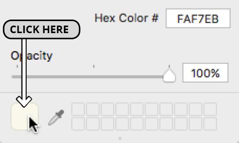
In the Hex Color field in the dialog that appears, type FAF7EB (a very pale yellow). Press Return and close the panel.
On both Storyboard screens, you should see a thin yellow line under the List Name and Item Name labels. Additionally, the bar behind the word Prototype Cells is colored slightly differently than the white cell underneath it.
To get rid of the white, let’s add the same background color to each Table View Cell. Select the first Table View Cell in the Document Outline, then Cmd–click on the second one.
In the Attributes inspector next to Background, click once on the bar.
-
We want to apply the FAF7EB hex color that is currently showing. To do so, go to the bottom left and click the color square as shown below:

Dismiss the panel and admire your work. The View Controllers look much spiffier, but we need them to look a little different based on what they are displaying. Let’s start with the Root View Controller in the middle.
Differentiating the First View Controller
We want each list title on the first View Controller to be displayed on top of a yellow background with a subtle gradient. The designer provided this asset to us for use as a background image.
Let’s add an image view where we can store this background image. In the Objects search field, type image to filter the list of UI elements.
-
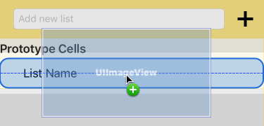
Drag an Image View into the first View Controller’s pale yellow Content View. Once the area around the List Name label is highlighted with a blue outline as shown below, release the mouse.

In the Attributes inspector next to Image type CellDeselectedBackground. Once it fills in the suggestion, press Return to apply it.
The image may already be obscuring some of the text. To move it back in the stack of UI objects, go to the Document Outline and drag CellDeselectedBackground above the List Name label. (Make sure it’s still nested inside the Content View.)
-
Still in the Document Outline, create these four constraints by Control–dragging from CellDeselectedBackground to the Content View that it’s inside:
- Center Horizontally in Container
- Center Vertically in Container
- Equal Widths
- Equal Heights
Go to the bottom right of the Editor and click the Update Frames button
 .
.In order to shrink the image so it looks better within its container, go to the top right and switch to the Size inspector tab
 .
.-
In the Size inspector, click the Edit button next to the constraints listed below, and change the Multiplier as indicated (remember to press Esc afterward):
Constraint Multiplier Equal Width 0.92 Equal Height 0.8 -
That looks a lot better, but it doesn’t have very much breathing room. Let’s make the cell and its parent container wider. To do so:
- In the Document Outline, select the Lists View Controller’s Table View Cell.
- At the top of the Size inspector, change the Row Height to 56 and press Return.
- Select the parent Table View in the Document Outline.
- In the Size inspector, change the Row Height to 56.
Perfect! Or is it…? In the Storyboard, look at the bottom of the gradated yellow background. That’s awfully close to the yellow separator. In retrospect, this screen will look better without any separators.
On the top right, switch back to the Attributes inspector tab
 .
.With the Table View still selected, go into the Separator menu. Change Default to None, and our first View Controller is done!
Adding a Check Button to the Second View Controller
Most of our users will want the ability to check a list item off to mark it as completed. Let’s add a Check button to the second View Controller so that later on, we can change its image using code.
-
In the Document Outline under the bottom scene (List Items Scene), select the Content View (you may need to expand the Table View Cell).
If you don’t see the final View Controller in the Editor, select List Items
 instead.
 In the Objects search field, type button to filter the list.
Drag the Button to the view, dropping it in the small amount of space to the left of the Item Name label. (The area around the label will be highlighted in blue.)
In the Attributes inspector just below Title, delete the Button text.
In a later exercise, we want to make this button’s image changeable when the user taps this button. For now we’ll set a default image. Next to Image type Unchecked and press Return to apply it.
In the Document Outline, Control–drag or Right mouse button–drag the new Button item to itself and from the pop-up, select Aspect Ratio.
-
Still in the Document Outline, create the following three constraints by Control–dragging from the Button to the Content View that it’s inside:
- Center Horizontally in Container
- Center Vertically in Container
- Equal Heights
Go to the bottom right of the Editor and click the Update Frames button
 .
.On the top right, switch to the Size inspector tab
 so we can edit the constraints.
-
In the Size inspector, click the Edit button next to the constraints listed below, and change the Multiplier as indicated:
Constraint Multiplier Align Center X 0.16 10:11 Ratio 1:1 Equal Height 0.8 Our Check button is where we want it, but it’s covering up some of the text below it. Let’s reorder it in the stack of UI elements so our Document Outline is ordered from top to bottom, and left to right. (It’s not necessary to make our app work.)
In the Document Outline, drag the Button object up so it’s the first child object under Content View.
Still in the Document Outline, select the Item Name label so we can reposition it.
In the Size inspector
 , notice that the Leading Space constraint is currently set in relation to the Superview (its parent view). In this case, this is the Content View.
-
We need to set a new Leading Space constraint in relation to the Check button. Select the current Leading Space constraint and press the Delete key.
The outlines of the label’s bounding box will turn red, indicating an error. This is because we no longer have enough constraints to exactly position this object.
-
Control–drag the Item Name label to the Check button and from the pop-up, select Horizontal Spacing.
If the outlines did not automatically turn blue, Update Frames
 now.
now. -
In the Size inspector next to the Leading Space constraint, click the Edit button and change the following:
Constant: Remove it by changing the number to the right of this menu to 0 Multiplier: Change it to 1.2 Press Esc.
- Lastly, to make sure our rows will display correctly, in the Document Outline, select the Table View.
In the Size inspector, change the Row Height to 44.
Setting View Controller & Table View Cell Classes
It’s very important to tell Xcode which of our custom classes to associate with the controllers. This is how it knows which Swift class file controls which screen. Because we also created custom classes for our two table view cells, we’ll need to set their classes as well.
To link a UI screen or element with a custom class (one we created), we need to be in the Identity inspector. At the top right, click its icon
 to switch to it.
Go to the Document Outline. In the Lists Scene that corresponds to the Root View Controller, select Lists (with the View Controller icon
 next to it).
At the top of the Identity inspector
 next to Class, start typing ListsVC. Once it gives you the correct suggestion, press Return.
-
Let’s rinse and repeat for the second View Controller:
- In the Document Outline, under List Items Scene, select List Items
 .
. - In the Identity Inspector’s Class field, type ListItemsVC and press Return.
- In the Document Outline, under List Items Scene, select List Items
In the Document Outline under Lists Scene (the first View Controller), select the Table View Cell so we can set its class.
In the Identity Inspector’s Class field, type ListTitleTVCell and press Return.
The text should still be selected. That’s great—we need to copy it! Press Cmd–C.
On the top right, switch to the Attributes inspector
 .
.-
In the Identifier field, paste the ListTitleTVCell class name and press Return.
Why did we need to use this class name twice? This is because we want to reuse the table cell. When the app is running, it stores an object of the ListTitleTVCell class in memory. Just like it saves energy to reuse a cloth shopping bag instead of accumulating plastic disposable bags, reusing these objects is a lot “greener” because it makes sure the app doesn’t have to create cells from scratch.
-
Let’s repeat the process with the second Table View Cell. To recap:
- Select it in the Document Outline (under List Items > superView > Table View).
- Switch to the Identity inspector
 and set the Class to ListItemTVCell. Copy it.
 - In the Attributes inspector
 , paste the class name into the Identifier field.
Save the file and keep Xcode open so that we can continue with this project in the next exercise.
