Responsive Web Design
Designing & Coding Websites That Respond to Mobile, Tablet & Beyond
Right/Left Arrows Change Slides (or Swipe Right/Left)
Esc zooms out (or Pinch)
Responsive design is not about ‘designing for mobile’. But it’s not about ‘designing for the desktop’, either. Rather, it’s about adopting a more flexible, device-agnostic approach
— Ethan Marcotte author of Responsive Web Design
Examples
- The Boston Globe
- Food Sense
- Skinny Ties
- Authentic Jobs
- mediaqueri.es has many more examples
So How Does it Work?
CSS Media Queries
Media Queries
Do not automatically make sites work on various devices!
They allow you to test for the following,
but you must adapt the layout with CSS:
- Device screen width/height
- Screen resolution
- Device orientation
- More
Live Demo
The media query
body { background: red; }

@media (max-width: 320px) {
  body { background: orange; }
}
Screens 0 to 320px:
body’s background will be orange instead of red
(overrides the first rule)
Screens Larger than 320px:
body’s background will be red
Ways to Use Media Queries
1. Within a CSS file or <style> tag
@media (max-width: 768px) {
    /* your css goes here */
}
2. When linking to a CSS file
<link media="(max-width: 768px)" href="tablet.css" rel="stylesheet">
3. Within a CSS file via @import
@import url("tablet.css") (max-width: 768px);
Previewing & Testing
- Responsinator.com displays any site in some common devices
- Google Resizer displays any site at common device sizes
- Google Chrome: Device Mode & Mobile Emulation. Read more about it in this article.
- Firefox: Responsive Design View
- iOS Simulator (built into Xcode) if you have a Mac. (After launching Xcode, go into the Xcode menu and choose Open Developer Tool > Simulator)
Test on real devices
Nothing beats holding a device and touching the site:
- Is the type legible?
- How far do you need to reach to tap something?
- How well does the device respond?
The Viewport
- Small devices assume sites are designed for desktops.
- They render the page on a large viewport (980px) and scale it down to fit a small screen. Apple’s viewport description & quirksmode.org
- Assuming a viewport of 980px, media queries for small screens (like 320px) won’t apply!
- Must tell them the viewport width = width of the device
<meta name="viewport" content="width=device-width, initial-scale=1, shrink-to-fit=no">
Flexible Images
Remove the width and height from the image:
<img src="image.png">
Ensure the image scales if it’s too large:
img {
    max-width: 100%;
}
Live Demo
Responsive Image Tips
- First ask “what images are necessary?”
- Be careful about sending too many unnecessarily large images to mobile
- Be crafty by using image optimization tricks to your favor like blur and monochrome
- Study responsive image solutions
- Cross browser studies: Media Query & Asset Downloading Results
Flexible Video
- Intrinsic Ratios for flexible video sizing
- FitVids.js
Shrinking down a desktop site reveals content issues
LIVE DEMO
Ask “What content is important and what isn’t?”
- “Mobile users want to see our menu, hours, and delivery number. Desktop users definitely want this 1mb png of someone smiling at a salad.” @wilto
- xkcd “University Website” comic
UX: User Experience is Important
Make it easy & enjoyable for people to use.
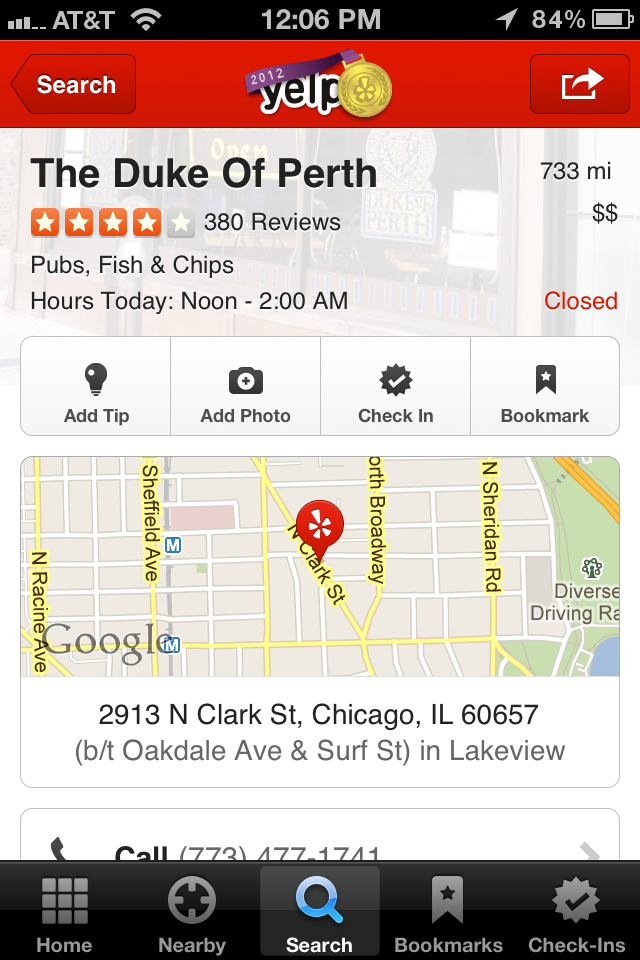
| Old Design (had to tap for reviews & tips) | Redesigned | Just scroll down for reviews & tips |
 |
 |
 |
RWD starts to influence everything from the ground up
…or Mobile up
Mobile First
Websites and applications should be designed and built for mobile first.
“Mobile First” — Luke Wroblewski
Also check out his Designing for Mobile First Video
Going mobile first:
- Forces you to focus and prioritize [...] by embracing the constraints inherent in mobile design
- Allows you to deliver innovative experiences by building on new capabilities native to mobile devices
“Mobile First” — Luke Wroblewski
Mobile First Design
- If mobile is a larger audience, why not design for them first?
- Work out priorities and UX issues on mobile, then build up to larger devices.
- Trying to squishing a desktop site down to fit smaller devices can bring up issues that may affect the desktop design.
- Design across screen sizes early on. Keep things flexible and mockup multiple sizes sooner rather than later.
Mobile First Development
It can be easier to build up, rather than tear down.
Tearing down (Desktop Down)
.column {
  float: left;
}
@media (max-width: 320px) {
  .column {
    float: none;
  }
}
Building up (Mobile First)
@media (min-width: 321px) {
  .column {
    float: left;
  }
}
Content Optimization Across Devices
ONLY HIDE PRESENTATIONAL CONTENT
People will get frustrated if they can’t find information on mobile if they know it exists on desktop.
How do we fit this into our process?
Become cyclical...
No, that doesn’t say cynical :)
[the design process] is about designing and prototyping and making.
When you separate those, I think the final result suffers.
Moving to code faster. Why?
- A static picture of a website is not as helpful as seeing how it reacts to its environment
- Save time by finding unexpected problems faster
How?
- Drive design direction via style tiles.
- Deliver working code based mockups instead of static mockups. Read insight from an agency that’s doing this.
- DevTools help you test ideas quickly, directly in a browser.
- Leverage grid frameworks—such as Bootstrap—to get up and running quickly.
Grid systems
- For Designers: Guides for column widths and gutters that help keep designs consistent and aligned.
- For Developers: A collection of prebuilt CSS rules that allow you to apply grid-like layouts to HTML
Benefits
- Many designers (web and print) already design on grids.
- Helps organize content & promotes modular thinking.
- Helps build a common language between designers & developers.
- Develop/Code Faster: The grid in a designer’s graphics app can be more quickly translated into a CSS grid.
Grid Systems
Already responsive.
Many have prebuilt CSS buttons and components.
Examples of Prebuilt Grid Systems:
Bootstrap,
Foundation, and
Skeleton
Free Bootstrap PSD Templates
Free Sketch Template
The challenge of responsive design is to be simultaneously agnostic and considerate of the environment in which it’s viewed.
Thinking Points
- Desktop down can perpetuate desktop thinking
- Constant designer/developer interactions can be helpful for problem solving
- Consider moving to code faster
- Focus on the content and user experience.
Learn More
Coding for Designers
2-hour beginner seminar
Mobile & Responsive Web Design
18-hours: coding experience required