Do you want to make your data more digestible and engaging? Discover the power of animated infographics and learn how to create them with our expert tips and examples!
Animated infographics can be a powerful tool for conveying complex information in a visually appealing and engaging way, allowing for better comprehension and retention. Here are some tips for creating effective animated infographics and samples demonstrating these concepts:
Presentation basics: the time-tested tenets for formal presentations work for animated infographics as well: know your audience, keep it simple (one concept at a time), use simple language (avoid jargon as much as possible), and keep on-screen reading to a minimum.
Example: Strava // Year In Sport by Giant Ant https://vimeo.com/311936927
Make your point: have your storyboards emphasize your point simply and clearly. Be bold. Charts, icons, and textual data should be large and in charge. Use color to make your point pop.

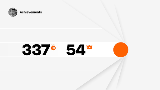
Example: Oil’d by Chris Harmon https://vimeo.com/22655744
Consider using a voice-over or lower thirds to help explain and strengthen concepts: your animation communicates more clearly, and the audience will better retain the information by experiencing it both visually and in a word-based manner.

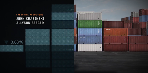
Example: NTT Data by Colin Jackson https://vimeo.com/clndvdjcksn > click the Load More button > scroll to NTT Data
Use visual metaphors: a standard for motion design, visual metaphors can help illustrate complex concepts in a more intuitive way. Also, visual metaphors are great for creating clever connections between story elements.
Example: Jack Ryan Season 2 Opening Titles https://www.youtube.com/watch?v=5i_Et-drvTQ
Divide a process or idea into phases and build the animation one transition at a time: Video is primarily a scanning modality, and this approach guides an audience along a thought process or series of results, which makes the content snackable.

Example: Artolution Timeline by Pentagram https://vimeo.com/605952518
The medium is the message: use animation to visually illustrate concepts and ideas that may be difficult to explain in words alone. Animations can help demonstrate processes, show cause-and-effect relationships succinctly, and aid comprehension of complex charts.

Example: Keplertek | AI & Robotics Ecosystem https://vimeo.com/279041273
Learn more in these courses
-
![]()
Motion Graphics Certificate
- Evenings or weekdays
- 102 hours
- Open to beginners
- Financing available
- 1:1 Mentoring
Learn motion graphics and visual effects with Adobe After Effects, Premiere Pro, and Cinema 4D Lite. Develop your skills in animation, video editing, and special effects, and create a motion graphics demo reel to showcase your work to potential clients or employers.
-
After Effects Bootcamp
![]()
- Weekdays or evenings
- 18 hours
- Open to beginners
Learn to create compelling video content with Adobe After Effects. This course covers everything from basics to advanced animation techniques like motion tracking and green screen removal. Get hands-on experience with real-world projects taught by an experienced instructor.
-
Premiere Pro Bootcamp
![]()
- Weekdays or evenings
- 18 hours
- Open to beginners
Learn how to use Adobe Premiere Pro to create professionally edited videos in this comprehensive class. From importing and organizing footage to advanced editing techniques like multi-cam editing and green screen removal, this course will equip you with the skills to create compelling video content.


